
Unlocking Real-time Predictions with Shopify's Machine Learning Platform
Learn how Shopify Data built new online inference capabilities into its Machine Learning Platform to deploy and serve models for real-time prediction at scale.
At Shopify, we’re empowering our platform to make great decisions quickly. Learn how we’re building better, smarter, and faster products through Data Engineering.
Usually, when you set success metrics you’re able to directly measure the value of interest in its entirety. For example, Shopify can measure Gross Merchandise Volume (GMV) with precision because we can query our databases for every order we process. However, sometimes the information that tells you whether you’re having an impact isn’t available, or is too expensive or time consuming to collect. In these cases, you'll need to rely on a sampled success metric.
In a one-shot experiment, you can estimate the sample size you’ll need to achieve a given confidence interval. However, success metrics are generally tracked over time, and you'll want to evaluate each data point in the context of the trend, not in isolation. Our confidence in our impact on the metric is cumulative. So, how do you extract the success signal from sampling noise? That's where a Monte Carlo Simulation comes in.
A Monte Carlo simulation can be used to understand the variability of outcomes in response to variable inputs. Below, we’ll detail how to use a Monte Carlo simulation to identify the data points you need for a trusted sampled success metric. We’ll walkthrough an example and share how to implement this in Python and pandas so you can do it yourself.
A Monte Carlo simulation can be used to generate a bunch of random inputs based on real world assumptions. It does this by feeding these inputs through a function that approximates the real world situation of interest, and observing the attributes of the output to understand the likelihood of possible outcomes given reasonable scenarios.
In the context of a sampled success metric, you can use the simulation to understand the tradeoff between:
These results can then be used to explain complex statistical concepts to your non-technical stakeholders. How? You'll be able to simply explain the percentage of certainty your sample size yields, against the cost of collecting more data.
To show you how to use a Monte Carlo simulation for a sampled success metric, we'll turn to the Shopify App Store as an example. The Shopify App Store is a marketplace where our merchants can find apps and plugins to customize their store. We have over 8,000 apps solving a range of problems. We set a high standard for app quality, with over 200 minimum requirements focused on security, functionality, and ease of use. Each app needs to meet these requirements in order to be listed, and we have various manual and automated app review processes to ensure these requirements are met.
We want to continuously evaluate how our review processes are improving the quality of our app store. At the highest level, the question we want to answer is, “How good are our apps?”. This can be represented quantitatively as, “How many requirements does the average app violate?”. With thousands of apps in our app store, we can’t check every app, every day. But we can extrapolate from a sample.
By auditing randomly sampled apps each month, we can estimate a metric that tells us how many requirement violations merchants experience with the average installed app—we call this metric the shop issue rate. We can then measure against this metric each month to see whether our various app review processes are having an impact on improving the quality of our apps. This is our sampled success metric.
With mock data and parameters, we’ll show you how we can use a Monte Carlo simulation to identify how many apps we need to audit each month to have confidence in our sampled success metric. We'll then repeatedly simulate auditing randomly selected apps, varying the following parameters:
To understand the sensitivity of our success metric to relevant parameters, we need to conduct five steps:
To use a Monte Carlo simulation, you'll need to have a success metric in mind already. While it’s ideal if you have some idea of its current value and the distribution it’s drawn from, the whole point of the method is to see what range of outcomes emerges from different plausible scenarios. So, don’t worry if you don’t have any initial samples to start with.
We start by establishing simulation metrics. These are different from our success metric as they describe the variability of our sampled success metric. Metrics on metrics!
For our example, we'll want to check on this metric on a monthly basis to understand whether our approach is working. So, to establish our simulation metric, we ask ourselves, “Assuming we decrease our shop issue rate in the population by a given amount per month, in how many months would our metric decrease?”. Let’s call this bespoke metric: 1 month decreases observed or 1mDO.
We can also ask this question over longer time periods, like two consecutive months (2mDO) or a full quarter (1qDO). As we make plans on an annual basis, we’ll want to simulate these metrics for one year into the future.
On top of our simulation metric, we’ll also want to measure the mean absolute percentage error (MAPE). MAPE will help us identify the percentage by which the shop issue rate departs from the true underlying distribution each month.
Now, with our simulation metrics established, we need to define what distribution we're going to be pulling from.
For the purpose of our example, let’s say we’re going to generate a year’s worth of random app audits, assuming a given monthly decrease in the population shop issue rate (our success metric). We’ll want to compare the sampled shop issue rate that our Monte Carlo simulation generates to that of the population that generated it.
We generate our Monte Carlo inputs by drawing from a random distribution. For our example, we've identified that the number of issues an app has is well represented by the Poisson distribution which models the sum of a collection of independent Bernoulli trials (where the evaluation of each requirement can be considered as an individual trial). However, your measure of interest might match another, like the normal distribution. You can find more information about fitting the right distribution to your data here.
The Poisson distribution has only one parameter, λ (lambda), which ends up being both the mean and the variance of the population. For a normal distribution, you’ll need to specify both the population mean and the variance.
Hopefully you already have some sample data you can use to estimate these parameters. If not, the code we’ll work through below will allow you to test what happens under different assumptions.
Remember, the goal is to quantify how much the sample mean will differ from the underlying population mean given a set of realistic assumptions, using your bespoke simulation metrics.
We know that one of the parameters we need to set is Poisson’s λ. We also assume that we’re going to have a real impact on our metric every month. We’ll want to specify this as a percentage by which we’re going to decrease the λ (or mean issue count) each month.
Finally, we need to set how many random audits we’re going to conduct (aka our sample size). As the sample size goes up, so does the cost of collection. This is a really important number for stakeholders. We can use our results to help communicate the tradeoff between certainty of the metric versus the cost of collecting the data.
Now, we’re going to write the building block function that generates a realistic sampled time series given some assumptions about the parameters of the distribution of app issues. For example, we might start with the following assumptions:
Note that these assumptions could be wrong, but the goal is not to get your assumptions right. We’re going to try lots of combinations of assumptions in order to understand how our simulation metrics respond across reasonable ranges of input parameters.
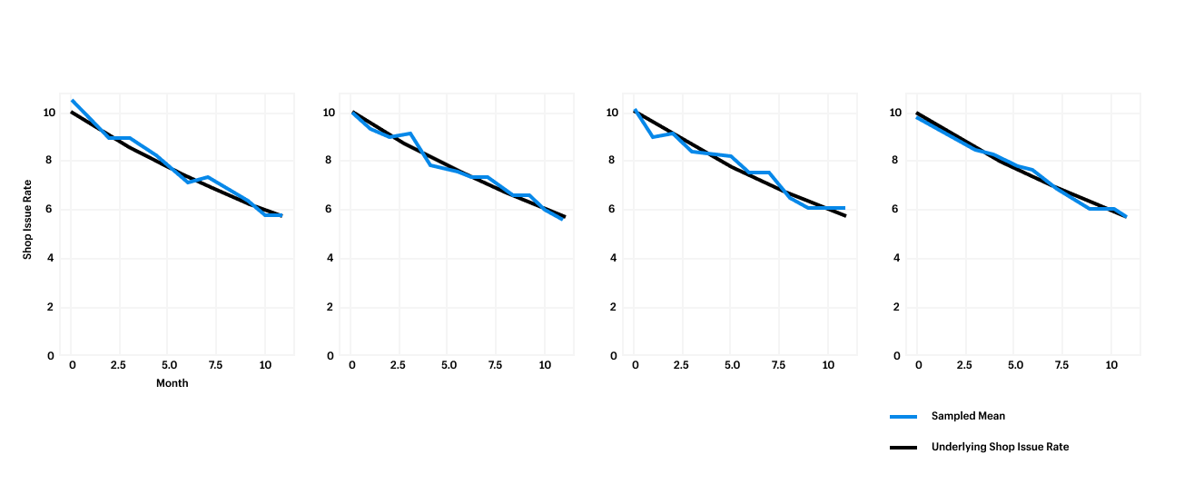
For our first simulation, we’ll start with a function that generates a time series of issue counts, drawn from a distribution of apps where the population issue rate is in fact decreasing by a given percentage per month. For this simulation, we’ll draw from 100 sample time series. This sample size will provide us with a fairly stable estimate of our simulation metrics, without taking too long to run. Below is the output of the simulation:
This function returns a sample dataset of n=audits_per_period apps over m=periods months, where the number of issues for each app is drawn from a Poisson distribution. In the chart below, you can see how the sampled shop issue rate varies around the true underlying number. We can see 10 mean issues decreasing 5 percent every month.

Now that we’ve run our first simulation, we can calculate our variability metrics MAPE and 1mDO. The below code block will calculate our variability metrics for us:
This code will tell us how many months it will take before we actually see a decrease in our shop issue rate. Interpreted another way, "How long do we need to wait to act on this data?".
In this first simulation, we found that the MAPE was 4.3 percent. In other words, the simulated shop issue rate differed from the population mean by 4.3 percent on average. Our 1MDO was 72 percent, meaning our sampled metric decreased in 72 percent of months. These results aren’t great, but was it a fluke? We’ll want to run a few more simulations to identify confidence in your simulation metrics.
The code below runs our generate_time_series function n=iterations times with the given parameters, and returns a DataFrame of our simulation metrics for each iteration. So, if we run this with 50 iterations, we'll get back 50 time series, each with 100 sampled audits per month. By averaging across iterations, we can find the averages of our simulation metrics.
Now, the number of simulations to run depends on your use case, but 50 is a good place to start. If you’re simulating a manufacturing process where millimeter precision is important, you’ll want to run hundreds or thousands of iterations. These iterations are cheap to run, so increasing the iteration count to improve your precision just means they’ll take a little while longer to complete.
For our example, 50 sampled time series enables us with enough confidence that these metrics represent the true variability of the shop issue rate. That is, as long as our real world inputs are within the range of our assumptions.
Now that we’re able to get representative certainty for our metrics for any set of inputs, we can run simulations across various combinations of assumptions. This will help us understand how our variability metrics respond to changes in inputs. This approach is analogous to the grid search approach to hyperparameter tuning in machine learning. Remember, for our app store example, we want to identify the impact of our review processes on the metric for both the monthly percentage decrease and monthly sample size.
We'll use the code below to specify a reasonable range of values for the monthly impact on our success metric, and some possible sample sizes. We'll then run the run_simulation function across those ranges. This code is designed to allow us to search across any dimension. For example, we could replace the monthly decrease parameter with the initial mean issue count. This allows us to understand the sensitivity of our metrics across more than two dimensions.
The simulation will produce a range of outcomes. Looking at our results below, we can tell our stakeholders that if we start at 10 average issues per audit, run 100 random audits per month, and decrease the underlying issue rate by 5 percent each month, we should see monthly decreases in our success metric 83 percent of the time. Over two months, we can expect to see a decrease 97 percent of the time.

With our simulations, we're able to clearly express the uncertainty tradeoff in terms that our stakeholders can understand and implement. For example, we can look to our results and communicate that an additional 50 audits per month would yield quantifiable improvements in certainty. This insight can enable our stakeholders to make an informed decision about whether that certainty is worth the additional expense.
And there we have it! The next time you're looking to separate signal from noise in your sampled success metric, try using a Monte Carlo simulation. This fundamental guide just scratches the surface of this complex problem, but it's a great starting point and I hope you turn to it in the future.
Tom is a data scientist working on systems to improve app quality at Shopify. In his career, he tried product management, operations and sales before figuring out that SQL is his love language. He lives in Brooklyn with his wife and enjoys running, cycling and writing code.
Are you passionate about solving data problems and eager to learn more about Shopify? Check out openings on our careers page.
By Kevin Lam and Rafael Aguiar
At Shopify, we’ve adopted Apache Flink as a standard stateful streaming engine that powers a variety of use cases. Earlier this year, we shared our tips for optimizing large stateful Flink applications. Below we’ll walk you through 3 more best practices.
A Flink application consists of multiple tasks, including transformations (operators), data sources, and sinks. These tasks are split into several parallel instances for execution and data processing.
Parallelism refers to the parallel instances of a task and is a mechanism that enables you to scale in or out. It's one of the main contributing factors to application performance. Increasing parallelism allows an application to leverage more task slots, which can increase the overall throughput and performance.
Application parallelism can be configured in a few different ways, including:
The configuration choice really depends on the specifics of your Flink application. For instance, if some operators in your application are known to be a bottleneck, you may want to only increase the parallelism for that bottleneck.
We recommend starting with a single execution environment level parallelism value and increasing it if needed. This is a good starting point as task slot sharing allows for better resource utilization. When I/O intensive subtasks block, non I/O subtasks can make use of the task manager resources.
A good rule to follow when identifying parallelism is:
The number of task managers multiplied by the number of tasks slots in each task manager must be equal (or slightly higher) to the highest parallelism value
For example, when using parallelism of 100 (either defined as a default execution environment level or at a specific operator level), you would need to run 25 task managers, assuming each task manager has four slots: 25 x 4 = 100.
Data pipelines usually have one or more data sinks (destinations like Bigtable, Apache Kafka, and so on) which can sometimes become bottlenecks in your Flink application. For example, if your target Bigtable instance has high CPU utilization, it may start to affect your Flink application due to Flink being unable to keep up with the write traffic. You may not see any exceptions, but decreased throughput all the way to your sources. You’ll also see backpressure in the Flink UI.
When sinks are the bottleneck, the backpressure will propagate to all of its upstream dependencies, which could be your entire pipeline. You want to make sure that your sinks are never the bottleneck!
In cases where latency can be sacrificed a little, it’s useful to combat bottlenecks by first batch writing to the sink in favor of higher throughput. A batch write request is the process of collecting multiple events as a bundle and submitting those to the sink at once, rather than submitting one event at a time. Batch writes will often lead to better compression, lower network usage, and smaller CPU hit on the sinks. See Kafka’s batch.size property, and Bigtable’s bulk mutations for examples.
You’ll also want to check and fix any data skew. In the same Bigtable example, you may have heavily skewed keys which will affect a few of Bigtable’s hottest nodes. Flink uses keyed streams to scale out to nodes. The concept involves the events of a stream being partitioned according to a specific key. Flink then processes different partitions on different nodes.
KeyBy is frequently used to re-key a DataStream in order to perform aggregation or a join. It’s very easy to use, but it can cause a lot of problems if the chosen key isn’t properly distributed. For example, at Shopify, if we were to choose a shop ID as our key, it wouldn’t be ideal. A shop ID is the identifier of a single merchant shop on our platform. Different shops have very different traffic, meaning some Flink task managers would be busy processing data, while the others would stay idle. This could easily lead to out-of-memory exceptions and other failures. Low cardinality IDs (< 100) are also problematic because it’s hard to distribute them properly amongst the task managers.
But what if you absolutely need to use a less than ideal key? Well, you can apply a bucketing technique:
By applying a bucketing technique, your processing logic is better distributed (up to the maximum number of additional buckets per key). However, you need to come up with a way to combine the results in the end. For instance, if after processing all your buckets you find the data volume is significantly reduced, you can keyBy the stream by your original “less than ideal” key without creating problematic data skew. Another approach could be to combine your results at query time, if your query engine supports it.
HybridSource to Combine Heterogeneous Sources Let’s say you need to abstract several heterogeneous data sources into one, with some ordering. For example, at Shopify a large number of our Flink applications read and write to Kafka. In order to save costs associated with storage, we enforce per-topic retention policies on all our Kafka topics. This means that after a certain period of time has elapsed, data is expired and removed from the Kafka topics. Since users may still care about this data after it’s expired, we support configuring Kafka topics to be archived. When a topic is archived, all Kafka data for that topic are copied to a cloud object storage for long-term storage. This ensures it’s not lost when the retention period elapses.
Now, what do we do if we need our Flink application to read all the data associated with a topic configured to be archived, for all time? Well, we could create two sources—one source for reading from the cloud storage archives, and one source for reading from the real-time Kafka topic. But this creates complexity. By doing this, our application would be reading from two points in event time simultaneously, from two different sources. On top of this, if we care about processing things in order, our Flink application has to explicitly implement application logic which handles that properly.
If you find yourself in a similar situation, don’t worry there’s a better way! You can use HybridSource to make the archive and real-time data look like one logical source. Using HybridSource, you can provide your users with a single source that first reads from the cloud storage archives for a topic, and then when the archives are exhausted, switches over automatically to the real-time Kafka topic. The application developer only sees a single logical DataStream and they don’t have to think about any of the underlying machinery. They simply get to read the entire history of data.
Using HybridSource to read cloud object storage data also means you can leverage a higher number of input partitions to increase read throughput. While one of our Kafka topics might be partitioned across tens or hundreds of partitions to support enough throughput for live data, our object storage datasets are typically partitioned across thousands of partitions per split (e.g. day) to accommodate for vast amounts of historical data. The superior object storage partitioning, when combined with enough task managers, will allow Flink to blaze through the historical data, dramatically reducing the backfill time when compared to reading the same amount of data straight from an inferiorly partitioned Kafka topic.
Here’s what creating a DataStream using our HybridSource powered KafkaBackfillSource looks like in Scala:
In the code snippet, the KafkaBackfillSource abstracts away the existence of the archive (which is inferred from the Kafka topic and cluster), so that the developer can think of everything as a single DataStream.
HybridSource is a very powerful construct and should definitely be considered if you need your Flink application to read several heterogeneous data sources in an ordered format.
And there you go! 3 more tips for optimizing large stateful Flink applications. We hope you enjoyed our key learnings and that they help you out when implementing your own Flink applications. If you’re looking for more tips and haven’t read our first blog, make sure to check them out here.
Kevin Lam works on the Streaming Capabilities team under Production Engineering. He's focused on making stateful stream processing powerful and easy at Shopify. In his spare time he enjoys playing musical instruments, and trying out new recipes in the kitchen.
Rafael Aguiar is a Senior Data Engineer on the Streaming Capabilities team. He is interested in distributed systems and all-things large scale analytics. When he is not baking some homemade pizza he is probably lost outdoors. Follow him on Linkedin.
Interested in tackling the complex problems of commerce and helping us scale our data platform? Join our team.
When building any kind of real-time data application, trying to figure out how to send messages from the server to the client (or vice versa) is a big part of the equation. Over the years, various communication models have popped up to handle server-to-client communication, including Server Sent Events (SSE).
SSE is a unidirectional server push technology that enables a web client to receive automatic updates from a server via an HTTP connection. With SSE data delivery is quick and simple because there’s no periodic polling, so there’s no need to temporarily stage data.
This was a perfect addition to a real-time data visualization product Shopify ships every year—our Black Friday Cyber Monday (BFCM) Live Map.
Our 2021 Live Map system was complex and used a polling communication model that wasn’t well suited. While this system had 100 percent uptime, it wasn't without its bottlenecks. We knew we could improve performance and data latency.
Below, we’ll walk through how we implemented an SSE server to simplify our BFCM Live Map architecture and improve data latency. We’ll discuss choosing the right communication model for your use case, the benefits of SSE, and code examples for how to implement a scalable SSE server that’s load-balanced with Nginx in Golang.
First, let’s discuss choosing how to send messages. When it comes to real-time data streaming, there are three communication models:
No model is better than the other, it really depends on the use case.
Our use case is the Shopify BFCM Live Map, a web user interface that processes and visualizes real-time sales made by millions of Shopify merchants over the BFCM weekend. The data we’re visualizing includes:
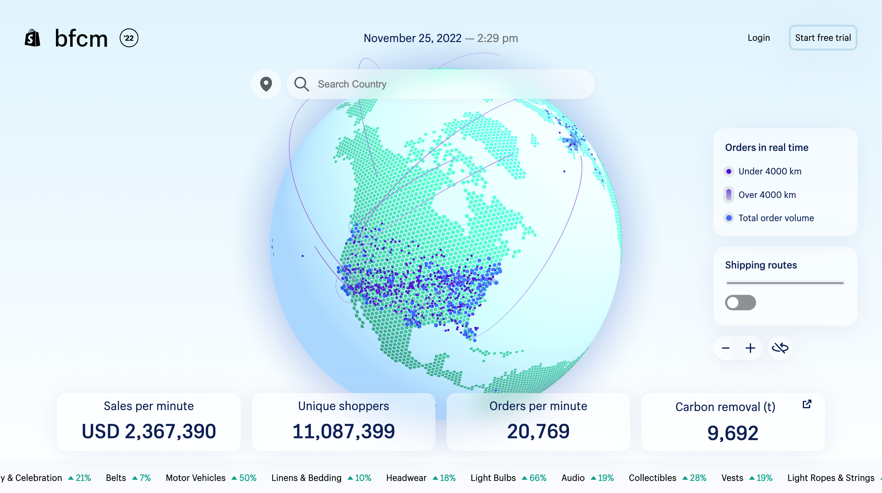
BFCM is the biggest data moment of the year for Shopify, so streaming real-time data to the Live Map is a complicated feat. Our platform is handling millions of orders from our merchants. To put that scale into perspective, during BFCM 2021 we saw 323 billion rows of data ingested by our ingestion service.
For the BFCM Live Map to be successful, it requires a scalable and reliable pipeline that provides accurate, real-time data in seconds. A crucial part of that pipeline is our server-to-client communication model. We need something that can handle both the volume of data being delivered, and the load of thousands of people concurrently connecting to the server. And it needs to do all of this quickly.
Our 2021 BFCM Live Map delivered data to a presentation layer via WebSocket. The presentation layer then deposited data in a mailbox system for the web client to periodically poll, taking (at minimum) 10 seconds. In practice, this worked but the data had to travel a long path of components to be delivered to the client.
Data was provided by a multi-component backend system consisting of a Golang based application (Cricket) using a Redis server and a MySQL database. The Live Map’s data pipeline consisted of a multi-region, multi-job Apache Flink based application. Flink processed source data from Apache Kafka topics and Google Cloud Storage (GCS) parquet-file enrichment data to produce into other Kafka topics for Cricket to consume.

While this got the job done, the complex architecture caused bottlenecks in performance. In the case of our trending products data visualization, it could take minutes for changes to become available to the client. We needed to simplify in order to improve our data latency.
As we approached this simplification, we knew we wanted to deprecate Cricket and replace it with a Flink-based data pipeline. We’ve been investing in Flink over the past couple of years, and even built our streaming platform on top of it—we call it Trickle. We knew we could leverage these existing engineering capabilities and infrastructure to streamline our pipeline.
With our data pipeline figured out, we needed to decide on how to deliver the data to the client. We took a look at how we were using WebSocket and realized it wasn’t the best tool for our use case.
WebSocket provides a bidirectional communication channel over a single TCP connection. This is great to use if you’re building something like a chat app, because both the client and the server can send and receive messages across the channel. But, for our use case, we didn’t need a bidirectional communication channel.
The BFCM Live Map is a data visualization product so we only need the server to deliver data to the client. If we continued to use WebSocket it wouldn’t be the most streamlined solution. SSE on the other hand is a better fit for our use case. If we went with SSE, we’d be able to implement:
But most importantly, SSE would allow us to remove the process of retrieving, processing, and storing data on the presentation layer for the purpose of client polling. With SSE, we would be able to push the data as soon as it becomes available. There would be no more polls and reads, so no more delay. This, paired with a new streamlined pipeline, would simplify our architecture, scale with peak BFCM volumes and improve our data latency.
With this in mind, we decided to implement SSE as our communication model for our 2022 Live Map. Here’s how we did it.
We implemented an SSE server in Golang that subscribes to Kafka topics and pushes the data to all registered clients’ SSE connections as soon as it’s available.

A real-time streaming Flink data pipeline processes raw Shopify merchant sales data from Kafka topics. It also processes periodically-updated product classification enrichment data on GCS in the form of compressed Apache Parquet files. These are then computed into our sales and trending product data respectively and published into Kafka topics.
Here’s a code snippet of how the server registers an SSE connection:
Subscribing to the SSE endpoint is simple with the EventSource interface. Typically, client code creates a native EventSource object and registers an event listener on the object. The event is available in the callback function:
When it came to integrating the SSE server to our frontend UI, the UI application was expected to subscribe to an authenticated SSE server endpoint to receive data. Data being pushed from the server to client is publicly accessible during BFCM, but the authentication enables us to control access when the site is no longer public. Pre-generated JWT tokens are provided to the client by the server that hosts the client for the subscription. We used the open-sourced EventSourcePolyfill implementation to pass an authorization header to the request:
Once subscribed, data is pushed to the client as it becomes available. Data is consistent with the SSE format, with the payload being a JSON parsable by the client.
Our 2021 system struggled under a large number of requests from user sessions at peak BFCM volume due to the message bus bottleneck. We needed to ensure our SSE server could handle our expected 2022 volume.
With this in mind, we built our SSE server to be horizontally scalable with the cluster of VMs sitting behind Shopify’s NGINX load-balancers. As the load increases or decreases, we can elastically expand and reduce our cluster size by adding or removing pods. However, it was essential that we determined the limit of each pod so that we could plan our cluster accordingly.
One of the challenges of operating an SSE server is determining how the server will operate under load and handle concurrent connections. Connections to the client are maintained by the server so that it knows which ones are active, and thus which ones to push data to. This SSE connection is implemented by the browser, including the retry logic. It wouldn’t be practical to open tens of thousands of true browser SSE connections. So, we need to simulate a high volume of connections in a load test to determine how many concurrent users one single server pod can handle. By doing this, we can identify how to scale out the cluster appropriately.
We opted to build a simple Java client that can initiate a configurable amount of SSE connections to the server. This Java application is bundled into a runnable Jar that can be distributed to multiple VMs in different regions to simulate the expected number of connections. We leveraged the open-sourced okhttp-eventsource library to implement this Java client.
Here’s the main code for this Java client:
With another successful BFCM in the bag, we can confidently say that implementing SSE in our new streamlined pipeline was the right move. Our BFCM Live Map saw 100 percent uptime. As for data latency in terms of SSE, data was delivered to clients within milliseconds of its availability. This was much improved from the minimum 10 second poll from our 2021 system. Overall, including the data processing in our Flink data pipeline, data was visualized on the BFCM’s Live Map UI within 21 seconds of its creation time.
We hope you enjoyed this behind the scenes look at the 2022 BFCM Live Map and learned some tips and tricks along the way. Remember, when it comes to choosing a communication model for your real-time data product, keep it simple and use the tool best suited for your use case.
Bao is a Senior Staff Data Engineer who works on the Core Optimize Data team. He's interested in large-scale software system architecture and development, big data technologies and building robust, high performance data pipelines.
Our platform handled record-breaking sales over BFCM and commerce isn't slowing down. Want to help us scale and make commerce better for everyone? Join our team.
"Is there a way to extract Datadog metrics in Python for in-depth analysis?"
This question has been coming up a lot at Shopify recently, so I thought detailing a step-by-step guide might be useful for anyone going down this same rabbit hole.
Follow along below to learn how to extract data from Datadog and build your analysis locally in Jupyter Notebooks.
As a quick refresher, Datadog
So, why would you ever need Datadog metrics to be extracted?
There are two main reasons why someone may prefer to extract the data locally rather than using Datadog:

Comparatively, the below image shows a Datadog dashboard that captures a 30 day span of activity, which generates metrics on a 2 hour interval:
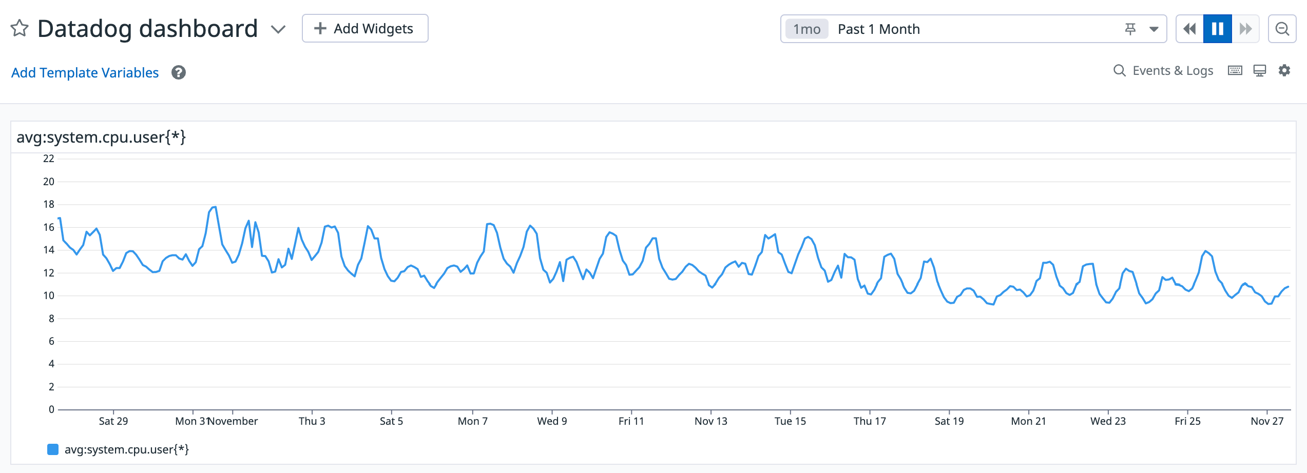
As you can see, Datadog visulaizes an aggregated trend in the 2 hour window, which means it smoothes (hides) any interesting events. For those reasons, someone may prefer to extract the data manually from Datadog to run their own analysis.
For the purposes of this blog, we’ll be running our analysis in Jupyter notebooks. However, feel free to use your own preferred tool for working with Python.
Datadog has a REST API which we’ll use to extract data from.
In order to extract data from Datadog's API, all you need are two things :
Once you have the above two requirements sorted, you’re ready to dive into the data.
Step 1: Initiate the required libraries and set up your credentials for making the API calls:
Step 2: Specify the parameters for time-series data extraction. Below we’re setting the time period from Tuesday, November 22, 2022 at 16:11:49 GMT to Friday, November 25, 2022 at 16:11:49 GMT:
One thing to keep in mind is that Datadog has a rate limit of API requests. In case you face rate issues, try increasing the “time_delta” in the query above to reduce the number of requests you make to the Datadog API.
Step 3: Run the extraction logic. Take the start and the stop timestamp and split them into buckets of width = time_delta.

Next, make calls to the Datadog API for the above bucketed time windows in a for loop. For each call, append the data you extracted for bucketed time frames to a list.
Lastly, convert the lists to a dataframe and return it:
Step 4: Voila, you have the data! Looking at the below mock data table, this data will have more granularity compared to what is shown in Datadog.

Now, we can use this to visualize data using any tool we want. For example, let’s use seaborn to look at the distribution of the system’s CPU utilization using KDE plots:
As you can see below, this visualization provides a deeper insight.

And there you have it. A super simple way to extract data from Datadog for exploration in Jupyter notebooks.
Kunal is a data scientist on the Shopify ProdEng data science team, working out of Niagara Falls, Canada. His team helps make Shopify’s platform performant, resilient and secure. In his spare time, Kunal enjoys reading about tech stacks, working on IoT devices and spending time with his family.
Are you passionate about solving data problems and eager to learn more about Shopify? Check out openings on our careers page.
During the infrastructural exploration of a pipeline my team was building, we discovered a query that could have cost us nearly $1 million USD a month in BigQuery. Below, we’ll detail how we reduced this and share our tips for lowering costs in BigQuery.
My team was responsible for building a data pipeline for a new marketing tool we were shipping to Shopify merchants. We built our pipeline with Apache Flink and launched the tool in an early release to a select group of merchants. Fun fact: this pipeline became one of the first productionized Flink pipelines at Shopify. During the early release, our pipeline ingested one billion rows of data into our Flink pipeline's internal state (managed by RocksDB), and handled streaming requests from Apache Kafka.
We wanted to take the next step by making the tool generally available to a larger group of merchants. However, this would mean a significant increase in the data our Flink pipeline would be ingesting. Remember, our pipeline was already ingesting one billion rows of data for a limited group of merchants. Ingesting an ever-growing dataset wouldn’t be sustainable.
As a solution, we looked into a SQL-based external data warehouse. We needed something that our Flink pipeline could submit queries to and that could write back results to Google Cloud Storage (GCS). By doing this, we could simplify the current Flink pipeline dramatically by removing ingestion, ensuring we have a higher throughput for our general availability launch.
The external data warehouse needed to meet the following three criteria:
The first query engine that came to mind was BigQuery. It’s a data warehouse that can both store petabytes of data and query those datasets within seconds. BigQuery is fully managed by Google Cloud Platform and was already in use at Shopify. We knew we could load our one billion row dataset into BigQuery and export query results into GCS easily. With all of this in mind, we started the exploration but we met an unexpected obstacle: cost.
As mentioned above, we’ve used BigQuery at Shopify, so there was an existing BigQuery loader in our internal data modeling tool. So, we easily loaded our large dataset into BigQuery. However, when we first ran the query, the log showed the following:
total bytes processed: 75462743846, total bytes billed: 75462868992
That roughly translated to 75 GB billed from the query. This immediately raised an alarm because BigQuery is charged by data processed per query. If each query were to scan 75 GB of data, how much would it cost us at our general availability launch?
I quickly did some rough math. If we estimate 60 RPM at launch, then:
60 RPM x 60 minutes/hour x 24 hours/day x 30 days/month = 2,592,000 queries/month
If each query scans 75 GB of data, then we’re looking at approximately 194,400,000 GB of data scanned per month. According to BigQuery’s on-demand pricing scheme, it would cost us $949,218.75 USD per month!
With the estimation above, we immediately started to look for solutions to reduce this monstrous cost.
We knew that clustering our tables could help reduce the amount of data scanned in BigQuery. As a reminder, clustering is the act of sorting your data based on one or more columns in your table. You can cluster columns in your table by fields like DATE, GEOGRAPHY, TIMESTAMP, ect. You can then have BigQuery scan only the clustered columns you need.
With clustering in mind, we went digging and discovered several condition clauses in the query that we could cluster. These were ideal because if we clustered our table with columns appearing in WHERE clauses, we could apply filters in our query that would ensure only specific conditions are scanned. The query engine will stop scanning once it finds those conditions, ensuring only the relevant data is scanned instead of the entire table. This reduces the amount of bytes scanned and would save us a lot of processing time.
We created a clustered dataset on two feature columns from the query’s WHERE clause. We then ran the exact same query and the log now showed 508.1 MB billed. That’s 150 times less data scanned than the previous unclustered table.
With our newly clustered table, we identified that the query would now only scan 108.3 MB of data. Doing some rough math again:
2,592,000 queries/month x 0.1 GB of data = 259,200 GB of data scanned/month
That would bring our cost down to approximately $1,370.67 USD per month, which is way more reasonable.
While all it took was some clustering for us to significantly reduce our costs, here are a few other tips for lowering BigQuery costs:
SELECT* statement: Only select the columns in the table you need queried. This will limit the engine scan to only those columns, therefore limiting your cost. And there you have it. If you’re working with a high volume of data and using BigQuery, following these tips can help you save big. Beyond cost savings, this is critical for helping you scale your data architecture.
Calvin is a senior developer at Shopify. He enjoys tackling hard and challenging problems, especially in the data world. He’s now working with the Return on Ads Spend group in Shopify. In his spare time, he loves running, hiking and wandering in nature. He is also an amateur Go player.
Are you passionate about solving data problems and eager to learn more about Shopify? Check out openings on our careers page.
One of the biggest challenges most managers face (in any industry) is trying to assign their reports work in an efficient and effective way. But as data science leaders—especially those in an embedded model—we’re often faced with managing teams with responsibilities that traverse multiple areas of a business. This juggling act often involves different streams of work, areas of specialization, and stakeholders. For instance, my team serves five product areas, plus two business areas. Without a strategy for dealing with these stakeholders and related areas of work, we risk operational inefficiency and chaotic outcomes.
There are many frameworks out there that suggest the most optimal way to structure a team for success. Below, we’ll review these frameworks and their positives and negatives when applied to a data science team. We’ll also share the framework that’s worked best for empowering our data science teams to drive impact.

Before looking at frameworks for managing these complex team structures, I’ll first describe some effective guiding principles we should use when organizing workflows and teams:
Alright, now let’s look at some of the more popular frameworks used to organize data teams. While they’re not the only ways to structure teams and align work, these frameworks cover most of the major aspects in organizational strategy.
You’ve likely heard of this framework before, and maybe even cringed when someone has told you or your report to "stay in your swim lanes". This framework involves assigning someone to very strictly defined areas of responsibility. Looking at the product and business areas my own team supports as an example, we have seven different groups to support. According to the swim lane framework, I would assign one data scientist to each group. With an assigned product or business group, their work would never cross lanes.
In this framework, there's little expected help or cross-training that occurs, and everyone is allowed to operate with their own fiefdom. I once worked in an environment like this. We were a group of tenured data scientists who didn’t really know what the others were doing. It worked for a while, but when change occurred (new projects, resignations, retirements) it all seemed to fall apart.
Let’s look at this framework’s advantages:
And the disadvantages:
Referring back to our guiding principles when considering how to effectively organize a date team, this framework hits our stakeholder clarity and efficiency principles, but only in stable environments. Swim lanes often fail in conditions of change or when the team needs to pivot to new responsibilities—something most teams should expect.
As data scientists, we’re often educated in the stochastic process and this framework resembles this theory. As a refresher, the stochastic process is defined by randomness of assignment, where expected behavior is near random assignments to areas or categories.
Likewise, in this framework each report takes the next project that pops up, resembling a random assignment of work. However, projects are prioritized and when an employee finishes one project, they take on the next, highest priority project.
This may sound overly random as a system, but I’ve worked on a team like this before. We were a newly setup team, and no one had any specific experience with any of the work we were doing. The system worked well for about six months, but over the course of a year, we felt like we'd been put through the wringer and as though no one had any deep knowledge of what we were working on.
The advantages of this framework are:
And the disadvantages:
Looking at the advantages and disadvantages of this framework, and measuring them against our guiding principles, this framework only hits two of our principles: flexibility and efficiency. While this framework can work in very specific circumstances (like brand new teams), the lack of stakeholder clarity, relationship building, and growth opportunity will result in the failure of this framework to sufficiently serve the needs of the team and stakeholders.
Luckily, we’ve created a third way to organize data teams and work. I like to compare this framework to the concept of diamond defense in basketball. In diamond defense, players have general areas (zones) of responsibility. However, once play starts, the defense focuses on trapping (sending extra resources) to the toughest problems, while helping out areas in the defense that might be left with fewer resources than needed.
This same defense method can be used to structure data teams to be highly effective. In this framework, you loosely assign reports to your product or business areas, but ensure to rotate resources to tough projects and where help is needed.
Referring back to the product and business areas my team supports, you can see how I use this framework to organize my team:

Each data scientist is assigned to a zone. I then aligned our additional business areas (Finance and Marketing) to a product group, and assigned resources to these groupings. Finance and Marketing are aligned differently here because they are not supported by a team of Software Engineers. Instead, I aligned them to the product group that mostly closely resembles their work in terms of data accessed and models built. Currently, Marketing has the highest number of requests for our team, so I added more resources to support this group.
You’ll notice on the chart that I keep myself and an additional data scientist in a bullpen. This is key to the diamond defense as it ensures we always have additional resources to help out where needed. Let’s dive into some examples of how we may use resources in the bullpen:
This framework has several advantages:
And the disadvantages:
This framework hits all of our guiding principles. It provides the flexibility and stability needed when dealing with change, it enables teams to efficiently tackle problems, focus areas enable report growth and stakeholder clarity, and relationships between reports and their stakeholders improves the team's ability to influence policies and outcomes.
There are many ways to organize data teams to different business or product areas, stakeholders, and bodies of work. While the traditional frameworks we discussed above can work in the short-term, they tend to over-focus either on rigid areas of responsibility or everyone being able to take on any project.
If you use one of these frameworks and you’re noticing that your team isn’t working as effectively as you know they can, give our diamond defense framework a try. This hybrid framework addresses all the gaps of the traditional frameworks, and ensures:
Every business and team is different, so we encourage you to play around with this framework and identify how you can make it work for your team. Just remember to reference our guiding principles for complex team structures.
Are you passionate about solving data problems and eager to learn more about Shopify? Check out openings on our careers page.
At Shopify, we've embraced the idea of full stack data science and are often asked, "What does it mean to be a full stack data scientist?". The term has seen a recent surge in the data industry, but there doesn’t seem to be a consensus on a definition. So, we chatted with a few Shopify data scientists to share our definition and experience.
"Full stack data scientists engage in all stages of the data science lifecycle. While you obviously can’t be a master of everything, full stack data scientists deliver high-impact, relatively quickly because they’re connected to each step in the process and design of what they’re building." - Siphu Langeni, Data Scientist
"Full stack data science can be summed up by one word—ownership. As a data scientist you own a project end-to-end. You don't need to be an expert in every method, but you need to be familiar with what’s out there. This helps you identify what’s the best solution for what you’re solving for." - Yizhar (Izzy) Toren, Senior Data Scientist
Typically, data science teams are organized to have different data scientists work on singular aspects of a data science project. However, a full stack data scientist’s scope covers a data science project from end-to-end, including:
"Typically the problems you're solving for, you’re understanding them as you're solving them. That’s why you need to be constantly communicating with your stakeholders and asking questions. You also need good engineering practices. Not only are you responsible for identifying a solution, you also need to build the pipeline to ship that solution into production." - Yizhar (Izzy) Toren, Senior Data Scientist
"The most effective full stack data scientists don't just wait for ad hoc requests. Instead, they proactively propose solutions to business problems using data. To effectively do this, you need to get comfortable with detailed product analytics and developing an understanding of how your solution will be delivered to your users." - Sebastian Perez Saaibi, Senior Data Science Manager
Full stack data scientists are generalists versus specialists. As full stack data scientists own projects from end-to-end, they work with multiple stakeholders and teams, developing a wide range of both technical and business skills, including:
“You get to choose how you want to solve different problems. We don't have one way of doing things because it really depends on what the problem you’re solving for is. This can even include deciding which tooling to use.”- Yizhar (Izzy) toren, Senior Data Scientist
“You get maximum exposure to various parts of the tech stack, develop a confidence in collaborating with other crafts, and become astute in driving decision-making through actionable insights.” - Siphu Langeni, Data Scientist
As a generalist, is a full stack data scientist a “master of none”? While full stack data scientists are expected to have a breadth of experience across the data science specialty, each will also bring additional expertise in a specific area. At Shopify, we encourage T-shaped development. Emphasizing this type of development not only enables our data scientists to hone skills they excel at, but it also empowers us to work broadly as a team, leveraging the depth of individuals to solve complex challenges that require multiple skill sets.
“Full stack data science might be intimidating, especially for folks coming from academic backgrounds. If you've spent a career researching and focusing on building probabilistic programming models, you might be hesitant to go to different parts of the stack. My advice to folks taking the leap is to treat it as a new problem domain. You've already mastered one (or multiple) specialized skills, so look at embracing the breadth of full stack data science as a challenge in itself.” - Sebastian Perez Saaibi, Senior Data Science Manager
“Ask lots of questions and invest effort into gathering context that could save you time on the backend. And commit to honing your technical skills; you gain trust in others when you know your stuff!” - Siphu Langeni, Data Scientist
To sum it up, a full stack data scientist is a data scientist who:
If you’re interested in tackling challenges as a full stack data scientist, check out Shopify’s career page.
For every initiative that a business takes on, there is an opportunity potential and a cost—the cost of not doing something else. But how do you tangibly determine the size of an opportunity?
Opportunity sizing is a method that data scientists can use to quantify the potential impact of an initiative ahead of making the decision to invest in it. Although businesses attempt to prioritize initiatives, they rarely do the math to assess the opportunity, relying instead on intuition-driven decision making. While this type of decision making does have its place in business, it also runs the risk of being easily swayed by a number of subtle biases, such as information available, confirmation bias, or our intrinsic desire to pattern-match a new decision to our prior experience.
At Shopify, our data scientists use opportunity sizing to help our product and business leaders make sure that we’re investing our efforts in the most impactful initiatives. This method enables us to be intentional when checking and discussing the assumptions we have about where we can invest our efforts.
Here’s how we think about opportunity sizing.
Opportunity sizing is more than just a tool for numerical reasoning, it’s a framework businesses can use to have a principled conversation about the impact of their efforts.
An example of opportunity sizing could look like the following equation: if we build feature X, we will acquire MM (+/- delta) new active users in T timeframe under DD assumptions.
So how do we calculate this equation? Well, first things first, although the timeframe for opportunity sizing an initiative can be anything relevant to your initiative, we recommend an annualized view of the impact so you can easily compare across initiatives. This is important because when your initiative goes live, it can have a significant impact on the in-year estimated impact of your initiative.
Diving deeper into how to size an opportunity, below are a few methods we recommend for various scenarios.
Directional t-shirt sizing is the most common approach when opportunity sizing an existing initiative and is a method anyone (not just data scientists) can do with a bit of data to inform their intuition. This method is based on rough estimates and depends on subject matter experts to help estimate the opportunity size based on similar experiences they’ve observed in the past and numbers derived from industry standards. The estimates used in this method rely on knowing your product or service and your domain (for example, marketing, fulfillment, etc.). Usually the assumptions are generalized, assuming overall conversion rates using averages or medians, and not specific to the initiative at hand.
For example, let’s say your Growth Marketing team is trying to update an email sequence (an email to your users about a new product or feature) and is looking to assess the size of the opportunity. Using the directional t-shirt sizing method, you can use the following data to inform your equation:
Say your top-performing content has an open rate of five percent, while the industry average is ten percent. Based on these benchmarks, you can assume that the opportunity can be doubled (from five to ten percent).
This method offers speed over accuracy, so there is a risk of embedded biases and lack of thorough reflection on the assumptions made. Directional t-shirt sizing should only be used in the stages of early ideation or sanity checking. Opportunity sizing for growth initiatives should use the next method: bottom-up.

Unlike directional t-shirt sizing, the bottom-up method uses the performance of a specific comparable product or system as a benchmark, and relies on the specific skills of a data scientist to make data-informed decisions. The bottom-up method is used to determine the opportunity of an existing initiative. The bottom-up method relies on observed data on similar systems, which means it tends to have a higher accuracy than directional t-shirt sizing. Here are some tips for using the bottom-up method:
1. Understand the performance of a product or system that is comparable.
To introduce any enhancements to your current product or system, you need to understand how it’s performing in the first place. You’ll want to identify, observe and understand the performance rates in a comparable product or system, including the specifics of its unique audience and process.
For example, let’s say your Growth Marketing team wants to localize a new welcome email to prospective users in Italy that will go out to 100,000 new leads per year. A comparable system could be a localized welcome email in France that the team sent out the prior year. With your comparable system identified, you’ll want to dig into some key questions and performance metrics like:
Let’s say we identified that our current non-localized email in Italy has a click through rate (CTR) of three percent, while our localized email in France has a CTR of five percent over one year. Based on the metrics of your comparable system, you can identify a base metric and make assumptions of how your new initiative will perform.
2. Be clear and document your assumptions.
As you think about your initiative, be clear and document your assumptions about its potential impact and the why behind each assumption. Using the performance metrics of your comparable system, you can generate an assumed base metric and the potential impact your initiative will have on that metric. With your base metric in hand, you’ll want to consider the positive and negative impacts your initiative may have, so quantify your estimate in ranges with an upper and lower bound.
Returning to our localized welcome email example, based on the CTR metrics from our comparable system we can assume the impact of our Italy localization initiative: if we send out a localized welcome email to 100,000 new leads in Italy, we will obtain a CTR between three and five percent (+/- delta) in one year. This is based on our assumptions that localized content will perform better than non-localized content, as seen in the performance metrics of our localized welcome email in France.
3. Identify the impact of your initiative on your business’ wider goals.
Now that you have your opportunity sizing estimate for your initiative, the next question that comes to mind is “what does that mean for the rest of your business goals?”. To answer this, you’ll want to estimate the impact on your top-line metric. This enables you to compare different initiatives with an apples-to-apples lens, while also avoiding the tendency to bias to larger numbers when making comparisons and assessing impact. For example, a one percent change in the number of sessions can look much bigger than a three percent change in the number of customers which is further down the funnel.
Returning to our localized welcome email example, we should ask ourselves how an increase in CTR impacts our topline metric of active user count? Let’s say that when we localized the email in France, we saw an increase of five percent in CTR that translated to a three percent increase in active users per year. Accordingly, if we localize the welcome email in Italy, we may expect to get a three percent increase which would translate to 3,000 more active users per year.
Second order thinking is a great asset here. It’s beneficial for you to consider potential modifiers and their impact. For instance, perhaps getting more people to click on our welcome email will reduce our funnel performance because we have lower intent people clicking through. Or perhaps it will improve funnel performance because people are better oriented to the offer. What are the ranges of potential impact? What evidence do we have to support these ranges? From this thinking, our proposal may change: we may not be able to just change our welcome email, we may also have to change landing pages, audience selection, or other upstream or downstream aspects.

The top-down method should be used when opportunity sizing a new initiative. This method is more nuanced as you’re not optimizing something that exists. With the top-down method, you’ll start by using a larger set of vague information, which you’ll then attempt to narrow down into a more accurate estimation based on assumptions and observations. 2
Here are a few tips on how to implement the top-down method:
1. Gather information about your new initiative.
Unlike the bottom-up method, you won’t have a comparable system to establish a base metric. Instead, seek as much information on your new initiative as you can from internal or external sources.
For example, let’s say you’re looking to size the opportunity of expanding your product or service to a new market. In this case, you might want to get help from your product research team to gain more information on the size of the market, number of potential users in that market, competitors, etc.
2. Be clear and document your assumptions.
Just like the bottom-up method, you’ll want to clearly identify your estimates and what evidence you have to support them. For new initiatives, typically assumptions are going to lean towards being more optimistic than existing initiatives because we’re biased to believe that our initiatives will have a positive impact. This means you need to be rigorous in testing your assumptions as part of this sizing process. Some ways to test your assumptions include:
You should be conservative in your initial estimates to account for this lack of precision in your understanding of the potential.
Looking at our example of opportunity sizing a new market, we’ll want to document some assumptions about:
3. Identify the impact of your initiative on your business’ wider goals.
Like the bottom-up method, you need to assess the impact your initiative will have on your business’ wider goals. Based on the above example, what does the assumed impact of our initiative mean in terms of active users?

And there you have it! Opportunity sizing is a worthy investment that helps you say yes to the most impactful initiatives. It’s also a significant way for data science teams to help business leaders prioritize and steer decision-making. Once your initiative launches, test to see how close your sizing estimates were to actuals. This will help you hone your estimates over time.
Next time your business is outlining its product roadmap, or your team is trying to decide whether it’s worth it to take on a particular project, use our opportunity sizing basics to help identify the potential opportunity (or lack thereof).
Dr. Hilal is the VP of Data Science at Shopify, responsible for overseeing the data operations that power the company’s commercial and service lines.
Wherever you are, your next journey starts here! If building systems from the ground up to solve real-world problems interests you, our Engineering blog has stories about other challenges we have encountered. Intrigued? Visit our Data Science & Engineering career page to find out about our open positions. Learn about how we’re hiring to design the future together—a future that is Digital by Design.
By Eric Fung and Diego Castañeda
Shopify Inbox is a single business chat app that manages all Shopify merchants’ customer communications in one place, and turns chats into conversions. As we were building the product it was essential for us to understand how our merchants’ customers were using chat applications. Were they reaching out looking for product recommendations? Wondering if an item would ship to their destination? Or were they just saying hello? With this information we could help merchants prioritize responses that would convert into sales and guide our product team on what functionality to build next. However, with millions of unique messages exchanged in Shopify Inbox per month, this was going to be a challenging natural language processing (NLP) task.
Our team didn’t need to start from scratch, though: off-the-shelf NLP models are widely available to everyone. With this in mind, we decided to apply a newly popular machine learning process—the data-centric approach. We wanted to focus on fine-tuning these pre-trained models on our own data to yield the highest model accuracy, and deliver the best experience for our merchants.

We’ll share our journey of building a message classification model for Shopify Inbox by applying the data-centric approach. From defining our classification taxonomy to carefully training our annotators on labeling, we dive into how a data-centric approach, coupled with a state-of-the-art pre-trained model, led to a very accurate prediction service we’re now running in production.
A traditional development model for machine learning begins with obtaining training data, then successively trying different model architectures to overcome any poor data points. This model-centric process is typically followed by researchers looking to advance the state-of-the-art, or by those who don't have the resources to clean a crowd-sourced dataset.
By contrast, a data-centric approach focuses on iteratively making the training data better to reduce inconsistencies, thereby yielding better results for a range of models. Since anyone can download a well-performing, pre-trained model, getting a quality dataset is the key differentiator in being able to produce a high-quality system. At Shopify, we believe that better training data yields machine learning models that can serve our merchants better. If you’re interested in hearing more about the benefits of the data-centric approach, check out Andrew Ng’s talk on MLOps: From Model-centric to Data-centric.
Our first step was to build an internal prototype that we could ship quickly. Why? We wanted to build something that would enable us to understand what buyers were saying. It didn’t have to be perfect or complex, it just had to prove that we could deliver something with impact. We could iterate afterwards.
For our first prototype, we didn't want to spend a lot of time on the exploration, so we had to construct both the model and training data with limited resources. Our team chose a pre-trained model available on TensorFlow Hub called Universal Sentence Encoder. This model can output embeddings for whole sentences while taking into account the order of words. This is crucial for understanding meaning. For example, the two messages below use the same set of words, but they have very different sentiments:
To rapidly build our training dataset, we sought to identify groups of messages with similar meaning, using various dimensionality reduction and clustering techniques, including UMAP and HDBScan. After manually assigning topics to around 20 message clusters, we applied a semi-supervised technique. This approach takes a small amount of labeled data, combined with a larger amount of unlabeled data. We hand-labeled a few representative seed messages from each topic, and used them to find additional examples that were similar. For instance, given a seed message of “Can you help me order?”, we used the embeddings to help us find similar messages such as “How to order?” and “How can I get my orders?”. We then sampled from these to iteratively build the training data.

We used this dataset to train a simple predictive model containing an embedding layer, followed by two fully connected, dense layers. Our last layer contained the logits array for the number of classes to predict on.
This model gave us some interesting insights. For example, we observed that a lot of chat messages are about the status of an order. This helped inform our decision to build an order status request as part of Shopify Inbox’s Instant Answers FAQ feature. However, our internal prototype had a lot of room for improvement. Overall, our model achieved a 70 percent accuracy rate and could only classify 35 percent of all messages with high confidence (what we call coverage). While our scrappy approach of using embeddings to label messages was fast, the labels weren’t always the ground truth for each message. Clearly, we had some work to do.
We know that our merchants have busy lives and want to respond quickly to buyer messages, so we needed to increase the accuracy, coverage, and speed for version 2.0. Wanting to follow a data-centric approach, we focused on how we could improve our data to improve our performance. We made the decision to put additional effort into defining the training data by re-visiting the message labels, while also getting help to manually annotate more messages. We sought to do all of this in a more systematic way.
First, we dug deeper into the topics and message clusters used to train our prototype. We found several broad topics containing hundreds of examples that conflated distinct semantic meanings. For example, messages asking about shipping availability to various destinations (pre-purchase) were grouped in the same topic as those asking about what the status of an order was (post-purchase).
Other topics had very few examples, while a large number of messages didn’t belong to any specific topic at all. It’s no wonder that a model trained on such a highly unbalanced dataset wasn’t able to achieve high accuracy or coverage.
We needed a new labeling system that would be accurate and useful for our merchants. It also had to be unambiguous and easy to understand by annotators, so that labels would be applied consistently. A win-win for everybody!
This got us thinking: who could help us with the taxonomy definition and the annotation process? Fortunately, we have a talented group of colleagues. We worked with our staff content designer and product researcher who have domain expertise in Shopify Inbox. We were also able to secure part-time help from a group of support advisors who deeply understand Shopify and our merchants (and by extension, their buyers).
Over a period of two months, we got to work sifting through hundreds of messages and came up with a new taxonomy. We listed each new topic in a spreadsheet, along with a detailed description, cross-references, disambiguations, and sample messages. This document would serve as the source of truth for everyone in the project (data scientists, software engineers, and annotators).
In parallel with the taxonomy work, we also looked at the latest pre-trained NLP models, with the aim of fine-tuning one of them for our needs. The Transformer family is one of the most popular, and we were already using that architecture in our product categorization model. We settled on DistilBERT, a model that promised a good balance between performance, resource usage, and accuracy. Some prototyping on a small dataset built from our nascent taxonomy was very promising: the model was already performing better than version 1.0, so we decided to double down on obtaining a high-quality, labeled dataset.
Our final taxonomy contained more than 40 topics, grouped under five categories:
We arrived at this hierarchy by thinking about how an annotator might approach classifying a message, viewed through the lens of a buyer. The first thing to determine is: where was the buyer on their purchase journey when the message was sent? Were they asking about a detail of the product, like its color or size? Or, was the buyer inquiring about payment methods? Or, maybe the product was broken, and they wanted a refund? Identifying the category helped to narrow down our topic list during the annotation process.

Each category contains an other topic to group the messages that don’t have enough content to be clearly associated with a specific topic. We decided to not train the model with the examples classified as other because, by definition, they were messages we couldn’t classify ourselves in the proposed taxonomy. In production, these messages get classified by the model with low probabilities. By setting a probability threshold on every topic in the taxonomy, we could decide later on whether to ignore them or not.
Since this taxonomy was pretty large, we wanted to make sure that everyone interpreted it consistently. We held several training sessions with our annotation team to describe our classification project and philosophy. We divided the annotators into two groups so they could annotate the same set of messages using our taxonomy. This exercise had a two-fold benefit:
This process was time-consuming as we needed to do several rounds of exercises. But, the training led us to refine the taxonomy itself by eliminating inconsistencies, clarifying descriptions, adding additional examples, and adding or removing topics. It also gave us reassurance that the annotators were aligned on the task of classifying messages.
Once we and the annotators felt that they were ready, the group began to annotate messages. We set up a Slack channel for everyone to collaborate and work through tricky messages as they arose. This allowed everyone to see the thought process used to arrive at a classification.
During the preprocessing of training data, we discarded single-character messages and messages consisting of only emojis. During the annotation phase, we excluded other kinds of noise from our training data. Annotators also flagged content that wasn’t actually a message typed by a buyer, such as when a buyer cut-and-pastes the body of an email they’ve received from a Shopify store confirming their purchase. As the old saying goes, garbage in, garbage out. Lastly, due to our current scope and resource constraints, we had to set aside non-English messages.
You might be wondering how we dealt with personal information (PI) like emails or phone numbers. PI occasionally shows up in buyer messages and we took steps to handle this information. We identified the messages with PI, then replaced such data with mock data.
This process began with our annotators flagging messages containing PI. Next, we used an open-source library called Presidio to analyze and replace the flagged PI. This tool ran in our data warehouse, keeping our merchants’ data within Shopify’s systems. Presidio is able to recognize many different types of PI, and the anonymizer provides different kinds of operators that can transform the instances of PI into something else. For example, you could completely remove it, mask part of it, or replace it with something else.
In our case, we used another open-source tool called Faker to replace the PI. This library is customizable and localized, and its providers can generate realistic addresses, names, locations, URLs, and more. Here’s an example of its Python API:
Combining Presidio and Faker allowed us to automate parts of the PI replacement, see below for a fabricated example of running Presidio over a message:
|
Original |
can i pickup today? i ordered this am: Sahar Singh my phone is 852 5555 1234. Email is saharsingh@example.com |
|
After running Presidio |
can i pickup today? i ordered this am: Sahar Singh my phone is 090-722-7549. Email is osamusato@yoshida.jp |
After running Presidio, we also inspected the before and after output to identify whether any PI was still present. Any remaining PI was manually replaced with a placeholder (for example, the name "Sahar Singh" in the fabricated example above would be replaced with <PERSON>). Finally, we ran another script to replace the placeholders with Faker-generated data.
Towards the end of our annotation project, we noticed a trend that persisted throughout the campaign: some topics in our taxonomy were overrepresented in the training data. It turns out that buyers ask a lot of questions about products!
Our annotators had already gone through thousands of messages. We couldn’t afford to split up the topics with the most popular messages and re-classify them, but how could we ensure our model performed well on the minority classes? We needed to get more training examples from the underrepresented topics.
Since we were continuously training a model on the labeled messages as they became available, we decided to use it to help us find additional messages. Using the model’s predictions, we excluded any messages classified with the overrepresented topics. The remaining examples belonged to the other topics, or were ones that the model was uncertain about. These messages were then manually labeled by our annotators.
So, after all of this effort to create a high-quality, consistently labeled dataset, what was the outcome? How did it compare to our first prototype? Not bad at all. We achieved our goal of higher accuracy and coverage:
|
Metric |
Version 1.0 Prototype |
Version 2.0 in Production |
|
Size of training set |
40,000 |
20,000 |
|
Annotation strategy |
Based on embedding similarity |
Human labeled |
|
Taxonomy classes |
20 |
45 |
|
Model accuracy |
~70% |
~90% |
|
High confidence coverage |
~35% |
~80% |
Another key part of our success was working collaboratively with diverse subject matter experts. Bringing in our support advisors, staff content designer, and product researcher provided perspectives and expertise that we as data scientists couldn’t achieve alone.
While we shipped something we’re proud of, our work isn’t done. This is a living project that will require continued development. As trends and sentiments change over time, the topics of conversations happening in Shopify Inbox will shift accordingly. We’ll need to keep our taxonomy and training data up-to-date and create new models to continue to keep our standards high.
If you want to learn more about the data work behind Shopify Inbox, check out Building a Real-time Buyer Signal Data Pipeline for Shopify Inbox that details the real-time buyer signal data pipeline we built.
Eric Fung is a senior data scientist on the Messaging team at Shopify. He loves baking and will always pick something he’s never tried at a restaurant. Follow Eric on Twitter.
Diego Castañeda is a senior data scientist on the Core Optimize Data team at Shopify. Previously, he was part of the Messaging team and helped create machine learning powered features for Inbox. He loves computers, astronomy and soccer. Connect with Diego on LinkedIn.
Wherever you are, your next journey starts here! If building systems from the ground up to solve real-world problems interests you, our Engineering blog has stories about other challenges we have encountered. Intrigued? Visit our Data Science & Engineering career page to find out about our open positions. Learn about how we’re hiring to design the future together—a future that is Digital by Design.
At Shopify, we recognize the positive impact data-informed decisions have on the growth of a business. But we also recognize that data exploration is gated to those without a data science or coding background. To make it easier for our merchants to inform their decisions with data, we built an accessible, commerce-focused querying language. We call it ShopifyQL. ShopifyQL enables Shopify Plus merchants to explore their data with powerful features like easy to learn syntax, one-step data visualization, built-in period comparisons, and commerce-specific date functions.
I’ll discuss how ShopifyQL makes data exploration more accessible, then dive into the commerce-specific features we built into the language, and walk you through some query examples.
As data scientists, engineers, and developers, we know that data is a key factor in business decisions across all industries. This is especially true for businesses that have achieved product market fit, where optimization decisions are more frequent. Now, commerce is a broad industry and the application of data is deeply personal to the context of an individual business, which is why we know it’s important that our merchants be able to explore their data in an accessible way.
Standard dashboards offer a good solution for monitoring key metrics, while interactive reports with drill-down options allow deeper dives into understanding how those key metrics move. However, reports and dashboards help merchants understand what happened, but not why it happened. Often, merchants require custom data exploration to understand the why of a problem, or to investigate how different parts of the business were impacted by a set of decisions. For this, they turn to their data teams (if they have them) and the underlying data.
Historically, our Shopify Plus merchants with data teams have employed a centralized approach in which data teams support multiple teams across the business. This strategy helps them maximize their data capability and consistently prioritizes data stakeholders in the business. Unfortunately, this leaves teams in constant competition for their data needs. Financial deep dives are prioritized over operational decision support. This leaves marketing, merchandising, fulfillment, inventory, and operations to fend for themselves. They’re then forced to either make decisions with the standard reports and dashboards available to them, or do their own custom data exploration (often in spreadsheets). Most often they end up in the worst case scenario: relying on their gut and leaving data out of the decision making process.
Going past the reports and dashboards into the underlying datasets that drive them is guarded by complex data engineering concepts and languages like SQL. The basics of traditional data querying languages are easy to learn. However, applying querying languages to datasets requires experience with, and knowledge of, the entire data lifecycle (from data capture to data modeling). In some cases, simple commerce-specific data explorations like year-over-year sales require a more complicated query than the basic pattern of selecting data from some table with some filter. This isn’t a core competency of our average merchant. They get shut out from the data exploration process and the ability to inform their decisions with insights gleaned from custom data explorations. That’s why we built ShopifyQL.
We understand that merchants know their business the best and want to put the power of their data into their hands. Data-informed decision making is at the heart of every successful business, and with ShopifyQL we’re empowering Shopify Plus merchants to gain insights at every level of data analysis.
With our new data querying language, ShopifyQL, Shopify Plus merchants can easily query their online store data. ShopifyQL makes commerce data exploration accessible to non-technical users by simplifying traditional aspects of data querying like:
The ShopifyQL syntax is designed to simplify the traditional complexities of data querying languages like SQL. The general syntax tree follows a familiar querying structure:
FROM {table_name}

SHOW|VISUALIZE {column1, column2,...}

TYPE {visualization_type}

AS {alias1,alias2,...}

BY {dimension|date}

WHERE {condition}

SINCE {date_offset}

UNTIL {date_offset}

ORDER BY {column} ASC|DESC

COMPARE TO {date_offset}

LIMIT {number}
We kept some of the fundamentals of the traditional querying concepts because we believe these are the bedrock of any querying language:
On top of these foundations, we wanted to bring a commerce-centric view to querying data. Here’s what we are making available via Shopify today.
We moved FROM to precede SHOW. It’s more intuitive for users to select the dataset they care about first and then the fields. When wanting to know conversion rates it's natural to think about product and then conversion rates, that's why we swapped the order of FROM and SHOW as compared to traditional querying languages.
Charts are one of the most effective ways of exploring data, and VISUALIZE aims to simplify this process. Most query languages and querying interfaces return data in tabular format and place the burden of visualizing that data on the end user. This means using multiple tools, manual steps, and copy pasting. The VISUALIZE keyword allows Shopify Plus merchants to display their data in a chart or graph visualization directly from a query. For example, if you’re looking to identify trends in multiple sales metrics for a particular product category:

We’ve made the querying process simpler by introducing smart defaults that allow you to get the same output with less lines of code. The query from above can also be written as:
FROM sales

VISUALIZE total_sales, gross_sales

BY month

WHERE product_category = ‘Shoes’

SINCE -13m
The query and the output relationship remains explicit, but the user is able to get to the result much faster.
The following language features are currently being worked on, and will be available later this year:
Whether it’s year-over-year, month-over-month, or a custom date range, period comparison analyses are a staple in commerce analytics. With traditional querying languages, you either have to model a dataset to contain these comparisons as their own entries or write more complex queries that include window functions, common table expressions, or self joins. We’ve simplified that to a single statement. The COMPARE TO keyword allows ShopifyQL users to effortlessly perform period-over-period analysis. For instance, comparing this week’s sales data to last week:

This powerful feature makes period-over-period exploration simpler and faster; no need to learn joins or window functions. Future development will enable multiple comparison periods for added functionality.
Commerce-specific date ranges (for example Black Friday Cyber Monday, Christmas Holidays, or Easter) involve a manual lookup or a join to some holiday dataset. With ShopifyQL, we take care of the manual aspects of filtering for these date ranges and let the user focus on the analysis.
The DURING statement, in conjunction with Shopify provided date ranges, allows ShopifyQL users to filter their query results by commerce-specific date ranges. For example, finding out what the top five selling products were during BFCM in 2021 versus 2020:

Future development will allow users to save their own date ranges unique to their business, giving them even more flexibility when exploring data for specific time periods.
Check out our full list of current ShopifyQL features and language docs at shopify.dev.
ShopifyQL allows us to access data models that address commerce-specific use cases and abstract the complexities of data transformation. Traditionally, businesses trade off SQL query simplicity for functionality, which limits users’ ability to perform deep dives and explorations. Since they can’t customize the functionality of SQL, their only lever is data modeling. For example, if you want to make data exploration more accessible to business users via simple SQL, you have to either create one flat table that aggregates across all data sources, or a number of use case specific tables. While this approach is useful in answering simple business questions, users looking to dig deeper would have to write more complex queries to either join across multiple tables, leverage window functions and common table expressions, or use the raw data and SQL to create their own models.
Alongside ShopifyQL we’re building exploration data models that are able to answer questions across the entire spectrum of commerce: products, orders, and customers. Each model focuses on the necessary dimensions and metrics to enable data exploration associated with that domain. For example, our product exploration dataset allows users to explore all aspects of product sales such as conversion, returns, inventory, etc. The following characteristics allow us to keep these data model designs simple while maximizing the functionality of ShopifyQL:
Without the leverage of creating our own querying language, the characteristics above would require complex queries which would limit data exploration and analysis.
We built ShopifyQL for our Shopify Plus merchants, third-party developer partners, and ourselves as a way to serve merchant-facing commerce analytics.
We used the ShopifyQL APIs to build an app that allows our Shopify Plus merchants to write ShopifyQL queries inside a traditional notebooks experience. The notebooks app gives users the ultimate freedom of exploring their data, performing deep dives, and creating comprehensive data stories.
The Shopify platform allows third-party developers to build apps that enable merchants to fully customize their Shopify experience. We’ve built GraphQL endpoints for access to ShopifyQL and the underlying datasets. Developers can leverage these APIs to submit ShopifyQL queries and return the resulting data in the API response. This allows our developer partners to save time and resources by querying modeled data. For more information about our GraphQL API, check out our API documentation.
We believe ShopifyQL can address all commerce analytics use cases. Our internal teams are going to leverage ShopifyQL to power the analytical experiences we create in the Shopify Admin—the online backend where merchants manage their stores. This helps us standardize our merchant-facing analytics interfaces across the business. Since we’re also the users of the language, we’re acutely aware of its gaps, and can make changes more quickly.
We’re planning new language features designed to make querying with ShopifyQL even simpler and more powerful:
As we continue to evolve ShopifyQL, our focus will remain on making commerce analytics more accessible to those looking to inform their decisions with data. We’ll continue to empower our developer partners to build comprehensive analytics apps, enable our merchants to make the most out of their data, and support our internal teams with powering their merchant-facing analytical use cases.
Ranko is a product manager working on ShopifyQL and data products at Shopify. He's passionate about making data informed decisions more accessible to merchants.
Are you passionate about solving data problems and eager to learn more, we’re always hiring! Reach out to us or apply on our careers page.
Our mission at Shopify is to make commerce better for everyone. Doing this in the long term requires constant learning and development – which happen to be core values here at Shopify.
Learning and development aren’t exclusively internal endeavors, they also depend on broadening your horizons and gaining insight from what others are doing in your field. One of our favorite formats for learning are conferences.
Conferences are an excellent way to hear from peers about the latest applications, techniques, and use cases in data science. They’re also great for networking and getting involved in the larger data community.
We asked our data scientists and engineers to curate a list of the top upcoming data conferences for 2022. Whether you’re looking for a virtual conference or in-person learning, we’ve got something that works for everyone.
When: June 27-30
Where: Virtual or in-person (San Francisco)
The Data + AI Summit 2022 is a global event that provides access to some of the top experts in the data industry through keynotes, technical sessions, hands-on training, and networking. This four-day event explores various topics and technologies ranging from business intelligence, data analytics, and machine learning, to working with Presto, Looker, and Kedro. There’s great content on how to leverage open source technology (like Spark) to develop practical ways of dealing with large volumes of data. I definitely walked away with newfound knowledge.
Ehsan K. Asl, Senior Data Engineer
When: July 19-28
Where: Virtual or in-person (San Francisco)
Transform 2022 offers three concentrated events over an action-packed two weeks. The first event—The Data & AI Executive Summit—provides a leadership lens on real-world experiences and successes in applying data and AI. The following two events—The Data Week and The AI & Edge Week—dive deep into the most relevant topics in data science across industry tracks like retail, finance, and healthcare. Transform’s approach to showcasing various industry use cases is one of the reasons this is such a great conference. I find hearing how other industries are practically applying AI can help you find unique solutions to challenges in your own industry.
Ella Hilal, VP of Data Science
When: September 18-23
Where: Virtual & In-person (Seattle)
RecSys is a conference dedicated to sharing the latest developments, techniques, and use cases in recommender systems. The conference has both a research track and industry track, allowing for different types of talks and perspectives from the field. The industry track is particularly interesting, since you get to hear about real-world recommender use cases and challenges from leading companies. Expect talks and workshops to be centered around applications of recommender systems in various settings (fashion, ecommerce, media, etc), reinforcement learning, evaluation and metrics, and bias and fairness.
Chen Karako, Data Scientist Lead
When: November 1-3
Where: Virtual or in-person (San Francisco)
ODSC West is a great opportunity to connect with the larger data science community and contribute your ideas to the open source ecosystem. Attend to hear keynotes on topics like machine learning, MLOps, natural language processing, big data analytics, and new frontiers in research. On top of in-depth technical talks, there’s a pre-conference bootcamp on programming, mathematics or statistics, a career expo, and opportunities to connect with experts in the industry.
Ryan Harter, Senior Staff Data Scientist
When: June 17-19
Where: London
PyData is a community of data scientists and data engineers who use and develop a variety of open source data tools. The organization has a number of events around the world, but PyData London is one of its larger events. You can expect the first day to be tutorials providing walkthroughs on methods like data validation and training object detection with small datasets. The remaining two days are filled with talks on practical topics like solving real-world business problems with Bayesian modeling. Catch Shopify at this year’s PyData London event.
Micayla Wood, Data Brand & Comms Senior Manager
When: August 14-18
Where: Washington D.C.
KDD is a highly research-focused event and home to some of the data industry’s top innovations like personalized advertising and recommender systems. Keynote speakers range from academics to industry professionals, and policy leaders, and each talk is accompanied by well-written papers for easy reference. I find this is one of the best conferences to keep in touch with the industry trends and I’ve actually applied what I learned from attending KDD to the work that I do.
Vincent Chio, Data Science Manager
When: November 9-10
Where: Toronto
The Re-Work Deep Learning Summit focuses on showcasing the learnings from the latest advancements in AI and how businesses are applying them in the real world. With content focusing on areas like computer vision, pattern recognition, generative models, and neural networks, it was great to hear speakers not only share successes, but also the challenges that still lie in the application of AI. While I’m personally not a machine learning engineer, I still found the content approachable and interesting, especially the talks on how to set up practical ETL pipelines for machine learning applications.
Ehsan K. Asl, Senior Data Engineer
When: October 3-5
Where: Budapest
Crunch is a data science conference focused on sharing the industry’s top use cases for using data to scale a business. With talks and workshops around areas like the latest data science trends and tools, how to build effective data teams, and machine learning at scale, Crunch has great content and opportunities to meet other data scientists from around Europe. With their partner conferences (Impact and Amuse) you also have a chance to listen in to interesting and relevant product and UX talks.
Yizhar (Izzy) Toren, Senior Data Scientist
Rebekah Morgan is a Copy Editor on Shopify's Data Brand & Comms team.
Are you passionate about data discovery and eager to learn more, we’re always hiring! Visit our Data Science and Engineering career page to find out about our open positions. Join our remote team and work (almost) anywhere. Learn about how we’re hiring to design the future together—a future that is digital by design.
By Megan Parker and Sam Wheating
Apache Airflow is an orchestration platform that enables development, scheduling and monitoring of workflows. At Shopify, we’ve been running Airflow in production for over two years for a variety of workflows, including data extractions, machine learning model training, Apache Iceberg table maintenance, and DBT-powered data modeling. At the time of writing, we are currently running Airflow 2.2 on Kubernetes, using the Celery executor and MySQL 8.

Shopify’s usage of Airflow has scaled dramatically over the past two years. In our largest environment, we run over 10,000 DAGs representing a large variety of workloads. This environment averages over 400 tasks running at a given moment and over 150,000 runs executed per day. As adoption increases within Shopify, the load incurred on our Airflow deployments will only increase. As a result of this rapid growth, we have encountered a few challenges, including slow file access, insufficient control over DAG (directed acyclic graph) capabilities, irregular levels of traffic, and resource contention between workloads, to name a few.
Below we’ll share some of the lessons we learned and solutions we built in order to run Airflow at scale.
Fast file access is critical to the performance and integrity of an Airflow environment. A well defined strategy for file access ensures that the scheduler can process DAG files quickly and keep your jobs up-to-date.
Airflow keeps its internal representation of its workflows up-to-date by repeatedly scanning and reparsing all the files in the configured DAG directory. These files must be scanned often in order to maintain consistency between the on-disk source of truth for each workload and its in-database representation. This means the contents of the DAG directory must be consistent across all schedulers and workers in a single environment (Airflow suggests a few ways of achieving this).
At Shopify, we use Google Cloud Storage (GCS) for the storage of DAGs. Our initial deployment of Airflow utilized GCSFuse to maintain a consistent set of files across all workers and schedulers in a single Airflow environment. However, at scale this proved to be a bottleneck on performance as every file read incurred a request to GCS. The volume of reads was especially high because every pod in the environment had to mount the bucket separately.
After some experimentation we found that we could vastly improve performance across our Airflow environments by running an NFS (network file system) server within the Kubernetes cluster. We then mounted this NFS server as a read-write-many volume into the worker and scheduler pods. We wrote a custom script which synchronizes the state of this volume with GCS, so that users only have to interact with GCS for uploading or managing DAGs. This script runs in a separate pod within the same cluster. This also allows us to conditionally sync only a subset of the DAGs from a given bucket, or even sync DAGs from multiple buckets into a single file system based on the environment’s configuration (more on this later).
Altogether this provides us with fast file access as a stable, external source of truth, while maintaining our ability to quickly add or modify DAG files within Airflow. Additionally, we can use Google Cloud Platform’s IAM (identify and access management) capabilities to control which users are able to upload files to a given environment. For example, we allow users to upload DAGs directly to the staging environment but limit production environment uploads to our continuous deployment processes.
Another factor to consider when ensuring fast file access when running Airflow at scale is your file processing performance. Airflow is highly configurable and offers several ways to tune the background file processing (such as the sort mode, the parallelism, and the timeout). This allows you to optimize your environments for interactive DAG development or scheduler performance depending on the requirements.
In a normal-sized Airflow deployment, performance degradation due to metadata volume wouldn’t be an issue, at least within the first years of continuous operation.
However, at scale the metadata starts to accumulate pretty fast. After a while this can start to incur additional load on the database. This is noticeable in the loading times of the Web UI and even more so during Airflow upgrades, during which migrations can take hours.
After some trial and error, we settled on a metadata retention policy of 28 days, and implemented a simple DAG which uses ORM (object–relational mapping) queries within a PythonOperator to delete rows from any tables containing historical data (DagRuns, TaskInstances, Logs, TaskRetries, etc). We settled on 28 days as this gives us sufficient history for managing incidents and tracking historical job performance, while keeping the volume of data in the database at a reasonable level.
Unfortunately, this means that features of Airflow which rely on durable job history (for example, long-running backfills) aren’t supported in our environment. This wasn’t a problem for us, but it may cause issues depending on your retention period and usage of Airflow.
As an alternative approach to a custom DAG, Airflow has recently added support for a db clean command which can be used to remove old metadata. This command is available in Airflow version 2.3.
When running Airflow in a multi-tenant setting (and especially at a large organization), it’s important to be able to trace a DAG back to an individual or team. Why? Because if a job is failing, throwing errors or interfering with other workloads, us administrators can quickly reach out to the appropriate users.
If all of the DAGs were deployed directly from one repository, we could simply use git blame to track down the job owner. However, since we allow users to deploy workloads from their own projects (and even dynamically generate jobs at deploy-time), this becomes more difficult.
In order to easily trace the origin of DAGs, we introduced a registry of Airflow namespaces, which we refer to as an Airflow environment’s manifest file.
The manifest file is a YAML file where users must register a namespace for their DAGs. In this file they will include information about the jobs’ owners and source github repository (or even source GCS bucket), as well as define some basic restrictions for their DAGs. We maintain a separate manifest per-environment and upload it to GCS alongside with the DAGs.
By allowing users to directly write and upload DAGs to a shared environment, we’ve granted them a lot of power. Since Airflow is a central component of our data platform, it ties into a lot of different systems and thus jobs have wide-ranging access. While we trust our users, we still want to maintain some level of control over what they can and cannot do within a given Airflow Environment. This is especially important at scale as it becomes unfeasible for the Airflow administrators to review all jobs before they make it to production.
In order to create some basic guardrails, we’ve implemented a DAG policy which reads configuration from the previously mentioned Airflow manifest, and rejects DAGs which don’t conform to their namespace’s constraints by raising an AirflowClusterPolicyViolation.
Based on the contents of the manifest file, this policy will apply a few basic restrictions to DAG files, such as:
This policy can be extended to enforce other rules (for example, only allowing a limited set of operators), or even mutate tasks to conform to a certain specification (for exampke, adding a namespace-specific execution timeout to all tasks in a DAG).
Here’s a simplified example demonstrating how to create a DAG policy which reads the previously shared manifest file, and implements the first three of the controls mentioned above:
These validations provide us with sufficient traceability while also creating some basic controls which reduce DAGs abilities to interfere with each other.
It’s very tempting to use an absolute interval for your DAGs schedule interval—simply set the DAG to run every timedelta(hours=1) and you can walk away, safely knowing that your DAG will run approximately every hour. However, this can lead to issues at scale.
When a user merges a large number of automatically-generated DAGs, or writes a python file which generates many DAGs at parse-time, all the DAGRuns will be created at the same time. This creates a large surge of traffic which can overload the Airflow scheduler, as well as any external services or infrastructure which the job is utilizing (for example, a Trino cluster).
After a single schedule_interval has passed, all these jobs will run again at the same time, thus leading to another surge of traffic. Ultimately, this can lead to suboptimal resource utilization and increased execution times.
While crontab-based schedules won’t cause these kinds of surges, they come with their own issues. Humans are biased towards human-readable schedules, and thus tend to create jobs which run at the top of every hour, every hour, every night at midnight, etc. Sometimes there’s a valid application-specific reason for this (for example, every night at midnight we want to extract the previous day’s data), but often we have found users just want to run their job on a regular interval. Allowing users to directly specify their own crontabs can lead to bursts of traffic which can impact SLOs and put uneven load on external systems.
As a solution to both these issues, we use a deterministically randomized schedule interval for all automatically generated DAGs (which represent the vast majority of our workflows). This is typically based on a hash of a constant seed such as the dag_id.
The below snippet provides a simple example of a function which generates deterministic, random crontabs which yield constant schedule intervals. Unfortunately, this limits the range of possible intervals since not all intervals can be expressed as a single crontab. We have not found this limited choice of schedule intervals to be limiting, and in cases when we really need to run a job every five hours, we just accept that there will be a single four hours interval each day.
Thanks to our randomized schedule implementation, we were able to smooth the load out significantly. The below image shows the number of tasks completed every 10 minutes over a twelve hour period in our single largest Airflow environment.

There’s a lot of possible points of resource contention within Airflow, and it’s really easy to end up chasing bottlenecks through a series of experimental configuration changes. Some of these resource conflicts can be handled within Airflow, while others may require some infrastructure changes. Here’s a couple of ways which we handle resource contention within Airflow at Shopify:
One way to reduce resource contention is to use Airflow pools. Pools are used to limit the concurrency of a given set of tasks. These can be really useful for reducing disruptions caused by bursts in traffic. While pools are a useful tool to enforce task isolation, they can be a challenge to manage because only administrators have access to edit them via the Web UI.
We wrote a custom DAG which synchronizes the pools in our environment with the state specified in a Kubernetes Configmap via some simple ORM queries. This lets us manage pools alongside the rest of our Airflow deployment configuration and allows users to update pools via a reviewed Pull Request without needing elevated access.
Priority_weight allows you to assign a higher priority to a given task. Tasks with a higher priority will float to the top of the pile to be scheduled first. Although not a direct solution to resource contention, priority_weight can be useful to ensure that latency-sensitive critical tasks are run prior to lower priority tasks. However, given that the priority_weight is an arbitrary scale, it can be hard to determine the actual priority of a task without comparing it to all other tasks. We use this to ensure that our basic Airflow monitoring DAG (which emits simple metrics and powers some alerts) always runs as promptly as possible.
It’s also worthwhile to note that by default, the effective priority_weight of a task used when making scheduling decisions is the sum of its own weight and that of all its downstream tasks. What this means is that upstream tasks in large DAGs are often favored over tasks in smaller DAGs. Therefore, using priority_weight requires some knowledge of the other DAGs running in the environment.
If you need your tasks to execute in separate environments (for example, dependencies on different python libraries, higher resource allowances for intensive tasks, or differing level of access), you can create additional queues which a subset of jobs submit tasks to. Separate sets of workers can then be configured to pull from separate queues. A task can be assigned to a separate queue using the queue argument in operators. To start a worker which runs tasks from a different queue, you can use the following command:
bashAirflow celery worker –queues <list of queues>
This can help ensure that sensitive or high-priority workloads have sufficient resources, as they won’t be competing with other workloads for worker capacity.
Any combination of pools, priority weights and queues can be useful in reducing resource contention. While pools allow for limiting concurrency within a single workload, a priority_weight can be used to make individual tasks run at a lower latency than others. If you need even more flexibility, worker isolation provides fine-grained control over the environment in which your tasks are executed.
It’s important to remember that not all resources can be carefully allocated in Airflow—scheduler throughput, database capacity and Kubernetes IP space are all finite resources which can’t be restricted on a workload-by-workload basis without the creation of isolated environments.
There are many considerations that go into running Airflow with such high throughput, and any combination of solutions can be useful. We’ve learned a ton and we hope you’ll remember these lessons and apply some of our solutions in your own Airflow infrastructure and tooling.
To sum up our key takeaways:
What’s next for us? We’re currently working on applying the principles of scaling Airflow in a single environment as we explore splitting our workloads across multiple environments. This will make our platform more resilient, allow us to fine-tune each individual Airflow instance based on its workloads’ specific requirements, and reduce the reach of any one Airflow deployment.
Got questions about implementing Airflow at scale? You can reach out to either of the authors on the Apache Airflow slack community.
Megan has worked on the data platform team at Shopify for the past 9 months where she has been working on enhancing the user experience for Airflow and Trino. Megan is located in Toronto, Canada where she enjoys any outdoor activity, especially biking and hiking.
Sam is a Senior developer from Vancouver, BC who has been working on the Data Infrastructure and Engine Foundations teams at Shopify for the last 2.5 years. He is an internal advocate for open source software and a recurring contributor to the Apache Airflow project.
Interested in tackling challenging problems that make a difference? Visit our Data Science & Engineering career page to browse our open positions. You can also contribute to Apache Airflow to improve Airflow for everyone.
Recently we launched Shopify Balance, a money management account and card that gives Shopify merchants quick access to their funds with no fees. After the beta launch of Shopify Balance, the Shopify Data team was brought in to answer the question: how do we reliably count the number of merchants using Balance? In particular, how do we count this historically?
While this sounds like a simple question, it’s foundationally critical to knowing if our product is a success and if merchants are actually using it. It’s also more complicated than it seems to answer.
To be considered as using Shopify Balance, a merchant has to have both an active Shopify Balance account and an active Shopify account. This means we needed to build something to track the state changes of both accounts simultaneously, and make that tracking robust and reliable over time. Enter double entry transition tables. While very much an “invest up front and save a ton of time in the long run” strategy, double entry transition tables give us the flexibility to see the individual inputs that cause a given change. It does all of this while simplifying our queries and reducing long term maintenance on our reporting.
In this post, we’ll explore how we built a data pipeline using double entry transition tables to answer our question: how many Shopify merchants are using Shopify Balance? We’ll go over how we designed something that scales as our product grows in complexity, the benefits of using double entry transition tables—from ease of use to future proofing our reporting—and some sample queries using our new table.
Double entry transition tables are essentially a data presentation format that tracks changes in attributes of entities over time. At Shopify, one of our first use cases of a double entry transition table was used to track the state of merchants using the platform, allowing us to report on how many merchants have active accounts. In comparison to a standard transition table that has from and to columns, double entry transition tables output two rows for each state change, along with a new net_change column. They can also combine many individual tracked attributes into a single output.
It took me a long time to wrap my head around this net_change column, but it essentially works like this: if you want to track the status of something over time, every time the status changes from one state to another or vice versa, there will be two entries:
net_change = -1: this row is the previous statenet_change = +1: this row is the new stateDouble entry transition tables have many advantages including:
net_change column is additive: this is the true benefit of using this type of table. This allows you to quickly get the number of entities that are in a certain state by summing up net_change while filtering for the state you care about.transitions that have identical timestamps. This is helpful for situations where you need to know something like the duration of a given status.net_change column.For our purpose of identifying how many merchants are using Shopify Balance, double entry transition tables allow us to track state changes for both the Shopify Balance account and the Shopify account in a single table. It also gives us a clean way to query the status of each entity over time. But how do we do this?
First, we need to prepare individual attribute tables to be used as inputs for our double entry transition data infrastructure. We need at least one attribute, but it can scale to any number of attributes as the product we’re tracking grows.
In our case, we created individual attribute tables for both the Shopify Balance account status and the Shopify account status. An attribute input table must have a specific set of columns:
account_id
transition_at timestamp and an index
Using a standard transition table, we can convert it to an attribute with a simple PySpark job:
Note the index column. We created this index using a row number window function, ordering by the transition_id any time we have duplicate account_id and transition_at sets in our original data. While simple, it serves the role of a tiebreak should there be two transition events with identical timestamps. This ensures we always have a unique account_id, transition_at, index set in our attribute for correct ordering of events. The index plays a key role later on when we create our double entry transition table, ensuring we’re able to capture the order of our two states.

Now that we have our two attribute tables, it’s time to feed these into our double entry transition pipelines. This system (called build merge state transitions) takes our individual attribute tables and first generates a combined set of unique rows using a partition_key (in our case, the account_id column), and a sort_key (in our case, the transition_at and index columns). It then creates one column per attribute, and fills in the attribute columns with values from their respective tables, in the order defined by the partition_key and sort_key. Where values are missing, it fills in the table using the previous known value for that attribute. Below you can see two example attributes being merged together and filled in:

This table is then run through another process that creates our net_change column and assigns a +1 value to all current rows. It also inserts a second row for each state change with a net_change value of -1. This net_change column now represents the direction of each state change as outlined earlier.
Thanks to our pipeline, setting up a double entry transition table is a very simple PySpark job:
Note in the code above we’ve specified default values. These are used to fill in the initial null values for the attributes. Now below is the output of our final double entry transition table, which we call our accounts_transition_factsshopify_status column, we can see they went from inactive to active in 2018, while the balance_status column shows us that they went from not_on_balance to active on March 14, 2021, and subsequently from active to inactive on April 23, 2021:

accounts_transition_facts double entry transition table.Remember how I mentioned that the net_change column is additive? This makes working with double entry transition tables incredibly easy. The ability to sum the net_change column significantly reduces the SQL or PySpark needed to get counts of states. For example, using our new account_transition_facts table, we can identify the total number of active accounts on Shopify Balance, using both the Shopify Balance status and Shopify status. All we have to do is sum our net_change column while filtering for the attribute statuses we care about:
Add in a grouping on a date column and we can see the net change in accounts over time:
We can even use the output in other PySpark jobs. Below is an example of a PySpark job consuming the output of our account_transition_facts table. In this case, we are adding the daily net change in account numbers to an aggregate daily snapshot table for Shopify Balance:
There are many ways you can achieve the same outputs using SQL or PySpark, but having a double entry transition table in place significantly simplifies the code at query time. And as mentioned earlier, if you write the code using the additive net_change column, you won’t need to rewrite any SQL or PySpark when you add more attributes to your double entry transition table.
We won’t lie, it took a lot of time and effort to build the first version of our account_transition_facts table. But thanks to our investment, we now have a reliable way to answer our initial question: how do we count the number of merchants using Balance? It’s easy with our double entry transition table! Grouping by the status we care about, simply sum net_change and viola, we have our answer.
Not only does our double entry transition table simply and elegantly answer our question, but it also easily scales with our product. Thanks to the additive nature of the net_change column, we can add additional attributes without impacting any of our existing reporting. This means this is just the beginning for our account_transition_facts table. In the coming months, we’ll be evaluating other statuses that change over time, and adding in those that make sense for Shopify Balance into our table. Next time you need to reliably count multiple states, try exploring double entry transition tables.
Justin Pauley is a Data Scientist working on Shopify Balance. Justin has a passion for solving complex problems through data modeling, and is a firm believer that clean data leads to better storytelling. In his spare time he enjoys woodworking, building custom Lego creations, and learning new technologies. Justin can be reached via LinkedIn.
Are you passionate about data discovery and eager to learn more, we’re always hiring! Reach out to us or apply on our careers page.
If you’re interested in building solutions from the ground up and would like to come work with us, please check out Shopify’s career page.
People often equate data science with statistics, but it’s so much more than that. When data science first emerged as a craft, it was a combination of three different skill sets: science, mathematics, and art. But over time, we’ve drifted. We’ve come to prioritize the scientific side of our skillset and have lost sight of the creative part.

One of the most neglected, yet arguably most important, skills from the artistic side of data science is communication. Communication is key to everything we do as data scientists. Without it, our businesses won’t be able to understand our work, let alone act on it.
Being a good data storyteller is key to being a good data scientist. Storytelling captures your stakeholders’ attention, builds trust with them, and invites them to fully engage with your work. Many people are intimidated by numbers. By framing a narrative for them, you create a shared foundation they can work from. That’s the compelling promise of data storytelling.
Data science is a balancing act—math and science have their role to play, but so do art and communication. Storytelling can be the binding force that unites them all. In this article, I’ll explore how to tell an effective data story and illustrate with examples from our practice at Shopify. Let’s dive in.
When you Google data storytelling, you get definitions like: “Data storytelling is the ability to effectively communicate insights from a dataset using narratives and visualizations.” And while this isn’t untrue, it feels anemic. There’s a common misconception that data storytelling is all about charts, when really, that’s just the tip of the iceberg.
Even if you design the most perfect visualization in the world—or run a report, or create a dashboard—your stakeholders likely won’t know what to do with the information. All of the burden of uncovering the story and understanding the data falls back onto them.
At its core, data storytelling is about taking the step beyond the simple relaying of data points. It’s about trying to make sense of the world and leveraging storytelling to present insights to stakeholders in a way they can understand and act on. As data scientists, we can inform and influence through data storytelling by creating personal touch points between our audience and our analysis. As with any good story, you need the following key elements:
Here’s how this might look in practice on a sample data story:
| Main Character | Setting | Narrator | Plot |
| Identify the business question you're trying to solve. | What background information is key to understanding the problem. | Ensure you're communicating in a way that your audience will understand. | Use data to direct the action by providing next steps. |
| Ex. Why aren't merchants using their data to guide their business decisions? | Ex. How are they using existing analytic products and what might be preventing use? | Ex. Our audience are busy execs who prefer short bulleted lists in a Slack message. | Ex. Data shows merchants spend too much time going back and forth between their Analytics and Admin page. We recommend surfacing analytics right within their workflow. |
With all that in mind, how do you go about telling effective data stories? Let me show you.
In order to tell effective data stories, you need to invest in the right support structures. First of all, that means laying the groundwork with a strong data foundation. The right foundation ensures you have easy access to data that is clean and conformed, so you can move quickly and confidently. At Shopify, our data foundations are key to everything we do—it not only supports effective data storytelling, but also enables us to move purposefully during unprecedented moments.
For instance, we’ve seen the impact data storytelling can have while navigating the pandemic. In the early days of COVID-19, we depended on data storytelling to give us a clear lens into what was happening, how our merchants were coping, and how we could make decisions based on what we were seeing. This is a story that has continued to develop and one that we still monitor to this day.
Since then, our data storytelling approach has continued to evolve internally. The success of our data storytelling during the pandemic was the catalyst for us to start institutionalizing data storytelling through a dedicated working group at Shopify. This is a group for our data scientists, led by data scientists—so they fully own this part of our craft maturity.
Formalizing this support network has been key to advancing our data storytelling craft. Data scientists can drop in or schedule a review of a project in process. This group also provides feedback and informed guidance on how to improve the story that the analysis is trying to tell so communications back to stakeholders is most impactful. The goal is to push our data scientists to take their practice to the next level—by providing context, explaining what angles they already explored, offering ways to reframe the problem, and sharing potential next steps.
Taking these steps to invest in the practice of data storytelling ensures that when our audience receives our data communications, they’re equipped with accurate data and useful guidance to help them choose the best course of action. By investing in the practice of data storytelling, you too can ensure you’re producing the highest quality work for your stakeholders—establishing you as a trusted partner.
Having the right support systems in place is key to making sure you’re telling the right stories—but how you tell those stories is just as important. One of our primary duties as data scientists is decision support. This is where the art and communication side of the practice comes in. It's not just a one-and-done, "I built a dashboard, someone else can attend to that story now." You’re committed to transmitting the story to your audience. The question then becomes, how can you communicate it as effectively as possible, both to technical and non-technical partners?
At Shopify, we’ve been inspired by and have adopted design studio Duarte’s Slidedocs approach. Slidedocs is a way of using presentation software like PowerPoint to create visual reports that are meant to be read, not presented. Unlike a chart or a dashboard, what the Slidedoc gives you is a well-framed narrative. Akin to a “policy brief” (like in government), you can pack a dense amount of information and visuals into an easily digestible format that your stakeholders can read at their leisure. Storytelling points baked into our Slidedocs include:

Preparing a Slidedoc is a creative exercise—there’s no one correct way to present the data, it’s about understanding your audience and shaping a story that speaks to them. What it allows us to do is guide our stakeholders as they explore the data and come to understand what it’s communicating. This helps them form personal touchpoints with the data, allowing them to make a better decision at the end.
While the Slidedocs format is a useful method for presenting dense information in a digestible way, it’s not the only option. For more inspiration, you can learn a lot from teams who excel at effective communication, such as marketing, PR, and UX. Spend time with these teams to identify their methods of communication and how they scaffold stories to be consumed. The important thing is to find tools that allow you to present information in a way that’s action-oriented and tailored for the audience you’re speaking to.
The most effective way to help your audience feel invested in your data story is to let them be a part of it. Introducing interactivity allows your audience to explore different facets of the story on demand, in a sense, co-creating the story with you. If you supply data visualizations, consider ways that you can allow your audience to filter them, drill into certain details, or otherwise customize them to tell bigger, smaller, or different stories. Showing, not telling, is a powerful storytelling technique.
A unique way we’ve done this at Shopify is through a product we created for our merchants that lets them explore their own data. Last fall, we launched the BFCM 2021 Notebook—a data storytelling experience for our merchants with a comprehensive look at their store performance over Black Friday and Cyber Monday (BFCM).
While we have existing features for our merchants that show, through reports and contextual analytics, how their business is performing, we wanted to take it to the next level by giving them more agency and a personal connection to their own data. That said, we understand it can be overwhelming for our merchants (or anyone!) to have access to a massive set of data, but not know how to explore it. People might not know where to start or feel scared that they’ll do it wrong.

What the BFCM Notebook provided was a scaffold to support merchants’ data exploration. It’s an interactive visual companion that enables merchants to dive into their performance data (e.g. total sales, top-performing products, buyer locations) during their busiest sale season. Starting with total sales, merchants could drill into their data to understand their results based on products, days of the week, or location. If they wanted to go even deeper, they could click over the visualizations to see the queries that powered them—enabling them to start thinking about writing queries of their own.
Turning data storytelling into an experience has given our merchants the confidence to explore their own data, which empowers them to take ownership of it. When you’re creating a data story, consider: Are there opportunities to let the end user engage with the story in interactive ways?
Despite its name, data science isn’t just a science; it’s an art too. Data storytelling unites math, science, art, and communication to help you weave compelling narratives that help your stakeholders comprehend, reflect on, and make the best decisions about your data. By investing in your storytelling practice, using creative storytelling techniques, and including interactivity, you can build trust with your stakeholders and increase their fluency with data. The creative side of data science isn’t an afterthought—it’s absolutely vital to a successful practice.
Wendy Foster is the Director of Engineering & Data Science for Core Optimize at Shopify. Wendy and her team are focused on exploring how to better support user workflows through product understanding, and building experiences that help merchants understand and grow their business.
Are you passionate about data discovery and eager to learn more, we’re always hiring! Visit our Data Science and Engineering career page to find out about our open positions. Join our remote team and work (almost) anywhere. Learn about how we’re hiring to design the future together—a future that is digital by design.
Shopify's machine learning platform team builds the infrastructure, tools and abstracted layers to help data scientists streamline, accelerate and simplify their machine learning workflows. There are many different kinds of machine learning use cases at Shopify, internal and external. Internal use cases are being developed and used in specialized domains like fraud detection and revenue predictions. External use cases are merchant and buyer facing, and include projects such as product categorization and recommendation systems.
At Shopify we build for the long term, and last year we decided to redesign our machine learning platform. We need a machine learning platform that can handle different (often conflicting) requirements, inputs, data types, dependencies and integrations. The platform should be flexible enough to support the different aspects of building machine learning solutions in production, and enable our data scientists to use the best tools for the job.
In this post, we walk through how we built Merlin, our magical new machine learning platform. We dive into the architecture, working with the platform, and a product use case.
Our new machine learning platform is based on an open source stack and technologies. Using open source tooling end-to-end was important to us because we wanted to both draw from and contribute to the most up-to-date technologies and their communities as well as provide the agility in evolving the platform to our users’ needs.
Merlin’s objective is to enable Shopify's teams to train, test, deploy, serve and monitor machine learning models efficiently and quickly. In other words, Merlin enables:
For the first iteration of Merlin, we focused on enabling training and batch inference on the platform.

Merlin gives our users the tools to run their machine learning workflows. Typically, large scale data modeling and processing at Shopify happens in other parts of our data platform, using tools such as Spark. The data and features are then saved to our data lake or Pano, our feature store. Merlin uses these features and datasets as inputs to the machine learning tasks it runs, such as preprocessing, training, and batch inference.
With Merlin, each use case runs in a dedicated environment that can be defined by its tasks, dependencies and required resources — we call these environments Merlin Workspaces. These dedicated environments also enable distributed computing and scalability for the machine learning tasks that run on them. Behind the scenes, Merlin Workspaces are actually Ray clusters that we deploy on our Kubernetes cluster, and are designed to be short lived for batch jobs, as processing only happens for a certain amount of time.
We built the Merlin API as a consolidated service to allow the creation of Merlin Workspaces on demand. Our users can then use their Merlin Workspace from Jupyter Notebooks to prototype their work, or orchestrate it through Airflow or Oozie.
Merlin’s architecture, and Merlin Workspaces in particular, are enabled by one of our core components—Ray.
Ray is an open source framework that provides a simple, universal API for building distributed systems and tools to parallelize machine learning workflows. Ray is a large ecosystem of applications, libraries and tools dedicated to machine learning such as distributed scikit-learn, XGBoost, TensorFlow, PyTorch, etc.
When using Ray, you get a cluster that enables you to distribute your computation across multiple CPUs and machines. In the following example, we train a model using Ray:
We start by importing the Ray package. We call ray.init() to start a new Ray runtime that can run either on a laptop/machine or connect to an existing Ray cluster locally or remotely. This enables us to seamlessly take the same code that runs locally, and run it on a distributed cluster. When working with a remote Ray cluster, we can use the Ray Client API to connect to it and distribute the work.
In the example above, we use the integration between Ray and XGBoost to train a new model and distribute the training across a Ray cluster by defining the number of Ray actors for the job and different resources each Ray actor will use (CPUs, GPUs, etc.).
For more information, details and examples for Ray usage and integrations, check out the Ray documentation.
At Shopify, machine learning development is usually done using Python. We chose to use Ray for Merlin's distributed workflows because it enables us to write end-to-end machine learning workflows with Python, integrate it with the machine learning libraries we use at Shopify and easily distribute and scale them with little to no code changes. In Merlin, each machine learning project comes with the Ray library as part of its dependencies, and uses it for distributed preprocessing, training and prediction.
Ray makes it easy for data scientists and machine learning engineers to move from prototype to production. Our users start by prototyping on their local machines or in a Jupyter Notebook. Even at this stage, their work can be distributed on a remote Ray cluster, allowing them to run the code at scale from an early stage of development.
Ray is a fast evolving open source project. It has short release cycles and the Ray team is continuously adding and working on new features. In Merlin, we adopted capabilities and features such as:

A user’s first interaction with Merlin usually happens when they start a new machine learning project. Let’s walk through a user’s development journey:
Let's dive a little deeper into these steps.
The first step of each machine learning use case on our platform is creating a dedicated Merlin Project. Users can create Merlin Projects for machine learning tasks like training a model or performing batch predictions. Each project can be customized to fit the needs of the project by specifying the system-level packages or Python libraries required for development. From a technical perspective, a Merlin Project is a Docker container with a dedicated virtual environment (e.g. Conda, pyenv, etc.), which isolates code and dependencies. As the project requirements change, the user can update and change their Merlin Project to fit their new needs. Our users can leverage a simple-to-use command line interface that allows them to create, define and use their Merlin Project.
Below is an example of a Merlin Project file hierarchy:
The config.yml file allows users to specify the different dependencies and machine learning libraries that they need for their use case. All the code relevant to a specific use case is stored in the src folder.
Once users push their Merlin Project code to their branch, our CI/CD pipelines build a custom Docker image.
Once the Merlin Project is ready, our data scientists can use the centralized Merlin API to create dedicated Merlin Workspaces in prototype and production environments. The interface abstracts away all of the infrastructure-related logic (e.g. deployment of Ray clusters on Kubernetes, creation of ingress, service accounts) so they can focus on the core of the job.

Merlin Workspaces also allow users to define the resources required for running their project. While some use cases need GPUs, others might need more memory and additional CPUs or more machines to run on. The Docker image that was created for a Merlin Project will be used to spin up the Ray cluster in a dedicated Kubernetes namespace for a Merlin Workspace. The user can configure all of this through the Merlin API, which gives them either a default environment or allows them to select the specific resource types (GPUs, memory, machine types, etc.) that their job requires.
Here’s an example of a payload that we send the Merlin API in order to create a Merlin Workspace:
Using this payload will result in a new Merlin Workspace which will spin up a new Ray cluster with the specific pre-built Docker image of one of our models at Shopify—our product categorization model, which we’ll dive into more later on. This cluster will use 20 Ray workers, each one with 10 CPUs, 30GB of memory and 1 nvidia-tesla-t4 GPU. The cluster will be able to scale up to 30 workers.
After the job is complete, the Merlin Workspace can be shut down, either manually or automatically, and return the resources back to the Kubernetes cluster.
Once our users have their Merlin Workspace up and running, they can start prototyping and experimenting with their code from Shopify’s centrally hosted JupyterHub environment. This environment allows them to spin up a new machine learning notebook using their Merlin Project's Docker image, which includes all their code and dependencies that will be available in their notebook.

From the notebook, the user can access the Ray Client API to connect remotely to their Merlin Workspaces. They can then run their remote Ray Tasks and Ray Actors to parallelize and distribute the computation work on the Ray cluster underlying the Merlin Workspace.
This method of working with Merlin minimizes the gap between prototyping and production by providing our users with the full capabilities of Merlin and Ray right from the beginning.
Once the user is done prototyping, they can push their code to their Merlin Project. This will kick off our CI/CD pipelines and create a new version of the project's Docker image.
Merlin was built to be fully integrated with the tools and systems that we already have in place to process data at Shopify. Once the Merlin Project's production Docker image is ready, the user can build the orchestration around their machine learning flows using declarative YAML (yet another markup language) templates or by configuring a DAG (directed Acyclic Graph) in our Airflow environment. The jobs can be scheduled to run periodically, call the production Merlin API to spin up Merlin Workspaces and run Merlin jobs on them.

The DAG in the image above demonstrates a training flow, where we create a Merlin Workspace, train our model on it and—when it’s done—delete the workspace and return the resources back to the Kubernetes cluster.
We also integrated Merlin with our monitoring and observability tools. Each Merlin Workspace gets its own dedicated Datadog dashboard which allows users to monitor their Merlin job. It also helps them understand more about the computation load of their job and the resources it requires. On top of this, each Merlin job sends its logs to Splunk so that our users can also debug their job based on the errors or stacktrace.
At this point, our user's journey is done! They created their Merlin Project, prototyped their use case on a Merlin Workspace and scheduled their Merlin jobs using one of the orchestrators we have at Shopify (e.g Airflow). Later on, when the data scientist needs to update their model or machine learning flow, they can go back to their Merlin Project to start the development cycle again from the prototype phase.
Now that we explained Merlin's architecture and our user journey, let's dive into how we onboarded a real-world algorithm to Merlin—Shopify’s product categorization model.

Recently we rebuilt our product categorization model to ensure we understand what our merchants are selling, so we can build the best products that help power their sales. This is a complex use case that requires several workflows for its training and batch prediction. Onboarding this use case to Merlin early on enabled us to validate our new platform, as it requires large scale computation and includes complex machine learning logic and flows. The training and batch prediction workflows were migrated to Merlin and converted using Ray.
To onboard the product categorization model training stage to Merlin, we integrated its Tensorflow training code with Ray Train, for distributing training across a Ray cluster. With Ray Train, changing the code to support the distributed training was easy and required few code changes - the original logic stayed the same, and the core changes are described in the example below.
The following is an example of how we integrated Ray Train with our Tensorflow training code for this use-case:
The TensorFlow logic for the training step stays the same, but is separated out into its own function. The primary change is adding Ray logic to the main function. Ray Train allows us to specify the job configuration, with details such as number of workers, backend type, and GPU usage.
The inference step in the product categorization model is a multi-step process. We migrated each step separately, using the following method. We used Ray ActorPool to distribute each step of batch inference across a Ray cluster. Ray ActorPool is similar to Python's `multiprocessing.Pool` and allows scheduling Ray tasks over a fixed pool of actors. Using Ray ActorPool is straightforward and allows easy configuration for parallelizing the computation.
Here’s an example of how we integrated Ray ActorPool with our existing inference code to perform distributed batch predictions:
We first need to create our Predictor class (a Ray Actor), which includes the logic for loading the product categorization model, and performing predictions on product datasets. In the main function, we use the size of the cluster (ray.available_resources()["CPU"]) to create all the Actors that will run in the ActorPool. We then send all of our dataset partitions to the ActorPool for prediction.
While this method works for us at the moment, we plan to migrate to using Ray Dataset Pipelines which provides a more robust way to distribute the load of the data and perform batch inference across the cluster with less dependence on the number of data partitions or their size.
As Merlin and its infrastructure mature, we plan to continue growing and evolving to better support the needs of our users. Our aspiration is to create a centralized platform that streamlines our machine learning workflows in order to enable our data scientists to innovate and focus on their craft.
Our next milestones include:
While Merlin is still a new platform at Shopify, it’s already empowering us with the scalability, fast iteration and flexibility that we had in mind when designing it. We're excited to keep building the platform and onboarding new data scientists, so Merlin can help enable the millions of businesses powered by Shopify.
Isaac Vidas is a tech lead on the ML Platform team, focusing on designing and building Merlin, Shopify’s machine learning platform. Connect with Isaac on LinkedIn.
If building systems from the ground up to solve real-world problems interests you, our Engineering blog has stories about other challenges we have encountered. Visit our Engineering career page to find out about our open positions. Join our remote team and work (almost) anywhere. Learn about how we’re hiring to design the future together—a future that is digital by default.
We’ve spent a lot of time on performance tuning our Apache Flink application. We’ll walk you through key lessons for optimizing large stateful Apache Flink applications.
Five years ago, my team and I launched the first machine learning product at Shopify. We were determined to build an algorithm-powered product that solved a merchant problem and made a real impact on the business. Figuring out where to start was the hardest part. There was (and still is!) a lot of noise out there on best practices.
Fast forward to today, and machine learning is threaded into many aspects of Shopify. How did we get to this point? Through our experience building our first few models, we carved out a pragmatic step-by-step guide that has enabled us to successfully scale machine learning across our organization.
Our playbook is tech-independent and can be applied in any domain, no matter what point you’re at in your machine learning journey—which is why we’re sharing it with you today.
The first few problems your team chooses to solve with machine learning have a disproportionate impact on the success and growth of your machine learning portfolio. But knowing which problem to start with can be difficult.
You want to pick a problem that your users care about. This will ensure your users use your solution day in and day out and enable you to gather feedback quickly. Having a deep understanding of your problem domain will help you achieve this. Nothing surpasses the ability to grasp your business goals and user needs. This context will guide your team on what your product is trying to achieve and what data-driven solutions will have a real impact on these priorities.
One way Shopify achieves this is by embedding our data scientists into our various product and commercial lines. This ensures that they have their finger on the pulse and are partners in decision making. With this domain context, we were able to identify a worthy first problem—order fraud detection. Sales are the main goal of our merchants, so we knew this problem impacted every merchant. We also knew the existing solution was a pain point for them (more on this later).

Good, accessible data is half the battle for building a successful model. Many organizations collect data, but you need to have a high degree of confidence in it, otherwise, you have to start collecting it anew. And it needs to be accessible. Is your data loaded into a medium that your data scientists can use? Or do you have to call someone in operations to move data from an S3 bucket?
In our case, we had access to 10 years of transaction data that could help us understand the best inputs and outputs for detecting fraudulent orders. We have an in-house data platform and our data scientists have easy access to data through tools like Trino (formerly Presto). But the technology doesn’t matter, all that matters is that whatever problem you choose, you have trustworthy and accessible data to help you understand the problem you’re trying to solve.
Keep in mind that any problem you pick won’t be an abstract, isolated problem—there are going to be things downstream that are impacted by it. Understanding your user’s workflow is important as it should influence the conditions of your target.
For example, in order fraud, we know that fulfillment is a downstream dependency. A merchant won’t want to fulfill an order if it’s a high risk of fraud. With this dependency in mind, we realized that we needed to detect fraud before an order is fulfilled: after would leave our prediction useless.
If the problem you’re trying to solve has an existing solution, dig into the code and data, talk to the domain experts and fully understand how that solution is performing. If you’re going to add machine learning, you need to identify what you’re trying to improve. By understanding the existing solution, you’ll be able to identify benchmarks for your new solution, or decide if adding machine learning is even needed.
When we dug into the existing rule-based solution for detecting order fraud, we uncovered that it had a high false positive rate. For example, if the billing and shipping address on an order differed, our system would flag that order. Every time an order was flagged our merchants had to investigate and approve it, which ate up precious time they could be spending focused on growing their business. We also noticed that the high false positive rate was causing our merchants to cancel good orders. Lowering the false positive became a tangible benchmark for our new solution.
Remember, this is not an exercise in data science—your product is going to be used by real people. While it’s tempting to optimize for scores such as accuracy, precision and recall, if those scores don’t improve your user experience, is your model actually solving your problem?

For us, helping merchants be successful (i.e. make valid sales) was our guiding principle, which influenced how we optimize our models and where we put our thresholds. If we optimized our model to ensure zero fraud, then our algorithm would simply flag every order. While our merchants would sell nothing, we would achieve our result of zero fraud. Obviously this isn’t an ideal experience for our merchants. So, for our model, we optimized for helping merchants get the highest number of valid sales.
While you might not pick the same problem, or have the same technology, by focusing on these steps you’ll be able to identify where to add machine learning in a way that drives impact. For more tips from Shopify on building a machine learning model, checkout this blog.
So you’ve built a model, but now you’re wondering how to bring it to production? Understanding that the strength of everything that data science builds is on the foundation of a strong platform will help you find your answer. In order to bring your models to production in a way that can scale, you simply need to begin investing in good data engineering practices.
In order to confidently bring your model to production, you need to build well-defined pipelines for all stages of predictive modeling. For your training pipeline, you don’t want to waste time trying to keep track of your data and asking, “Did I replace the nulls with zeros? Did my colleagues do the same?” If you don’t trust your training, you’ll never get to the point where you feel comfortable putting your model into production. In our case, we created a clean pipeline by clearly labeling our input data, transformations and the features that go into our model.
You’ll want to do the same with your verification and testing pipeline. Building a pipeline that captures rich metadata around which model or dataset was used in your training will enable you to reproduce metrics and trace bugs. With these good data engineering practices in place, you’ll remove burdensome work and be able to establish model trust with your stakeholders.
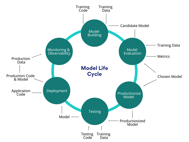
There are a lot of opinions on this, but the answer really depends on the problem and product context. Regardless of which decision you make, there are two key things to consider:
By focusing on these steps, we were able to quickly move our order fraud detection model into production and demonstrate if it actually worked—and it did! Our model beat the baseline, which is all we could have asked for. What we shipped was a very simple logistic regression model, but that simplicity allowed us to ship quickly and show impact. Today, the product runs on millions of orders a day and scales with the volume of Shopify.
Our first model became the stepping stone that enabled us to implement more models. Once your team has one successful solution in production, you now have an example that will evangelize machine learning within your organization. Now it’s time to scale.
Now that you have your first model in production, how do you go from one model to multiple models? Whether that’s in the same product or bringing machine learning to other existing products? You have to think about how you can speed up and scale your model building workflows.
While deploying your first model you focused on beginning to build good engineering practices. As you look to bring models to new products, you need to solidify those practices and build trust in your models. After we shipped our order fraud detection model, we implemented the following key processes into our model lifecycle to ensure our models are trustworthy, and would remain trustworthy:
Now that you’ve solidified some best practices, how do you scale that as your team grows? When your team is small and you only have 10 data scientists, it’s relatively straightforward to communicate standards. You may have a Slack channel or a Google Doc. But as both your machine learning portfolio and team grow, you need something more unifying. Something that scales with you.
A good platform isn’t just a technology enabler—it’s also a tool you can use to encode culture and best practices. That’s what we did at Shopify. For example, as we outlined above, backtesting is an important part of our training pipeline. We’ve encoded that into our platform by ensuring that if a model isn’t backtested before it goes into production, our platform will fail that model.
While encoding best practices will help you scale, it’s important that you don’t abstract too early. We took the best practices we developed while deploying our order fraud protection model, and a few other models implemented in other products, and we conducted trial and error. Only after taking a few years to see what worked, did we encode these practices into our platform.
If on top of building the foundations, our team had to monitor, version, and deploy our models every single day, we’d still be tinkering with our very first model. Ask yourself, “How can I scale far beyond the hours I invest?” and begin thinking in terms of model operations—scheduling runs, automatic checks, model versioning, and, one day, automatic model deployment. In our case, we took the time to build all of this into our infrastructure. It all runs on a schedule every day, every week, for every merchant. Of course, we still have humans in the loop to dig into any anomalies that are flagged. By automating the more operational aspects of machine learning, you’ll free up your data scientists’ time, empowering them to focus on building more awesome models.

These last three steps have enabled us to deploy and retrain models fast. While we started with one model that sought to detect order fraud, we were able to apply our learnings to build various other models for products like Shopify Capital, product categorization, the Shopify Help Center search, and hundreds more products. If you’re looking to go from one to one hundred, follow these steps, wash, rinse and repeat and you’ll have no problem scaling.
Now you have a playbook to scale machine learning in your organization. And that’s where you want to end up—in a place where you’re delivering more value for the business. But even with all of these steps, you won’t truly be able to scale unless your data scientists and data engineers work together. Building data products is a full-stack problem. Regardless of your organization structure, data scientists and data engineers are instrumental to the success of your machine learning portfolio. As my last piece of wisdom, ensure your data scientists and data engineers work in alignment, off of the same road map, and towards the same goal. Here’s to making products smarter for our users!
Solmaz is the Head of Commerce Intelligence and VP of Data Science and Engineering at Shopify. In her role, Solmaz oversees Data, Engineering, and Product teams responsible for leveraging data and artificial intelligence to reduce the complexities of commerce for millions of businesses worldwide.
If you’re passionate about solving complex problems at scale, and you’re eager to learn more, we're hiring! Reach out to us or apply on our careers page.
You’ve probably seen the “Data Science Hierarchy of Needs” (pictured below) before. Inspired by Maslow, it shows the tooling you would use at different levels in data science—from logging and user-generated content at the bottom, to AI and deep learning at the very top.
While hierarchies like this one can serve as helpful guides, at Shopify, we don’t think it always captures the whole picture. For one, it emphasizes particular tools over finding the best solution to a given problem. Plus, it can have a tendency of prioritizing more “advanced” solutions, when a simple one would do.

That’s why we’ve chosen to take a different approach. We’ve created our own Data Science Hierarchy of Needs to reflect the various ways we as a data team create impact, not only for Shopify, but also for our merchants and their customers. In our version, each level of the hierarchy represents a different way we deliver value—not better or worse, just different.
Our philosophy is much more tool-agnostic, and it emphasizes trying simple solutions before jumping to more advanced ones. This enables us to make an impact faster, then iterate with more complex solutions, if necessary. We see the pinnacle of data science not as machine learning or AI, but in the impact that we’re able to have, no matter the technology we use. Above all, we focus on helping Shopify and our merchants make great decisions, no matter how we get there.
Below, we’ll walk you through our Data Science Hierarchy of Needs and show you how our tool-agnostic philosophy was the key to navigating the unprecedented COVID-19 pandemic for Shopify and our merchants.
During the pandemic, we depended on our data to give us a clear lens into what was happening, how our merchants were coping, and what we could do to support them. Our COVID-19 impact analysis—a project we launched to understand the impact of the pandemic and support our merchants—is a great example of how our Data Science Hierarchy of Needs works.
For context—at Shopify, data scientists are embedded in different business units and product teams. When the pandemic hit, we were able to quickly launch a task force with data science representatives from each area of the business. The role of these data scientists was to surface important insights about the effects of the pandemic on our merchants and help us make timely, data-informed decisions to support them.
At every step of the way, we relied on our Data Science Hierarchy of Needs to support our efforts. With the foundations we had built, we were able to quickly ship insights to all of Shopify that were used to inform decisions on how we could best help our merchants navigate these challenging times. Let’s break it down.

Activities At The Collect & Model Level
At Shopify, we follow the Dimensional Modeling methodology developed by Ralph Kimball—a specific set of rules around organizing data in our data warehouse—to ensure all of our data is structured consistently. Since our team is familiar with how things are structured in the foundation, it’s easy for them to interact with the data and start using the tools at higher levels in the pyramid to analyze it.It’s important to note that even though these foundational practices, by necessity, precede activities at the higher level, they’re not “less than”—they are critical to everything we do as data scientists. Having this groundwork in place was absolutely critical to the success of our COVID-19 impact analysis. We weren’t scrambling to find data—it was already clean, structured, and ready to go. Knowing that we had put in the effort to collect data the right way also gave us the security that we could trust the insights that came out during our analysis.
This next level of the hierarchy is about leveraging the data we’ve collected to describe what we observe happening within Shopify. With a strong foundation in place, we’re able to report metrics and answer questions about our business. For instance, for every product we release, we create associated dashboards to help understand how well the product is meeting merchants’ needs.
At this phase, we’re able to start asking key questions about our data. These might be things like: What was the adoption of product X over the last three months? How many products do merchants add in their first week on the platform? How many buyers viewed our merchants’ storefronts? The answers to these questions offer us insight into particular business processes, which can help illuminate the steps we should take next—or, they might establish the building blocks for more complex analysis (as outlined in steps three and four). For instance, if we see that the adoption of product X was a success, we might ask, Why? What can we learn from it? What elements of the product launch can we repeat for next time?
Activities At The Describe Level
During our COVID-19 impact analysis, we were interested in discovering how the pandemic was affecting Shopify and our merchants’ businesses: What does COVID-19 mean for our merchants’ sales? Are they being affected in a positive or negative way, and why? This allowed us to establish a baseline understanding of the situation. While for some projects it might have been possible to stop the analysis here, we needed to go deeper—to be able to predict what might happen next and take the right actions to support our merchants.
At this level, the problems start to become more complex. With a strong foundation and clear ability to describe our business, we can start to look forward and offer predictions or inferences as to what we think may happen in the future. We also have the opportunity to start applying more specialized skills to seek out the answers to our questions.
Activities At The Predict / Infer Level
These questions might include things like: What do we think sales will be like in the future? What do we think caused the adoption of a particular product? Once we have the answers, we can start to explain why certain things are happening—giving us a much clearer picture of our business. We’re also able to start making predictions about what is likely to happen next.
Circling back to our COVID-19 impact analysis, we investigated what was happening globally and conducted statistical analysis to predict how different regions we serve might be affected. An example of the kinds of questions we asked includes: Based on what we see happening to our merchants in Italy as they enter lockdown, what can we predict will happen in the U.S. if they were to do the same? Once we had a good idea of what we thought might happen, we were able to move on to the next level of the pyramid and decide what we wanted to do about it.
At this level, we’re able to take everything from the underlying levels of the hierarchy to start forming opinions about what we should do as a business based on the information we’ve gathered. Within Shopify, this means offering concrete recommendations internally, as well as providing guidance to our merchants.
When it came to our COVID-19 impact analysis, our research at the lower levels helped provide the insights to pivot our product roadmap and ship products that we knew could support our merchants. For example:
By understanding what was happening in the world and the commerce industry, and how that was impacting our merchants and our business, we were able to take action and create a positive impact—which is what we’ll delve into in our next and final section.
This level of the hierarchy is the culmination of the work below and represents all we should strive to achieve in our data science practice. With a strong foundation and a deep understanding of our challenges, we’ve been able to put forward recommendations—and now, as the organization puts our ideas into practice, we start to make an impact.
Activities At The Influence Level
It’s critical to remember that the most valuable insights don’t necessarily have to come from using the most advanced tools. Any insight can be impactful if it helps us inform a decision, changes the way we view something, or (in our case) helps our merchants.
Our COVID-19 impact analysis didn’t actually involve any artificial intelligence or machine learning, but it nevertheless had wide-reaching positive effects. It helped us support our merchants through a challenging time and ensured that Shopify also continued to thrive. In fact, in 2020, our merchants made a total of $119.6 billion, an increase of 96% over 2019. Our work at all the prior levels ensured that we could make an impact when it mattered most.
In practice, positive influence can occur as a result of output at any level of the hierarchy—not just the very top. The highest level represents something that we should keep in mind as we deliver anything, whether it be a model, tool, data product, report analysis, or something else entirely. The lower levels of the hierarchy enable deeper levels of inquiry, but this doesn’t make them any less valuable on their own.
Using our Data Science Hierarchy of Needs as a guide, we were able to successfully complete our COVID-19 impact analysis. We used the insights we observed and put them into action to support our merchants at the moment they needed them most, and guided Shopify’s overarching business and product strategies through an unprecedented time.
No matter what level in the hierarchy we’re working at, we ensure we’re always asking ourselves about the impact of our work and how it is enabling positive change for Shopify and our merchants. Our Data Science Hierarchy of Needs isn’t a rigid progression—it’s a mindset.
Phillip Rossi is the Head of Expansion Intelligence at Shopify. He leads the teams responsible for using data to inform decision making for Shopify, our merchants, and our partners at scale.
By Ashay Pathak and Selina Li
Tens of thousands of merchants use Shopify Inbox as a single business chat app for all online customer interactions and staff communications. Over four million conversations were exchanged on Shopify Inbox in 2020, and 70 percent of Shopify Inbox conversations are with customers making a purchasing decision. This prompted the Shopify Data team to ask ourselves, “How can we help merchants identify and convert those conversations to sales?”
We built a real-time buyer signal data pipeline to surface relevant customer context—including active cart activities and order completion information—to merchants while they’re chatting with their customers. With these real-time, high-intent customer signals, merchants know where the buyers are in their shopping journey—from browsing products on online stores to placing orders. Merchants can ask more direct questions, better answer customer inquiries, and prioritize conversations that are more likely to convert.

We’ll share how we designed our pipeline, along with how we uncovered insights on merchant behaviors through A/B testing. We’ll also discuss how we address the common problems of streaming solutions, tackle complex use cases by leveraging various Apache Beam functions and measure success using an experiment.
Buyers can message merchants from many different channels like Online Store Chat, Facebook Messenger, and Apple Business Chat. Shopify Inbox allows merchants to manage customer conversations from different messaging channels within a single business chat app. While it’s a great tool for managing customer conversations, we wanted to go one step further by helping merchants optimize sales opportunities on existing conversations and prioritize conversations as they grow.
The majority of Shopify Inbox conversations are with customers making a purchasing decision. We need to identify signals that represent buyers’ purchase intent and surface it at the right time during a conversation. How we achieve this is by building a real-time Apache Beam pipeline that surfaces high-intent buyer signals in Shopify Inbox.
When a buyer has an active conversation with a merchant, we currently share two buyer signals with the merchant:
These signals are shared in the form of conversation events (as shown in the below image). Conversation events are the means for communicating context or buyer behavior to merchants that are relevant during the time of the conversation. They’re inserted in chronological order within the message flow of the conversation without adding extensive cognitive loads to merchants.

In general, the cart and order completion events are aggregated and shared based on the following characteristics:
To deliver quality information to merchants on time, there are two main requirements our system needs to fulfill: low latency and high reliability. We do so by leveraging three key technologies:

For this pipeline we use two different forms of Kafka events: Monorail and Change Data Capture.
Monorail is an abstraction layer developed internally at Shopify that adds structure to the raw Kafka events before producing it to Kafka. Also with the structure there’s support for versioning, meaning that if the schema produces upstream changes, then it gets produced to the updated version while the Kafka topic remains the same. Having version control is useful in our case as it helps to ensure data integrity.
CDC uses binlogs and Debezium to create a stream of events from changed data in MySQL databases and supports large record delivery. Some of the inputs to our pipeline aren’t streams by nature, so CDC allows us to read such data by converting it to a stream of events.
Apache Beam is a unified batch and stream processing system. Instead of using a batch system to aggregate months of old data and a separate streaming system to process the live user traffic, Apache Beam keeps these workflows together in one system. For our specific use case where the nature of events is transactional, it’s important for the system to be robust and handle all behaviors in a way that the results are always accurate. To make this possible, Apache Beam provides support with a variety of features like windowing, timers, and stateful processing.
We choose to use Google Dataflow as a runner for our Apache Beam model. Using a managed service helps us concentrate on the logical composition of our data processing job without worrying too much about physical orchestration of parallel processing.

The pipeline ingests data from CDC and Monorail while the sink only writes to a Monorail topic. We use Monorail as the standardized communication tool between the data pipeline and dependent service. The downstream consumer processes Monorail events that are produced from our model, structuring those events and sending them to merchants in Shopify Inbox.
The real-time buyer signals pipeline includes the following two main components:
The customer events aggregation job is the core of our real-time pipeline, so let’s dive into the design of this job.

As shown on the diagram above, we ingest three different input collections, including filtered conversation, checkout and cart events in the customer events aggregation job. All the input elements are keyed by the unique identifier of a buyer on an online store using the CoGroupByKey operator _shopify_y (see our policy on what information Shopify collects from visitors’ device). This allows us to group all input elements into a single Tuple collection for easier downstream processing. To ensure we have access to historical information, we leverage the state in Apache Beam that stores values by per-key-and-window to access last seen events. As states expire when a window ends, we maintain the key over a Global Window that’s unbonded and contains a single window to allow access to states at any time. We maintain three separate states for each customer event stream: conversation, checkout, and cart state. Upon arrival of new events, a processing time trigger is used to emit the current data of a window as a pane. Next, we process last seen events from state and new events from pane through defined logics in PTransform.
In this stage of the system, upon receiving new events from a buyer, we try to answer the following questions:
1. Does this buyer have an active conversation with the merchant?
This question determines whether our pipeline should emit any output or should just process the cart/checkout events and then store them to its corresponding state. The business logic of our pipeline is to emit events only when the buyer has started a conversation with the merchant through Shopify Inbox.
2. Do these events occur before or after a conversation is started?
This question relates to how we aggregate the incoming events. We aggregate events based on the two characteristics we mentioned above:
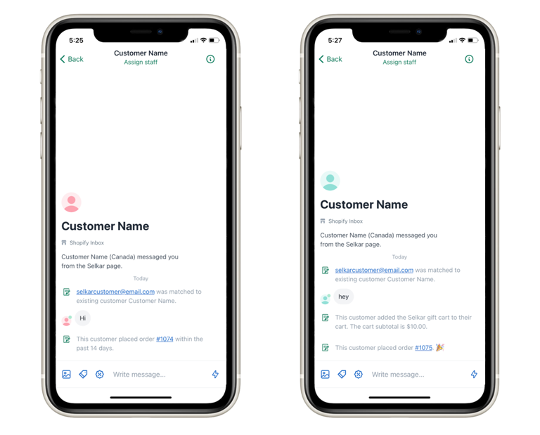
3. What is the latest interaction of a buyer on an online store?
This question reflects the key design principle of our pipeline—the information we share with merchants should be up-to-date and always relevant to a conversation. Due to the nature of how streaming data arrives at a pipeline and the interconnected process between cart and checkout, it introduces the main problems we need to resolve in our system.
There are a few challenges we faced when designing the pipeline and its solutions.
Cart to checkout is a closely connected process in a buyer’s shopping journey. For example, when a buyer places an order and returns to the online store, the cart should be empty. The primary goal of this job is to mock this process in the system to ensure correct reflection on cart checkout status at any time. The challenge is that cart and checkout events are from different Monorail sources but they have dependencies on each other. By using a single PTransform function, it allows us to access all mutable states and create dynamic logic based on that. An example of this is that we clear the cart state when receiving a checkout event of the same user token.
As the information we share in the event is accumulative (for example, total cart value) sharing the buyer signal events in the correct sequence is critical to a positive merchant experience. The output event order should be based on the chronological order of the occurrence of buyers’ interaction with the cart and chat. For example, removal of an item should always come after an item addition. However, one of the common problems with streaming data is we can’t guarantee events across data sources are read and processed in order. On top of that, the action on the cart isn’t explicitly stated in the source. Therefore, we rely on comparing quantities change between transactional events to extract the cart action.
This problem can be solved by leveraging stateful processing in Apache Beam. A state is a buffer that stores values by per-key-and-window. It’s mutable and evolved with time and new incoming elements. With the use of state, it allows us to access previous buyer activity snapshots and identify any out-of-order events by comparing the event timestamp between new events and events from the state. This ensures no outdated information is shared with merchants.
To ensure we’re not overloading data to states, we use Timer to manually clean up the expired or irrelevant per-key-and-window values in states. The timer is set to use the event_time domain to manage the state lifecycle per-key-and-window. We use this to accommodate the extendable lifespan of a cart.
Conversations and cart cookies have different life spans. The problem we had was that the characteristics of events can be evolved across time. For example, a post-conversation cart event can be shared as a pre-conversation event upon the expiration of a conversation. To address this, we introduced a dynamic tag in states to indicate whether the events have been shared in a conversation. Whenever the timer for the conversation state executes, it will reset this tag in the cart and checkout state.
Through this real-time system, we expect the conversation experience to be better for our merchants by providing them these intelligent insights about the buyer journey. We carried out an experiment and measured the impact on our KPI’s to validate the hypothesis. The experiment had a conventional A/B test setup where we divided the total audience (merchants using Shopify Inbox) into two equal groups: control and treatment. Merchants in the control group continued to have the old behavior, while the treatment group merchant saw the real-time buyer signal events in their Shopify Inbox client app. We tracked the merchant experience using the following metrics:
Our experiments showed that with these new buyer signals being shown to merchants in real-time, they’re able to better answer customer queries because they know where the buyers are in their shopping journey. Even better, they’re able to prioritize the conversations by responding to the buyer who is already in the checkout process, helping buyers to convert quicker. Overall, we observed a positive impact on all the above metrics.
Building a real-time buyer signal data pipeline to surface relevant customer context was a challenging process, but one that makes a real impact on our merchants. To quickly summarize the key takeaways:
Ashay Pathak is a Data Scientist working on Shopify’s Messaging team. He is currently working on building intelligence in conversations & improving chat experience for merchants. Previously he worked for an intelligent product which delivered proactive marketing recommendations to merchants using ML. Connect with Ashay on Linkedln to chat.
Selina Li is a Data Scientist on the Messaging team. She is currently working to build intelligence in conversation and improve merchant experiences in chat. Previously, she was with the Self Help team where she contributed to deliver better search experiences for users in Shopify Help Center and Concierge. Check out her last blog post on Building Smarter Search Products: 3 Steps for Evaluating Search Algorithms. If you would like to connect with Selina, reach out on Linkedin.
Interested in tackling challenging problems that make a difference? Visit our Data Science & Engineering career page to browse our open positions.
By Berkay Antmen, Chris Wu, and Dave Sugden
In 2017, various teams at Shopify came together to build an external-facing live-streamed visualization of all the sales made by Shopify merchants during the Black Friday and Cyber Monday (BFCM) weekend. We call it the Shopify BFCM live map.
Shopify’s BFCM live map is a visual signal of the shift in consumer spending towards independent businesses and our way to celebrate the power of entrepreneurship. Over the years, it’s become a tradition for different teams within Shopify to iterate on the live map to see how we can better tell this story. Because of our efforts, people all over the world can watch our merchant sales in real-time, online, broadcast on television, and even in Times Square.
This year, the Shopify Data Platform Engineering team played a significant role in the latest iteration of the BFCM live map. Firstly, we sought to explore what new insights we could introduce and display on the live map. Secondly, and most importantly, we needed to figure out a way to scale the live map. Last year we had more than 1 million merchants. That number has grown to over 1.7 million. With just weeks left until BFCM, we were tasked with not only figuring out how to address the system’s scalability issues but also challenging ourselves to do so in a way that would help us create patterns we could repeat elsewhere in Shopify.
We’ll dive into how our team, along with many others, revamped the data infrastructure powering our BFCM live map using Apache Flink. In a matter of weeks, we created a solution that displayed richer insights and processed a higher volume of data at a higher uptime—all with no manual interventions.
Last year’s live map drew a variety of transaction data and metadata types from our merchants. The live map looked amazing and did the job, but now with more than 1.7 million merchants on our platform, we weren’t confident that the backend architecture supporting it would be able to handle the volume predicted for 2021.
With just weeks until BFCM, Shopify execs challenged us to “see if we know our systems” by adding new metrics and scaling the live map.
In this ask, the Shopify Data Platform Engineering team saw an opportunity. We have an internal consulting team that arose organically to assist Shopify teams in leveraging our data stack. Lately, they'd been helping teams adopt stateful stream processing technologies. Streaming is still a developing practice at Shopify, but we knew we could tap this team to help us use this technology to scale the BFCM live map. With this in mind, we met with the Marketing, Revenue, UX, Product, and Engineering teams, all of whom were equally invested in this project, to discuss what we could accomplish in advance of BFCM.
We started by taking stock of the system powering the 2020 live map. The frontend was built with React and a custom 3D visualization library. The backend was a home-grown, bespoke stateful streaming service we call Cricket, built in Go. Cricket processes messages from relevant Kafka topics and broadcasts metrics to the frontend via Redis.

Our biggest concern was that this year Cricket could be overloaded with the volume coming from the checkout Kafka topic. To give you an idea of what that volume looked like, at the peak we saw roughly 50,000 messages per second during the 2021 BFCM weekend. On top of volume concerns, our Kafka topic contains more than just the subset of events that we need, and those events contain fields we didn’t intend to use.

Another challenge we faced was that the connection between Cricket and the frontend had a number of weaknesses. The original authors were aware of these, but there were trade-offs they’d made to get things ready in time. We were using Redis to queue up messages and broadcast our metrics to browsers, which was inefficient and relatively complex. The metrics displayed on our live map have more relaxed requirements around ordering than, say, chat applications where message order matters. Instead, our live map metrics:
This year, on top of the metrics listed above, we sought to add in:
Now in our load tests, we observed that Redis would quickly become a bottleneck due to the increase in the number of published messages and subscribers or connections. This would cause the browser long polling to sometimes hang for too long, causing the live map arc visuals to momentarily disappear until getting a response. We needed to address this because we forecasted that this year there would be more data to process. After talking to the teams who built last year’s model, and evaluating what existed, we developed a plan and started building our solution.
At a minimum, we knew that we had to deliver a live map that scaled at least as well as last year’s, so we were hesitant to go about changing too much without time to rigorously test it all. In a way this complicated things because while we might have preferred to build from scratch, we had to iterate upon the existing system.

In our load tests, with 1 million checkout events per second at peak, the Flink pipeline was able to operate well under high volume. We decided to put Flink on the critical path to filter out irrelevant checkout events and resolve the biggest issue—that of Cricket failing to scale. By doing this, Cricket was able to process one percent of the event volume to compute the existing metrics, while relying on Flink for the rest.
Due to our high availability requirements for the Flink jobs, we used a mixture of cross-region sharding and cross-region active-active deployment. Deduplications were handled in Cricket. For the existing metrics, Cricket continued to be the source of computation and for the new metrics, computed by Flink, Cricket acted as a relay layer.
For our new product trends metric, we leveraged our product categorization algorithm. We emitted 500 product categories with sales quantity changes, every five minutes. For a given product, the sales quantity percentage change was computed based on the following formula:
change = SUM(prior 1hr sales quantity) / MEAN(prior 6hr sales quantity) - 1
For all product trends job at a high level:
Pulling computation out of Cricket into Flink proved to be the right move. Those jobs ran with 100 percent uptime throughout BFCM without backpressure and required no manual intervention. To mitigate risk, we also implemented the new metrics as batch jobs on our time-tested Spark infrastructure. While these jobs ran well, we ended up not relying on them because Flink met our expectations.
Here’s a look at what we shipped:

In the end, user feedback was positive, and we processed significantly more checkout events, as well as produced new metrics.
However, not everything went as smoothly as planned. The method that we used to fetch messages from Redis and serve them to the end users caused high CPU loads on our machines. This scalability issue was compounded by Cricket producing metrics at a faster rate and our new product trends metric clogging Redis with its large memory footprint.
A small sample of users noticed a visual error: some of the arc visuals would initiate, then blip out of existence. With the help of our Production Engineering team, we dropped some of the unnecessary Redis state and quickly unclogged it within two hours.
Despite the hiccup, the negative user impact was minimal. Flink met our high expectations, and we took notes on how to improve the live map infrastructure for the next year.
With another successful BFCM through, the internal library we built for Flink enabled our teams to assemble sophisticated pipelines for the live map in a matter of weeks, proving that we can run mission-critical applications on this technology.
Beyond BFCM, what we’ve built can be used to improve other Shopify analytic visualizations and products. These products are currently powered by batch processing and the data isn’t always as fresh as we’d like. We can’t wait to use streaming technology to power more products that help our merchants stay data-informed.
As for the next BFCM, we’re planning to simplify the system powering the live map. And, because we had such a great experience with it, we’re looking to use Flink to handle all of the complexity.
This new system will enable us to:
We are exploring a few different solutions, but the following is a promising one:

The above design is relatively simple and satisfies both our scalability and complexity requirements. All of the metrics would be produced by Flink jobs and periodically snapshotted in a database or key-value store. The Web tier would then periodically synchronize its in-memory cache and serve the polling requests from the browsers.
Overall, we’re pleased with what we accomplished and excited that we have such a head start on next year’s design. Our platform handled record-breaking sales over BFCM and commerce isn't slowing down. Want to help us scale and make commerce better for everyone? Join our team.
Berkay Antmen leads the Streaming Capabilities team under Data Platform Engineering. He’s interested in computational mathematics and distributed systems. His current Shopify mission is to make large-scale near real-time processing easy. Follow Berkay on Twitter.
Chris Wu is a Product Lead who works on the Data Platform team. He focuses on making great tools to work with data. In his spare time he can be found buying really nice notebooks but never actually writing in them.
Dave Sudgen is a Staff Data Developer who works on the Customer Success team, enabling Shopifolk to onboard to streaming technology.
Are you passionate about data discovery and eager to learn more, we’re always hiring! Reach out to us or apply on our careers page.
By Breno Freitas and Nevena Francetic
Five years ago, we introduced Shopify Capital, our data-powered product that enables merchants to access funding from right within the Shopify platform. We built it using a version of a recurrent neural network (RNN)—analyzing more than 70 million data points across the Shopify platform to understand trends in merchants’ growth potential and offer cash advances that make sense for their businesses. To date, we’ve provided our merchants with over $2.7 billion in funding.
But how much of an impact was Shopify Capital having, really? Our executives wanted to know—and as a Data team, we were invested in this question too. We were interested in validating our hypothesis that our product was having a measurable, positive impact on our merchants.
We’ve already delved into the impact of the program in another blog post, Digging Through the Data: Shopify Capital's Effect on Business Growth, but today, we want to share how we got our results. In this post, we’re going behind the scenes to show you how we investigated whether Shopify Capital does what we intended it to do: help our merchants grow.
What’s the impact on future cumulative gross merchandise value (for example, sales) of a shop after they take Shopify Capital for the first time?
To test whether Shopify merchants who accepted Capital were more successful than those who didn’t, we needed to compare their results against an alternative future (the counterfactual) in which merchants who desired Capital didn’t receive it. In other words, an A/B test.
Unfortunately, in order to conduct a proper A/B test, we would need to randomly and automatically reject half of the merchants who expressed interest in Capital for some period of time in order to collect data for proper analysis. While this makes for good data collection, it would be a terrible experience for our users and undermine our mission to help merchants grow, which we were unwilling to do.
With Shopify Capital only being active in the US in 2019, an alternative solution would be to use Canadian merchants who didn’t yet have access to Shopify Capital (Capital launched in Canada and the UK in Spring 2020) as our “alternate reality.” We needed to seek out Canadian shops who would have used Shopify Capital if given the opportunity, but weren’t able to because it wasn’t yet available in their market.
We can do this comparison through a method called “propensity score matching” (PSM).
In the 1980s, researchers Rosenbaum and Rubin proposed PSM as a method to reduce bias in the estimation of treatment effects with observational data sets. This is a method that has become increasingly popular in medical trials and in social studies, particularly in cases where it isn’t possible to complete a proper random trial. A propensity score is defined as the likelihood of a unit being assigned to the treatment group. In this case: What are the chances of a merchant accepting Shopify Capital if it were offered to them?
It works like this: After propensity scores are estimated, the participants are matched with similar counterparts on the other set, as depicted below.

We’re looking for a score of similarity for taking treatment and only analyzing samples in both sets that are close enough (get a match) and respecting any other constraints imposed by the selected matching methodology. This means we could even be dropping samples from treatment when matching, if the scores fall outside of the parameters we’ve set.
Once matched, we’ll be able to determine the difference in gross merchandise value (GMV), that is, sales, between the control and treatment groups in the six months after they take Shopify Capital for the first time.
As previously discussed, in order to do the matching, we needed two sets of participants in the experiment, the treatment group, and the control group. We decided to set our experiment for a six-month period, starting in January 2019 to remove any confounding effect of COVID-19.
We segment our two groups as follows:
Ideally, we would have recreated underwriting criteria from January 2019 to see which Canadian shops would have pre-qualified for Capital at that time. To proxy for this, we looked at shops that remained stable until at least April 2020 in the US and Canada, and then went backwards to analyze their 2019 data.
Key assumptions:
We began our matching process with approximately 8,000 control shops and about 600 treated shops. At the end of the day, our goal was to make the distributions of the propensity scores for each group of shops match as closely as possible.
For the next stage in our matching, we set up some features, using characteristics from within the Shopify platform to describe a shop. The literature says there’s no right or wrong way to pick characteristics—just use your discernment to choose whichever ones make the most sense for your business problem.
We opted to use merchants’ (which we’ll refer to as shops) sales and performance in Shopify. While we have to keep the exact characteristics a secret for privacy reasons, we can say that some of the characteristics we used are the same ones the model would use to generate a Shopify Capital offer.
At this stage, we also logarithmically transformed many of the covariates. We did this because of the wild extremes we can get in terms of variance on some of the features we were using. Transforming them to logarithmic space shrinks the variances and thus makes the linear regressions behave better (for example, to shrink large disparities in revenue). This helps minimize skew.
There are many ways we could match the participants on both sets—the choice of algorithm depends on the research objectives, desired analysis, and cost considerations. For the purpose of this study, we chose a caliper matching algorithm.
A caliper matching algorithm is basically a nearest neighbors (NN) greedy matching algorithm where, starting from the largest score, the algorithm tries to find the closest match on the other set. It differs from a regular NN greedy algorithm as it only allows for matches within a certain threshold. The caliper defines the maximum distance the algorithm is allowed to have between matches—this is key because if the caliper is infinite, you’ll always find a neighbor, but that neighbor might be pretty far away. This means not all shops will necessarily find matches, but the matches we end up with will be fairly close. We followed Austin’s recommendation to choose our caliper width.
After computing the caliper and running the greedy NN matching algorithm, we found a match to all but one US first-time Capital adopter within Canadian counterparts.
Before jumping to evaluate the impact of Capital, we need to determine the quality of our matching. We used the following three techniques to assess balance:
Standardized mean differences: This methodology compares the averages of the distributions for the covariates for the two groups. When close to zero, it indicates good balance. Several recommended thresholds have been published in the literature with many authors recommending 0.1. We can visualize this using a “love plot,” like so:

Visual Diagnostics: Visual diagnostics such as empirical cumulative distribution plots (eCDF), quantile-quantile plots, and kernel density plots can be used to see exactly how the covariate distributions differ from each other (that is, where in the distribution are the greatest imbalances). We plot their distributions to check visually how they look pre and post matching. Ideally, the distributions are superimposed on one another after matching.


The checks presented cover most of the steps presented in the literature in regards to making sure the matching is okay to be used in further analysis. While we could go further and keep tweaking covariates and testing different methods until a perfect matching is achieved, that would risk introducing bias and wouldn’t guarantee the assumptions would be any stronger. So, we decided to proceed with assessing the treatment effect.
At this point, the shops were matched, we had the counterfactual and treatment group, and we knew the matching was balanced. We’d come to the real question: Is Shopify Capital impacting their sales? What’s the difference in GMV between shops who did and didn’t receive Shopify Capital?
In order to assess the effect of the treatment, we set up a simple binary regression: .
Where T is a binary indicator of whether or not the data point is for a US or Canadian shop, β₀ is the intercept for the regression and is the coefficient that will show how being on treatment on average influences our target. Target, , is a logarithm of the cumulative six-month GMV, from February to July 2019, plus one (that is, log1p transform of six-month sales).
Using this methodology, we found that US merchants on average had a 36% higher geometric average of cumulative six-month GMV after taking Capital for the first time than their peers in Canada.
In order to make sure we were confident in the treatment effect we calculated, we ran several robustness checks. We won’t get into the details, but we used the margins package, simulated an A/A test to validate our point estimate, and followed Greifer’s proposed method for bootstrapping.

Our results show that the 95% confidence interval for the average increase in the target, after taking Capital for the first time, is between 13% and 65%. The most important takeaway is that the lower bound is positive—so we can say with high confidence that Shopify Capital has a positive effect on merchants’ sales.
With high statistical significance, backed by robustness checks, we concluded that the average difference in the geometric mean of GMV in the following six months after adopting Shopify Capital for the first time is +36%, bounded by +13% and +65%. We can now say with confidence that Shopify Capital does indeed help our merchants—and not only that, but it validates the work we’re doing as a data team. Through this study, we were able to prove that one of our first machine learning products has a significant real-world impact, making funding more accessible and helping merchants grow their businesses. We look forward to continuing to create innovative solutions that help our merchants achieve their goals.
Breno Freitas is a Staff Data Scientist working on Shopify Capital Data and a machine learning researcher at Federal University of Sao Carlos, Brazil. Breno has worked with Shopify Capital for over four years and currently leads a squad within the team. Currently based in Ottawa, Canada, Breno enjoys kayaking and working on DIY projects in his spare time.
Nevena Francetic is a Senior Data Science Manager for Money at Shopify. She’s leading teams that use data to power and transform financial products. She lives in Ottawa, Ontario and in her spare time she spoils her little nephews. To connect, reach her on LinkedIn.
Are you passionate about data discovery and eager to learn more, we’re always hiring! Reach out to us or apply on our careers page.
Data scientists at Shopify expect fast results when querying large datasets across multiple data sources. We use Trino (a distributed SQL query engine) to provide quick access to our data lake and recently, we’ve invested in speeding up our query execution time.
On top of handling over 500 Gbps of data, we strive to deliver p95 query results in five seconds or less. To achieve this, we’re constantly tuning our infrastructure. But with each change comes a risk to our system. A disruptive change could stall the work of our data scientists and interrupt our engineers on call.
That’s why Shopify’s Data Reliability team built custom verification, benchmarking, and profiling tooling for testing and analyzing Trino. Our tooling is designed to minimize the risk of various changes at scale.
Below we’ll walk you through how we developed our tooling. We’ll share simple concepts to use in your own Trino deployment or any other complex system involving frequent iterations.

As Shopify grows, so does our data and our team of data scientists. To handle the increasing volume, we’ve scaled our Trino cluster to hundreds of nodes and tens of thousands of virtual CPUs.
Managing our cluster gives way to two main concerns:
Both of these concerns involve changes that need constant vetting, but the changes are further complicated by the fact that we run a fork of Trino. Our fork allows us more control over feature development and release schedules. The tradeoff is that we’re sometimes the first large organization to test new code “in the field,” and if we’re contributing back upstream to Trino, the new code must be even more thoroughly tested.
Changes also have a high cost of failure because our data scientists are interrupted and our engineers must manually roll back Trino to a working version. Due to increasing uncertainty on how changes might negatively affect our cluster, we decided to hit the brakes on our unstructured vetting process and go back to the drawing board. We needed a tool that could give us confidence in potential changes and increase the reliability of our system as a whole.
To help identify our missing tool, we looked at our Trino deployment as a Formula 1 race car. We need to complete each lap (or query) as fast as possible and shorten the timeline between research and production of our engine, all the while considering safety.
The highest-ranked Formula 1 teams have their own custom simulators. They put cars in real-life situations and use data to answer critical questions like, “How will the new steering system handle on the Grand Prix asphalt?” Teams also use simulations to prevent accidents from happening in real life.
Taking inspiration from this practice, we iterated on a few simulation prototypes:
Another thing we were missing in our “garage” was a good set of single-purpose gauges for evaluating a possible change to Trino. We had some manual checks in our heads, but they were undocumented, and some checks caused significant toil to complete. These could surely be formalized and automated.

We were now left with a mixed bag of ideas and prototypes that lacked structure.
We decided to address all our testing concerns within a single framework to build the structure that was lacking in our solution. Initially, we had three use cases for this framework: verification, benchmarking, and profiling of Trino.
The framework materialized as a lightweight Python library. It eliminates toil by extracting undocumented tribal knowledge into code, with familiar, intuitive interfaces. An interface may differ depending on the use case (verification, benchmarking, or profiling), but all rely on the same core code library.
The core library is a set of classes for Trino query orchestration. It’s essentially an API that has a shared purpose for all of our testing needs. The higher level Library class handles connections, query states, and multithreaded execution or cancellation of queries. The Query class handles more low level concerns, such as query annotations, safety checks, and fetching individual results. Our library makes use of the open source repository trino-python-client which implements the Python Database API Specification for Trino.
Verification consists of simple checks to ensure Trino still works as expected after a change. We use verification to accelerate the deployment cycle for a change to Trino.

We knew the future users of our framework (Data Platform engineers) have a development background, and a high likelihood of knowing Python. Associating verification with unit testing, we decided to leverage an existing testing framework as our main developer interface. Conceptually, PyTest's features fit our verification needs quite well.
We wrote a PyTest interface on top of our query orchestration library that abstracted away all the underlying Trino complications into a set of test fixtures. Now, all our verification concerns are structured into a suite of unit tests, in which the fixtures initialize each test in a repeatable manner and handle the cleanup after each test is done. We put a strong focus on testing standards, code readability, and ease of use.
Here’s an example block of code for testing our Trino cluster:
First, the test is marked. We’ve established a series of marks, so a user can run all “correctness” tests at a time, all “performance” tests at a time, or every test except the “production_only” ones. In our case, “correctness” means we’re expecting an exact set of rows to be returned given our query. “Correctness” and “verification” have interchangeable meanings here.
Next, a fixture (in this case, candidate_cluster, which is a Trino cluster with our change applied) creates the connection, executes a query, fetches results, and closes the connection. Now, our developers can focus on the logic of the actual test.
Lastly, we call run_query and run a simple assertion. With this familiar pattern, we can already check off a handful of our items on our undocumented Trino upgrade checklist.

Now, we increase the complexity:
First, notice @pytest.mark.performance. Although performance testing is a broad concept, by asserting on a simple threshold comparison we can verify performance of a given factor (for example, execution time) isn’t negatively impacted.
In this test, we call multi_cluster, which runs the same query on two separate Trino clusters. We look for any differences between the “candidate” cluster we’re evaluating and a “standby” control cluster at the same time.

We used the multi_cluster pattern during a Trino upgrade when verifying our internal Trino User Defined Functions (which are utilized in domains such as finance and privacy). We also used this pattern when assessing a candidate cluster’s proposed storage caching layer. Although our suite didn’t yet have the ability to assert on performance automatically, our engineer evaluated the caching layer with some simple heuristics and intuition after kicking off some tests.
We plan to use containerization and scheduling to automate our use cases further. In this scenario, we’d run verification tests at regular intervals and make decisions based on the results.
So far, this tool covers the “gauges” in our race car analogy. We can take a pit stop, check all the readings, and analyze all the changes.
Formula 1 cars need to be aerodynamic, and they must direct air to the back engine for cooling. Historically, Formula 1 cars are benchmarked in a wind tunnel, and every design is tested in the same wind tunnel with all components closely monitored.
We took some inspiration from the practice of Formula 1 benchmarking. Our core library runs TPC-DS queries on sample datasets that are highly relevant to the nature of our business. Fortunately, Trino generates these datasets deterministically and makes them easily accessible.
The benchmarking queries are parametrized to run on multiple scale factors (sf). We repeat the same test on increasing magnitudes of dataset size with corresponding amounts of load on our system. For example, sf10 represents a 10 GB database, while sf1000 represents 1 TB.
PyTest is just one interface that can be swapped out for another. But in the benchmarking case, it continues to work well:

This style of benchmarking is an improvement over our team members’ improvised methodologies. Some used Spark or Jupyter Notebooks, while others manually executed queries with SQL consoles. This led to inconsistencies, which was against the point of benchmarking.
We’re not looking to build a Formula 1 wind tunnel. Although more advanced benchmarking frameworks do exist, their architectures are more time-consuming to set up. At the moment, we’re using benchmarking for a limited set of simple performance checks.
Profiling refers to the instrumentation of specific scenarios for Trino, in order to optimize how the situations are handled. Our library enables profiling at scale, which can be utilized to make a large system more stable.
In order to optimize our Trino configuration even further, we need to profile highly specific behaviours and functions. Luckily, our core library enables us to write some powerful instrumentation code.
Notably, it executes queries and ignores individual results (we refer to these as background queries). When kicking off hundreds of parallel queries, which could return millions of rows of data, we’d quickly run out of memory on our laptops (or external Trino clients). With background queries, we put our cluster into overdrive with ease and profile on a much larger scale than before.
We formalized all our prototyped simulation code and brought it into our library, illustrated with the following samples:
generate_traffic is called with a custom profile to target a specific behaviour. replay_queries plays back queries in real time to see how a modified cluster handles them. These methodologies cover edge cases that a standard benchmark test will miss.

This sort of profiling was used when evaluating an auto-scaling configuration for cloud resources during peak and off-hours. Although our data scientists live around the world, most of our queries happen between 9-5 PM EST, so we’re overprovisioned outside of these hours. One of our engineers experimented with Kubernetes’ horizontal pod autoscaling, kicking off simulated traffic to see how our count of Trino workers adjusted to different load patterns (such as “high to low” and “low to high”).
Building a faster and safer Trino is a platform effort supported by multiple teams. With this tooling, the Data Foundations team wrote an extensive series of correctness tests to prepare for the next Trino upgrade. The tests helped iron out issues and led to a successful upgrade! To bring back our analogy, we made an improvement to our race car, and when it left the garage, it didn’t crash. Plus, it maintained its speed—our P95 query execution time has remained stable over the past few months (the upgrade occurred during this window).

By using this tool, our team learned about the effectiveness of our experimental performance changes, such as storage caching or traffic-based autoscaling. We were able to make more informed decisions about what (or what not) to ship.
Another thing we learned along the way is that performance testing is complicated. Here are a few things to consider when creating this type of tooling:
In the end, we scoped out most of our performance testing and profiling goals from this project, and focused specifically on verification. By ensuring that our framework is extensible and that our library is modular, we left an opportunity for more advanced performance, benchmarking, and profiling interfaces to be built into our suite in the future.
We’re excited to use this tool in several gameday scenarios to prepare our Data Reliability team for an upcoming high-traffic weekend—Black Friday and Cyber Monday—where business-critical metrics are needed at a moment’s notice. This is as good a reason as ever for us to formalize some repeatable load tests and stress tests, similar to how we test the Shopify system as a whole.
We’re currently evaluating how we can open-source this suite of tools and give back to the community. Stay tuned!
Interested in tackling challenging problems that make a difference? Visit our Data Science & Engineering career page to browse our open positions.
Noam is a Hacker in both name and spirit. For the past three years, he’s worked as a data developer focused on infrastructure and platform reliability projects. From Toronto, Canada, he enjoys biking and analog photography (sometimes at the same time).
Wherever you are, your next journey starts here! If building systems from the ground up to solve real-world problems interests you, our Engineering blog has stories about other challenges we have encountered. Intrigued? Visit our Data Science & Engineering career page to find out about our open positions. Learn about how we’re hiring to design the future together—a future that is Digital by Design.
Running a business requires making a lot of decisions. To be competitive, they have to be good. There are two complications, though:
The AI4TSP Competition fosters research on the intersection of optimization (addressing the first issue of efficient computation for hard problems) and artificial intelligence (addressing the second issue of handling uncertainty). Shopify optimization expert Meinolf Sellmann collaborated with his former colleagues Tapan Shah at GE Research, Kevin Tierney, Fynn Schmitt-Ulms, and Andre Hottung from the University of Bielefeld to compete and win first prize in both tracks of the competition. The type of problem studied in this competition matters to Shopify as the optimization of our fulfillment system requires making decisions based on estimated data.
The AI4TSP Competition focuses on the Travelling Salesperson Problem (TSP), one of the most studied routing problems in the optimization community. The task is to determine the order to visit a given set of locations, starting from, and returning to, a given home location, so the total travel time is minimized. In its original form, the travel times between all locations are known upfront. In the competition, these times weren’t known but sampled according to a probability distribution. The objective was to visit as many locations as possible within a given period of time, whereby each location was associated with a specific reward. To complicate matters further, the locations visited on the tour had to be reached within fixed time windows. Arriving too early meant having to wait until the location would open, arriving too late was associated with penalties.

When travel times are known, the problem looks innocent enough. However, consider this: the number of possible tours grows more than exponentially and is given by “n! = 1 * 2 * 3 … * n” (n factorial) for a problem instance with n locations. Even if we could:
It wouldn’t even enumerate all solutions for just one TSP instance with 91 locations. The biggest problems at the competition had 200 locations—with over 10375 potential solutions.
The competition consisted of two tracks. In the first, participants had to determine a tour for a given TSP instance that would work well on expectation when averaged over all possible travel time scenarios. A tour had to be chosen and participants had to stick to that tour no matter how the travel times turned out when executing the tour. The results were then averaged ten times over 100,000 scenarios to determine the winner.

In the second track, it was allowed to build the tour on the fly. At every location, participants could choose which location to go to next, taking into account how much time had already elapsed. The policy that determined how to choose the next location was evaluated on 100 travel time realizations for each of 1,000 different TSP instances to determine the winner.
For hard problems like the TSP, optimization requires searching. This search can be systematic, whereby we search in such a manner that we can efficiently keep record of the solutions that have already been looked at. Alternatively, we can search heuristically, which generally refers to search methods that work non-systematically and may revisit the same candidate solution multiple times during the search. This is a drawback of heuristic search, but it offers much more flexibility as the search controller can guide where to go next opportunistically and isn’t bound by exploring spaces that neatly fit to our existing search record. However, we need to deploy techniques that allow us to escape local regions of attraction, so that we don’t explore the same basin over and and over.
For the solution to both tracks, Shopify and friends used heuristic search, albeit in two very different flavors. For the first track, the team applied a search paradigm called dialectic search. For the second track, they used what’s known in machine learning as deep reinforcement learning.
Key to making both approaches work is to allow the machine to learn from prior experience and to adjust the program automatically. If the ongoing machine learning revolution had to be summarized in just one sentence, it would be:
“If, for a given task, we fail to develop algorithms with sufficient performance, then shift the focus to building an algorithm that can build this algorithm for us, automatically.“
A recent prominent example where this revolution has led to success is AlphaFold, DeepMind’s self-taught algorithm for predicting the 3D structure of proteins. Humans tried to build algorithms that could predict this structure for decades, but were unable to reach sufficient accuracy to be practically useful. The same was demonstrated for tasks like machine vision, playing board games, and optimization. At another international programming competition, the MaxSAT Evaluation 2016, Meinolf and his team entered a self-tuned dialectic search approach which won four out of nine categories and ten medals overall.
These examples show that machine-generated algorithms can vastly outperform human-generated approaches. Particularly when problems become hard to conceptualize in a concise theory and hunches or guesses must be made during the execution of the algorithm, allowing the machine to learn and improve based on prior experience is the modern way to go.
Meinolf Sellmann, Director for Network Optimization at Shopify, is best known for algorithmic research, with a special focus on self-improving algorithms, automatic algorithm configuration and algorithm portfolios based on artificial intelligence, combinatorial optimization, and the hybridization thereof. He received a doctorate degree (Dr. rer. nat.) from Paderborn University (Germany). Prior to this he was Technical Operations Leader for machine learning and knowledge discovery at General Electric, senior manager for data curation at IBM, Assistant Professor at Brown University, and Postdoctoral Scholar at Cornell University.
His honors include the Prize of the Faculty of the University of Paderborn (Germany) for his doctoral thesis, an NSF Career Award in 2007, over 20 Gold Medals at international SAT and MaxSAT Competitions, and first places at both tracks of the 2021 AI for TSP Competition. Meinolf has also been invited as keynote speaker and program chair of many international conferences like AAAI, IAAI, Informs, LION and CP.
Wherever you are, your next journey starts here! If building systems from the ground up to solve real-world problems interests you, our Engineering blog has stories about other challenges we have encountered. Intrigued? Visit our Engineering career page to find out about our open positions and learn about Digital by Default.
To do this, we considered two metrics of highest importance:
In addition to these two metrics, we also care about how these predictions are consumed and if we’re providing the right access patterns and SLA’s to satisfy all use cases. As an example, we might want to provide low latency real time predictions to our consumers.
After evaluating our model against these metrics and taking into account the various data products we were looking to build, we decided to build a new model to improve our performance. As we approached the problem, we reminded ourselves of the blind spots of the existing model. These included things such as only using textual features for prediction and the ability to only understand products in the english language.
In this post, we’ll discuss how we evolved and modernized our product categorization model that increased our leaf precision by 8% while doubling our coverage. We’ll dive into the challenges of solving this problem at scale and the technical trade-offs we made along the way. Finally we’ll describe a product that’s currently being used by multiple internal teams and our partner ecosystems to build derivative data products.
Before we discuss the model, let’s recap why product categorization is an important problem to solve.
Merchants sell a variety of products on our platform, and these products are sold across different sales channels. We believe that the key to building the best products for our merchants is to understand what they’re selling. For example, by classifying all the products our merchants sell into a standard set of categories, we can build features like better search and discovery across all channels and personalized insights to support merchants’ marketing efforts.
Our current categorization model uses the Google Product Taxonomy (GPT). The GPT is a list of over 5,500 categories that help us organize products. Unlike a traditional flat list of categories or labels that’s common to most classification problems, the GPT has a hierarchical tree structure. Both the sheer number of categories in the taxonomy and the complex structure and relationship between the different classes make this a hard problem to model and solve.

Before we could dive into creating our improved model, we had to take into account what we had to work with by exploring the product features available to us. Below is an example of the product admin page you would see in the backend of a Shopify merchant’s store:
The image above shows the product admin page in the Shopify admin. We have highlighted the features that can help us identify what the product is. These include the title, description vendor, product type collection, tags and the product images.
Clearly we have a few features that can help us identify what the product is, but nothing in a structured format. For example, multiple merchants selling the same product can use different values for Product Type. While this provides a lot of flexibility for the merchant to organize their inventory internally, it creates a harder problem in categorizing and indexing these products across stores.
Broadly speaking we have two types of features available to us:
|
Text Features |
|
|
Visual Features |
|
These are the features we worked with to categorize the products.
To start off, we had to choose what kind of vectorization approaches our features need since both text and image features can’t be used by most machine learning models in their raw state. After a lot of experimentation, we moved forward with transfer learning using neural networks. We used pre-trained image and text models to convert our raw features into embeddings to be further used for our hierarchical classification. This approach provided us with flexibility to incorporate several principles that we’ll discuss in detail in the next section.
We horse raced several pre-trained models to decide which models to use for image and text embeddings. The parameters to consider were both model performance and computational cost. As we balanced out these two parameters, we settled on the choice of:
As explained in our previous post, categorizing hierarchical classification problems presents us with additional challenges beyond a flat multi-class problem. We had two lessons from our previous attempts at solving this problem:
So, we went about framing the problem as a multi-task, multi-class classification problem in order to incorporate these learnings into our model.

The above image illustrates the approach we took to incorporate these lessons. As mentioned previously, we use pre-trained models to embed the raw text and image features and then feed the embeddings into multiple hidden layers before having a multi-class output layer for the Level 1 prediction. We then take the output from this layer along with the original embeddings and feed it into subsequent hidden layers to predict Level 2 output. We continue this feedback loop all the way until Level 7.
Some important points to note:
One of the benefits of Shopify's scale is the availability of large datasets to build great data products that benefit our merchants and their buyers. For product categorization, we have collected hundreds of millions of observations to learn from. But this also comes with its own set of challenges! The model we described above turns out to be massive in complexity. It ends up having over 250 million parameters. Add to this the size of our dataset, training this model in a reasonable amount of time is a challenging task. Training this model using a single machine can run into multiple weeks even with GPU utilization. We needed to bring down training time while also not sacrificing the model performance.
We decided to go with a data parallelization approach to solve this training problem. It would enable us to speed up the training process by chunking up the training dataset and using one machine per chunk to train the model. The model was built and trained using distributed Tensorflow using multiple workers and GPUs on Google Cloud Platform. We performed multiple optimizations to ensure that we utilized these resources as efficiently as possible.
As described in the model architecture section, we don’t constrain the model to strictly follow the hierarchy during training. While this works during training, we can’t allow such behavior during inference time or we jeopardize providing a reliable and smooth experience for our consumers. To solve this problem, we incorporate additional logic during the inference step. The steps during predictions are
We perform the above logic as Tensorflow operations and build a Keras subclass model to combine these operations with the trained model. This allows us to have a single Tensorflow model object that contains all the logic used in both batch and online inference.

The image above illustrates how we build a Keras subclass model to take the raw trained Keras functional model and attach it to a downstream Tensorflow graph to do the recursive prediction.
We collected a suite of different metrics to measure the performance of a hierarchical classification model. These include:
In addition to gains in all the metrics listed above, the new model classifies products in multiple languages and isn’t limited to only products with English text, which is critical for us as we further Shopify's mission of making commerce better for everyone around the world.
In order to ensure only the highest quality predictions are surfaced, we impose varying thresholds on the confidence scores at different levels to filter out low confidence predictions. This means not all products have predictions at every level.
An example of this is shown in the image below:

The image above illustrates how the photo of the dog bed results in four levels of predictions. The first three levels all have a high confidence score and will be exposed. The fourth level prediction has a low confidence score and this prediction won’t be exposed.
In this example, we don’t expose anything beyond the third level of predictions since the fourth level doesn’t satisfy our minimum confidence requirement.
One thing we’ve learned during this process was how to tune the model so that these different metrics were balanced in an optimal way. We could, for example, achieve a higher hierarchical precision at the cost of lower coverage. These are hard decisions to make and would need us to understand our business use case and the priorities to make these decisions. We can’t emphasize enough how vital it is for us to focus on the business use cases and the merchant experience in order to guide us. We optimized towards reducing negative merchant experience and friction. While metrics are a great indication of model performance, we also conducted spot checks and manual QA on our predictions to identify areas of concern.
An example is how we paid close attention to model performance on items that belonged to sensitive categories like “Religious and Ceremonial”. While overall metrics might look good, they can also mask model performance in small pockets of the taxonomy that can cause a lot of merchant friction. We manually tuned thresholds for confidences to ensure high performance in these sensitive areas. We encourage the reader to also adopt this practice in rolling out any machine learning powered consumer facing data product.
The upgrade from the previous model gave us a boost in both precision and coverage. At a high level, we were able to increase precision by eight percent while also almost doubling the coverage. We have more accurate predictions for a lot more products. While we improved the model and delivered a robust product to benefit our merchants, we believe we can further improve it. Some of the areas of improvements include:
Kshetrajna Raghavan is a data scientist who works on Shopify's Commerce Algorithms team. He enjoys solving complex problems to help use machine learning at scale. He lives in the San Francisco Bay Area with his wife and two dogs. Connect with Kshetrajna on LinkedIn to chat.
By Ali Wytsma and C. Carquex
Over the last decade, machine learning underwent a broad democratization. Countless tutorials, books, lectures, and blog articles have been published related to the topic. While the technical aspects of how to build and optimize models are well documented, very few resources are available on how developing machine learning models fits within a business context. When is it a good idea to use machine learning? How to get started? How to update a model over time without breaking the product?
Below, we’ll share five steps and supporting tips on approaching machine learning from a business perspective. We’ve used these steps and tips at Shopify to help build and scale our suite of machine learning products. They may look simple, but when used together they give a straight-forward workflow to help you productionize models that actually drive impact.

Before starting the development of any machine learning model, the first question to ask is: should I invest resources in a machine learning model at this time? It’s tempting to spend lots of time on a flashy machine learning algorithm. This is especially true if the model is intended to power a product that is supposed to be “smart”. Below are two simple questions to assess whether it’s the right time to develop a machine learning model:
Launching a new product requires a tremendous amount of effort, often with limited resources. Shipping a first version, understanding product fit, figuring out user engagement, and collecting feedback are critical activities to be performed. Choosing to delay machine learning in these early stages allows resources to be freed up and focused instead on getting the product off the ground.
Plans for setting up the data flywheel and how machine learning can improve the product down the line are recommended. Data is what makes or breaks any machine learning model, and having a solid strategy for data collection will serve the team and product for years to come. We recommend exploring what will be beneficial down the line so that the right foundations are put in place from the beginning, but holding off on using machine learning until a later stage.
To the contrary, if the product is already launched and proven to solve the user’s pain points, developing a machine learning algorithm might improve and extend it.
Before jumping ahead with developing a machine learning model, we recommend trying to solve the problem with a simple heuristic method. The performance of those methods is often surprising. A benefit to starting with this class of solution is that they’re typically easier and faster to implement, and provide a good baseline to measure against if you decide to build a more complex solution later on. They also allow the practitioner to get familiar with the data and develop a deeper understanding of the problem they are trying to solve.
In 90 percent of cases, you can create a baseline using heuristics. Here are some of our favorite for various types of business problems:
| Forecasting | For forecasting with time series data, moving averages are often robust and efficient |
| Predicting Churn | Using a behavioural cohort analysis to determine user dropoff points are hard to beat |
| Scoring | For scoring business entities (for example leads and customers), a composite index based on two or three weighted proxy metrics is easy to explain and fast to spin up |
| Recommendation Engines | Recommending content that’s popular across the platform with some randomness to increase exploration and content diversity is a good place to start |
| Search | Stemming and keyword matching gives a solid heuristic |
When developing a first model, the excitement of seeking the best possible solution often leads to adding unnecessary complexity early on: engineering extra features or choosing the latest popular model architecture can certainly provide an edge. However, they also increase the time to build, the overall complexity of the system, as well as the time it takes for a new team member to onboard, understand, and maintain the solution.
On the other hand, simple models enable the team to rapidly build out the entire pipeline and de-risk any surprise that could appear there. They’re the quickest path to getting the system working end-to-end.
At least for the first iteration of the model, we recommend being mindful of these costs by starting with the simplest approach possible. Complexity can always be added later on if necessary. Below are a few tips that help cut down complexity:
Simple models contribute to iteration speed and allow for better understanding of the model. When possible, start with robust, interpretable models that train quickly (shallow decision tree, linear or logistic regression are three good initial choices). These models are especially valuable for getting buy-in from stakeholders and non-technical partners because they’re easy to explain. If this model is adequate, great! Otherwise, you can move to something more complex later on. For instance, when training a model for scoring leads for our Sales Representatives, we noticed that the performance of a random forest model and a more complex ensemble model were on par. We ended up keeping the first one since it was robust, fast to train, and simple to explain.
A basic set of features allows you to get up and running fast. You can defer most feature engineering work until it’s needed. Having a reduced feature space also means that computational tasks run faster with a quicker iteration speed. Domain experts often provide valuable suggestions for where to start. For example at Shopify, when building a system to predict the industry of a given shop, we noticed that the weight of the products sold was correlated with the industry. Indeed, furniture stores tend to sell heavier products (mattresses and couches) than apparel stores (shirts and dresses). Starting with these basic features that we knew were correlated allowed us to get an initial read of performance without going deep into building a feature set.
For some tasks (in particular tasks related to images, video, audio, or text), it’s essential to use deep learning to get good results. In this case, pre-trained, off the shelf models help build a powerful solution quickly and easily. For instance, for text processing, a pre-trained word embedding model that feeds into a logistic regression classifier might be sufficient for an initial release. Fine tuning the embedding to the target corpus comes in a subsequent iteration, if there’s a need for it.
A common pitfall we’ve encountered is starting to optimize machine learning models too early. While it’s true that thousands of parameters and hyper-parameters have to be tuned (with respect to the model architecture, the choice of a class of objective functions, the input features, etc), jumping too fast to that stage is counterproductive. Answering the two questions below before diving in helps make sure your system is set up for success.
Benchmarks are critical to the development of machine learning models. They allow for the comparison of performance. There are two steps to creating a benchmark, and the second one is often forgotten.
The metric should align with the primary objectives of the business. One of the best ways to do so is by building an understanding of what the value means. For instance, what does an accuracy of 98 percent mean in the business context? In the case of a fraud detection system, accuracy would be a poor metric choice, and 98 percent would indicate poor performance as instances of fraud are typically rare. In another situation, 98 percent accuracy could mean great performance on a reasonable metric.
For comparison purposes, a baseline value for the performance metric can be provided by an initial non-machine learning method, as discussed in the Ask Yourself If It’s the Right Time for Machine Learning? section.
Design a strategy to measure the impact of a performance improvement on the business. For instance, if the metric chosen in step one is accuracy, the strategy chosen in step two should allow the quantification of how each percentage point increment impacts the user of the product. Is an increase from 0.8 to 0.85 a game changer in the industry or barely noticeable to the user? Are those 0.05 extra points worth the potential added time and complexity? Understanding this tradeoff is key to deciding how to optimize the model and drives decisions such as continuing or stopping to invest time and resources in a given model.
When a model appears to perform well, it’s easy to celebrate too soon and become comfortable with the idea that machine learning is an opaque box with a magical performance. Based on experience, in about 95 percent of cases the magical performance is actually the symptom of an issue in the system. A poor choice of performance metric, a data leakage, or an uncaught balancing issue are just a few examples of what could be going wrong.
Being able to understand the tradeoffs behind the performance of the model will allow you to catch any issues early, and avoid wasting time and compute cycles on optimizing a faulty system. One way to do this is by investigating the output of the model, and not just its performance metrics:
| Classification System | In a classification system, what does the confusion matrix look like? Does the balancing of classes make sense? |
| Regression Model | When fitting a regression model, what does the distribution of residuals look like? Is there any apparent bias? |
| Scoring System | For a scoring system, what does the distribution of scores look like? Are they all grouped toward one end of the scale? |
Example
Order Dataset
Prediction Accuracy 98%
| Actual |
| Order is fraudulent | Order is not fraudulent | ||
| Prediction | Order is fraudulent | 0 | 0 |
| Order is not fraudulent | 20 | 1,000 |
Optimizing the model in this state doesn’t make sense, the metric needs to be fixed first.
Optimizing the various parameters becomes simpler once the performance metric is set and tied to a business impact: the optimization stops when it doesn’t drive any incremental business impact. Similarly, by being able to explain the tradeoffs behind a model, errors that are otherwise masked by an apparent great performance are likely to get caught early.
Machine learning models evolve over time. They can be retrained at a set frequency. Their architecture can be updated to increase their prediction power or features can be added and removed as the business evolves. When updating a machine learning model, the roll out of the new model is usually a critical part. We must understand our performance relative to our baseline, and there should be no regression in performance. Here are a few tips that have helped us do this effectively:
Models are built and rolled out iteratively. We recommend investing in building a pipeline to train and experimentally evaluate two or more versions of the model concurrently. Depending on the situation, there are Depending on the situation, there are several ways that new models are evaluated. Two great methods are:
Will the changes affect how the metrics are reported? As an example, in a classification problem, if the class balance is different between the set the model variant is being evaluated on and production, the comparison may not be fair. Similarly, if we’re changing the dataset being used, we may not be able to use the same population for evaluating our production model as our variant model. If there is bias, we try to change how the evaluations are conducted to remove it. In some cases, it may be necessary to adjust or reweight metrics to make the comparison fair.
One run of the variant model may not be enough to understand it’s impact. Model performance can vary due to many factors like random parameter initializations or how data is split between training and testing. Verify its performance over time, between runs and based on minor differences in hyperparameters. If the performance is inconsistent, this could be a sign of bigger issues (we’ll discuss those in the next section!). Also, verify whether performance is consistent across key segments in the population. If that’s a concern, it may be worth reweighting the metric to prioritize key segments.
It’s important to be aware of the risks of overfitting when optimizing, and to account for this when developing a comparison strategy. For example, using a fixed test data set can cause you to optimize your model to those specific examples. Incorporating practices like cross validation, changing the test data set, using a holdout, regularization, and running multiple tests whenever random initializations are involved into your comparison strategy helps to mitigate these problems.
One aspect that’s rarely discussed is the stability of prediction as a model evolves over time. Say the model is retrained every quarter, and the performance is steadily increasing. If our metric is good, this means that performance is improving overall. However, individual subjects may have their predictions changed, even as the performance increases overall. That may cause a subset of users to have a negative experience with the product, without the team anticipating it.
As an example, consider a case where a model is used to decide whether a user is eligible for funding, and that eligibility is exposed to the user. If the user sees their status fluctuate, that could create frustration and destroy trust in the product. In this case, we may prefer stability over marginal performance improvements. We may even choose to incorporate stability into our model performance metric.

Being aware of this effect and measuring it is the first line of defense. The causes vary depending on the context. This issue can be tied to a form of overfitting, though not always. Here’s our checklist to help prevent this:
To recap, there are a lot of factors to consider when building products and tools that leverage machine learning in a business setting. Carefully considering these factors can make or break the success of your machine learning projects. To summarize, always remember to:
Ali Wytsma is a data scientist leading Shopify's Workflows Data team. She loves using data in creative ways to help make Shopify's admin as powerful and easy to use as possible for entrepreneurs. She lives in Kitchener, Ontario, and spends her time outside of work playing with her dog Kiwi and volunteering with programs to teach kids about technology.
Carquex is a Senior Data Scientist for Shopify’s Global Revenue Data team. Check out his last blog on 4 Tips for Shipping Data Products Fast.
By Matt Bruce & Bruno Deszczynski
Driving down the amount of time data scientists are waiting for query results is a critical focus (and necessity) for every company with a large data lake. However, handling and analyzing high-volume data within split seconds is complicated. One of the biggest hurdles to speed is whether you have the proper infrastructure in place to efficiently store and query your data.
At Shopify, we use Trino to provide our data scientists with quick access to our data lake, via an industry standard SQL interface that joins and aggregates data across heterogeneous data sources. However, our data has scaled to the point where we’re handling 15 Gbps and over 300 million rows of data per second. With this volume, greater pressure was put on our Trino infrastructure, leading to slower query execution times and operational problems. We’ll discuss how we scaled our interactive query infrastructure to handle the rapid growth of our datasets, while enabling a query execution time of less than five seconds.
At Shopify, we use Trino and multiple client apps as our main interactive query tooling, where the client apps are the interface and Trino is the query engine. Trino is a distributed SQL query engine. It’s designed to query large data sets distributed over heterogeneous data sources. The main reason we chose Trino is that it gives you optionality in the case of database engine use. However, it’s important to note that Trino isn’t a database itself, as it’s lacking the storage component. Rather, it's optimized to perform queries across one or more large data sources.
Our architecture consists of two main Trino clusters:
We use a fork of Lyft’s Trino Gateway to route queries to the appropriate cluster by inspecting header information in the query. Each of the Trino clusters runs on top of Kubernetes (Google GKE) which allows us to scale the clusters and perform blue-green deployments easily.
While our Trino deployment managed to process an admirable amount of data, our users had to deal with inconsistent query times depending on the load of the cluster, and occasionally situations where the cluster became so bogged down that almost no queries could complete. We had to get to work to identify what was causing these slow queries, and speed up Trino for our users.
When it comes to querying data, Shopify data scientists (rightfully) expect to get results within seconds. However, we encounter scenarios like interactive analytics, A/B testing (experiments), and reporting all in one place. In order to improve our query execution times, we focused on speeding up Trino, as it enables a larger portion of optimization to the final performance of queries executed via any SQL client software.
We wanted to achieve a query latency of P95 less than five seconds, which would be a significant decrease (approximately 30 times). That was a very ambitious target as approximately five percent of our queries were running around one to five minutes. To achieve this we started by analyzing these factors:
When analyzing the factors above, we discovered that it’s not necessarily the query volume itself that was driving our performance problems. We noticed a correlation between certain types of queries and datasets consuming the most resources that was creating a lot of error scenarios for us. So we decided to zoom in and look into the errors.
We started looking at error classes in particular:

It can be observed that our resource relevant error rate (related to exceeding resource use) was around 0.35 percent, which was acceptable due to the load profile that was executed against Trino. What was most interesting for us was the ability to identify the queries that were timing out or causing a degradation in the performance of our Trino cluster. At first it was hard for us to properly debug our load specific problems, as we couldn’t recreate the state of Trino during the performance degradation scenarios. So, we created a Trino Query Replicator that allowed us to recreate any load from the past.
Recreating the state of Trino during performance degradation scenarios enabled us to drill down deeper on the classes of errors, and identify that the majority of our problems were related to:
While we could write a full book diving into each problem, for this post we’ll focus on how we addressed problems related to JVM settings, CPU and Memory allocation, and cluster classes.

In order to improve Trino query execution times and reduce the number of errors caused by timeouts and insufficient resources, we first tried to “money scale” the current setup. By “money scale” we mean we scaled our infrastructure horizontally and vertically. We doubled the size of our worker pods to 61 cores and 220GB memory, while also increasing the number of workers we were running. Unfortunately, this alone didn’t yield stable results. For that reason, we dug deeper into the query execution logs, stack-traces, Trino codebase, and consulted Trino creators. From this exploration, we discovered that we could try the following:
As outlined above, we initially had two Trino clusters: a Scheduled cluster and an Adhoc cluster. The shared cluster for user's ad hoc queries and the experiment queries was causing frustrations on both sides. The experiment queries were adding a lot of excess load causing user's queries to have inconsistent query times. A query that might take seconds to run could take minutes if there were experiment queries running. Correspondingly, the user's queries were making the runtime for the experiments queries unpredictable. To make Trino better for everyone, we added a new cluster just for the experiments queries, leveraging our existing deployment of Trino Gateway to route experiments queries there based on a HTTP header.
We also took this opportunity to write some tooling that allows users to create their own ephemeral clusters for temporary heavy-duty processing, or investigations with a single command (these are torn down automatically by an Airflow job after a defined TTL).


After exhausting the conventional scaling up options, we moved onto the most urgent problem: when the Trino cluster overloaded and work wasn’t progressing, what was happening? By analyzing metrics output to Datadog, we were able to identify a few situations that would arise.One problem we identified was that the Trino cluster’s queued work would continue to increase, but no queries or splits were being dispatched. In this situation, we noticed that the Trino coordinator (the server that handles incoming queries) was running, but it stopped outputting metrics for minutes at a time. We originally assumed that this was due to CPU load on the coordinator (those metrics were also unavailable). However, after logging into the coordinator’s host and looking at the CPU usage, we saw that the coordinator wasn’t busy enough that it shouldn’t be able to report statistics. We proceeded to capture and analyze multiple stack traces and determined that the issue wasn’t an overloaded CPU, but lock contention against the Internal Resource Group object from all the active queries and tasks.
We set hardConcurrencyLimit to 60 in our root resource group to limit the number of running parallel queries and reduce the lock contention on the coordinator.
"rootGroups": [
    {
    "hardConcurrencyLimit": "60",
Resource group configuration
This setting is a bit of a balancing act between allowing enough queries to run to fully utilize the cluster, and capping the amount running to limit the lock contention on the coordinator.


After the coordinator lock contention was reduced, we noticed that we would have a reasonable number of running queries, but the cluster throughput would still be lower than expected. This caused queries to eventually start queuing up. Datadog metrics showed that a single worker’s CPU was running at 100%, but most of the others were basically idle.

We investigated this behaviour by doing some profiling of the Trino process with jvisualvm while the issue was occurring. What we found was that almost all the CPU time was spent either:
What was curious to us is that the datasets the affected workers were processing were no different than any of the other workers. Why were these using more CPU time to do the same work?After some trial and error, we found setting the following JVM options prevented our users from being put in this state:
-XX:PerMethodRecompilationCutoff=10000
-XX:PerBytecodeRecompilationCutoff=10000
JVM settings
It’s worth noting that these settings were added to the recommended JVM options in a later version of Trino than we were running at the time. There’s a good discussion about those settings in the trino GitHub repo! It seems that we were hitting a condition that was causing the JVM to no longer attempt compilation of some methods, which caused them to run in the JVM interpreter rather than as compiled code which is much, much slower.
In the graph below, the CPU of the workers is more aligned without the ‘long tail’ of the single worker running at 100 percent.

In the process of investigating the performance of queries, we happened to come across an interesting query via the Trino Web UI:

What we found was one query had a massive number of running splits: approximately 29,000. This was interesting because, at that time, our cluster only had 18,000 available worker threads, and our Datadog graphs showed a maximum of 18,000 concurrent running splits. We’ll chalk that up to an artifact of the WebUI. Doing some testing with this query, we discovered that a single query could monopolize the entire Trino cluster, starving out all the other queries.After hunting around the Slack and forum archives, we came across an undocumented configuration option: `task.max-drivers-per-task`. This configuration enabled us to limit the maximum number of splits that can be scheduled per stage, per query, per worker. We set this to 16, which limited this query to around 7,200 active splits.
Without leveraging the storage upgrade and by tapping into cluster node sizing, cluster classes, Trino configs, and JVM tuning, we managed to bring down our execution latency to 30 seconds and provide a stable environment for our users. The below charts present the final outcome:


The changes in the distribution of queries being run within certain bins shows that we managed to move more queries into the zero to five second bucket and (most importantly) limited the time that the heaviest queries were executed at. Our execution time trendline speaks for itself, and as we’re writing this blog, we hit less than 30 seconds with P95 query execution time.
By creating separate clusters, lowering the number of concurrent queries, ensuring the recommended JVM recompilation setting were applied, and limiting the maximum number of drivers per query task, we were able to scale our interactive query infrastructure.
While addressing the infrastructure was an important step to speed up our query execution, it’s not our only step. We still think there is room for improvement and are working to make Trino our primary interactive query engine. We’re planning to put further efforts into:
Matt Bruce: Matt is a four-year veteran at Shopify serving as Staff Data Developer for the Foundations and Orchestration team. He’s previously helped launch many open source projects in Shopify including Apache Druid and Apache Airflow, as well as migrating Shopify’s Hadoop and Presto infrastructure from physical Data centers into cloud based services.
Bruno Deszczynski: Bruno is a Data Platform EPM working with the Foundations team. He is obsessed with making Trino execute interactive analytics queries (P95) below five seconds in Shopify.
Wherever you are, your next journey starts here! If building systems from the ground up to solve real-world problems interests you, our Engineering blog has stories about other challenges we have encountered. Intrigued? Visit our Data Science & Engineering career page to find out about our open positions. Learn about how we’re hiring to design the future together—a future that is Digital by Design.
Controlled experiments are considered the gold standard approach for determining the true effect of a change. Despite that, there are still many traps, biases, and nuances that can spring up as you experiment, and lead you astray. Last week, I wrapped up my tenth online experiment, so here are 10 hard-earned lessons from the past year.
After launching our multi-currency functionality, our team wanted to measure the impact of our feature on the user experience, so we decided to run an experiment. I quickly decided that we randomly assign each session to test or control, and measure the impact on conversion (purchase) rates. We had a nicely modelled dataset at the session grain that was widely used for analyzing conversion rates, and consequently, the decision to randomize by session seemed obvious.

When you map out this setup, it looks something like the image below. Each session comes from some user, and we randomly assign their session to an experience. Our sessions are evenly split 50/50.

However, if you look a little closer, this setup could result in some users getting exposed to both experiences. It’s not uncommon for a user to have multiple sessions on a single store before they make a purchase.
If we look at our user Terry below, it’s not unrealistic to think that the “Version B” experience they had in Session 2 influenced their decision to eventually make a purchase in Session 3, which would get attributed to the “Version A” experience.

This led me to my first very valuable lesson that is to think carefully when choosing your randomization unit. Randomization units should be independent, and if they aren’t, you may not be measuring the true effect of your change. Another factor in choosing your randomization unit comes from the desired user experience. You can imagine that it’s confusing for some users if something significant was visibly different each time they came to a website. For a more involved discussion on choosing your randomization unit, check out my post: Choosing your randomization unit in online A/B tests.
With the above tip in mind, we decided to switch to user level randomization for the experiment, while keeping the session conversion rate as our primary success metric since it was already modelled and there was a high degree of familiarity with the metric internally.
However, after doing some reading I discovered that having a randomization unit (user) that’s different from your analysis unit (session) could lead to issues. In particular, there were some articles claiming that this could result in a higher rate of false positives. One of them showed a plot like this:

The intuition is that your results could be highly influenced by which users land in which group. If you have some users with a lot of sessions, and a really high or low session conversion rate, that could heavily influence the overall session conversion rate for that group.
Rather than throwing my hands up and changing the strategy, I decided to run a simulation to see if we would actually be impacted by this. The idea behind the simulation was to take our population and simulate many experiments where we randomized by user and compared session conversion rates like we were planning to do in our real experiment. I then checked if we saw a higher rate of false positives, and it turned out we didn’t so we decided to stick with our existing plan.
The key lesson here was that simulations are your friend. If you’re ever unsure about some statistical effect, it’s very quick (and fun) to run a simulation to see how you’d be affected, before jumping to any conclusions.
Data is commonly used to influence big decisions with an obvious need for quantitative evidence. Does this feature positively impact our users? Should we roll it out to everyone? But there’s also a large realm of much smaller decisions that can be equally influenced by data.
Around the time we were planning an experiment to test a new design for our geolocation recommendations, the system responsible for rendering the relevant website content was in the process of being upgraded. The legacy system (“Renderer 1”) was still handling approximately 15 percent of the traffic, while the new system (“Renderer 2”) was handling the other 85 percent. This posed a question to us: do we need to implement our experiment in the two different codebases for each rendering system? Based on the sizable 15 percent still going to “Renderer 1”, our initial thinking was yes. However, we decided to dig a bit deeper.
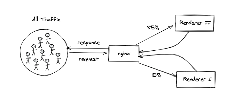
With our experiment design, we’d only be giving the users the treatment or control experience on the first request in a given session. With that in mind, the question we actually needed to answer changed. Instead of asking what percent of all requests across all users are served by “Renderer 2”, we needed to look at what percent of first requests in a session are served by “Renderer 2” for the users we planned to include in our experiment.

By reframing the problem, we learned that almost all of the relevant requests were being served by the new system, so we were safe to only implement our experiment in one code base.
A key lesson learned from this was that data can and should inform both big and small decisions. Big decisions like “should we roll out this feature to all users,” and small decisions like “should we spend a few days implementing our experiment logic in another codebase.” In this case, two hours of scoping saved at least two days of engineering work, and we learned something useful in the process.
This lesson wasn’t necessarily unique to this experiment, but it’s worth reinforcing. You can only identify these opportunities when you’re working very closely with your cross-discipline counterparts (engineering in this case), attending their standups, and hearing the decisions they’re trying to make. They usually won’t come to you with these questions as they may not think that this is something data can easily or quickly solve.
For an experiment that involved redirecting the treatment group to a different URL, we decided to first run an A/A test to validate that redirects were working as expected and not having a significant impact on our metrics.
The A/A setup looked something like this:
This may look like a lot, but for users this is virtually invisible. You’d only know if you were redirected if you opened your browser developer tools (under the “Network” tab you’ll see a request with a 302 status).

Shortly into the experiment, I encountered my first instance of sample ratio mismatch (SRM). SRM is when the number of subjects in each group doesn’t match your expectations.
After “inner joining” the assigned users to our sessions system of record, we were seeing a slightly lower fraction of users in the test group compared to the control group instead of the desired 50/50 split.
We asked ourselves why this could be happening. And in order to answer that question, we needed to understand how our system worked. In particular, how do records appear in the sessions data model, and what could be causing fewer records from our test group to appear in there?

After digging through the source code of the sessions data model, I learned that it’s built by aggregating a series of pageview events. These pageview events are emitted client side, which means that the “user” needs to download the html and javascript content our servers return, and then they will emit the pageview events to Kafka.
With this understanding in place, I now knew that some users in our test group were likely dropping off after the redirect and consequently not emitting the pageview events.

To better understand why this was happening, we added some new server-side logging for each request to capture some key metadata. Our main hypothesis was that this was being caused by bots, since they may not be coded to follow redirects. Using this new logging, I tried removing bots by filtering out different user agents and requests coming from certain IP addresses. This helped reduce the degree of SRM, but didn’t entirely remove it. It’s likely that I wasn’t removing all bots (as they’re notoriously hard to identify) or there were potentially some real users (humans) who were dropping off in the test group. Based on these results, I ended up changing the data sources used to compute our success metric and segment our users.
Despite the major head scratching this caused, I walked away with some really important lessons:
In one experiment where we were testing the impact of translating content into a buyer’s preferred language, I was constantly peeking at the results each day as I was particularly interested in the outcome. The difference in the success metric between the treatment and control groups had been holding steady for well over a week, until it took a nose dive in the last few days of the experiment.

After digging into the data, I found that this change was entirely driven by a single store with abnormal activity and very high volumes, causing it to heavily influence the overall result. This served as a pleasant reminder to beware of user skew. With any rate based metric, your results can easily be dominated by a set of high volume users (or in this case, a single high volume store).
And despite the warnings you’ll hear, don’t be afraid to peek. I encourage you to look at your results throughout the course of the experiment. Avoiding the peeking problem can only be done in conjunction with following a strict experiment plan to collect a predetermined sample size (that is, don’t get excited by the results and end the experiment early). Peeking at the results each day allowed me to spot the sudden change in our metrics and subsequently identify and remove the offending outlier.
In another experiment involving redirects, I was once again experiencing SRM. There was a higher than expected number of sessions in one group. In past experiments, similar SRM issues were found to be caused by bots not following redirects or weird behaviour with certain browsers.
I was ready to chalk up this SRM to the same causes and call it a day, but there was some evidence that hinted something else may be at play. As a result, I ended up going down a big rabbit hole. The rabbit hole eventually led me to review the application code and our experiment qualification logic. I learned that users in one group had all their returning sessions disqualified from the experiment due to a cookie that was set in their first session.
For an ecommerce experiment, this has significant implications since returning users (buyers) are much more likely to purchase. It’s not a fair comparison if one group contains all sessions, and the other only contains the buyer’s first sessions. The results of the experiment changed from negative to positive overall after switching the analysis unit from session to user so that all user’s sessions were considered.
Another important lesson learned: go down rabbit holes. In this case, the additional investigation turned out to be incredibly valuable as the entire outcome of the experiment changed after discovering the key segment that was inadvertently excluded. The outcome of a rabbit hole investigation may not always be this rewarding, but at minimum you’ll learn something you can keep in your cognitive backpack.
Oftentimes it may be tempting to look at your overall experiment results across all segments and call it a day. Your experiment is positive overall and you want to move on and roll out to the feature. This is a dangerous practice, as you can miss some really important insights.

As we report results across all segments, it’s important to remember that we’re measuring averages. Positive overall doesn’t mean positive for everyone and vice versa. Always slice your results across key segments and look at the results. This can identify key issues like a certain browser or device where your design doesn’t work, or a buyer demographic that’s highly sensitive to the changes. These insights are just important as the overall result, as they can drive product changes or decisions to mitigate these effects.
So as you run more experiments remember:
I certainly will.
Ian Whitestone: Ian joined Shopify in 2019 and currently leads a data science team working to simplify cross border commerce and taxes. Connect with Ian on LinkedIn to hear about work opportunities or just to chat.
Are you passionate about data discovery and eager to learn more, we’re always hiring! Reach out to us or apply on our careers page.
Federica Luraschi & Racheal Herlihy
Whether determining which orders to fulfill first or assessing how their customer acquisition efforts are performing, our merchants rely on data to make informed decisions about their business. In 2013, we made easy-access to data a reality for Shopify merchants with the Analytics section. The Analytics section lives within the Shopify admin (where merchants can login to manage their business) and it gives them access to data that helps them understand how their business is performing.
While the Analytics section is a great way to get data into merchants’s hands, we realized there was an opportunity to bring insights right within their workflows. That’s why we’ve launched a brand new merchant analytics experience that surfaces data in-context within the most visited page in the Shopify admin—the Orders page.
Below, we’ll discuss the motivation behind bringing analytics in-context and the data work that went into launching this new product. We’ll walk you through the exploratory analysis, data modeling, instrumentation, and success metrics work we conducted to bring analytics into our merchants’s workflow.

From user research, as well as quantitative analysis, we found merchants were often navigating back and forth between the Analytics section and different pages within the Shopify admin in order to make data-informed decisions. To enable merchants to make informed decisions faster, we decided to bring data to where it is most impactful to them—right within their workflow.
Our goal was to insert analytics into the most used page in the Shopify admin, where merchants view and fulfill their orders—aka the Orders page. Specifically, we wanted to surface real-time and historical metrics that give merchants insight into the health of their orders and fulfillment workflows.
First, we collaborated with product managers to look at merchant workflows on the Orders Page (for example how merchants fulfill their orders) and, just as important, the associated goals the merchant would have for that workflow (e.g. they want to reduce the time required for fulfillment). We compared these to the available data to identify:
For every metric we identified, we worked through specific use cases to understand how a merchant would use the metric as part of their workflow. We wanted to ensure that seeing a metric would push merchants to a follow-up action or give them a certain signal. For example, if a merchant observes that their median fulfillment time for the month is higher than the previous month, they could explore this further by looking at the data over time to understand if this is a trend. This process validated that the metrics being surfaced would actually improve merchant workflows by providing them actionable data.
After segmenting our merchants, we looked at the “shape of the data” for all the metrics we wanted to surface. More specifically, it was important for us to answer the following questions for each metric:
These explorations helped us understand the data that was available for us to surface and also validate or invalidate our proposed metrics. Below are some examples of how what we noticed in the shape of data affected our product:
| What we saw | Action we took |
| We don’t have the data necessary to compute a metric, or a metric is always 0 for a merchant segment | Only show the metric to the stores where the metric is applicable |
| A metric stays constant over time | The metric isn’t a sensitive enough health indicator to show in the Orders page |
| A metric is most useful for longer time periods | The metric will only be available in reports where a merchant could look at those longer time periods |
These examples highlight that looking at the real data for different merchant segments was crucial for us to build an analytics experience that was useful, relevant, and fit the needs of all merchants.

As you can imagine, these data explorations meant we were producing a lot of analyses. By the end of our project, we had collected hundreds of data points. To communicate these analyses clearly to our collaborators we produced a slide deck that contained one data point per slide, along with its implications and product recommendations. This enabled us to share our analyses in a consistent, digestible format, keeping everyone on our team informed.
Once we had explored the shape of the data, aligned on the metrics we wanted to surface to our merchants, and validated them, we worked with the UX team to ensure that they could prototype with data for the different merchant segments we outlined above.

|

|
When we started exploring data for real stores, we found ourselves often re-thinking our visualizations or introducing complementary metrics to the ones we already identified. For example, we initially considered a report that displayed the median fulfillment, delivery, and in-transit times by location. When looking at the data and prototyping the report, we noticed that there was a spread in the event durations. We identified that a histogram visualization of the distribution of the event durations would be the most informative to merchants. As data scientists, we could prototype the graphs with real data and explore new visualizations that we provided to our product, engineering, and UX collaborators, influencing the final visualizations.
Every metric in the experience (on the Orders page and reports) was powered by a different query, meaning that there were a lot of queries to keep track of. We wanted to make sure that all clients (Web, Android, and iOS) were using the same query with the same data source, fields, and aggregations. To make sure there was one source of truth for the queries powering the experience, the final step of this exploratory phase was to produce a data specification sheet.
This data specification sheet contained the following information for each metric in-context and in reports:
Giving our whole team access to the queries powering the experience meant that anyone could look at data for stores when prototyping and building.
Once we had identified the metrics we wanted to surface in-context, we worked on the dataset design for all the new metrics that weren’t already modelled. This process involved a few different steps:
Beyond the dataset design, one of our requirements was that we wanted to surface real-time metrics, meaning we needed to build a streaming pipeline. However, for a few different reasons, we decided to start by building a batch pipeline.
First, modelling our data in batch meant we could produce a model in our usual development environment, iron out the details of the model, and iterate on any data cleaning. The model we created was available for internal analysis before sending it to our production analytics service, enabling us to easily run sanity checks. Engineers on our team were also able to use the batch model’s data as a placeholder when building.
Second, given our familiarity with building models in the batch environment, we were able to produce the batch model quickly. This gave us the ability to iterate on it behind the scenes and gave the engineers on our team the ability to start querying the model, and using the data as a placeholder when building the experience.
Third, the batch model allowed us to backfill the historic data for this model, and eventually use the streaming pipeline to power the most recent data that wasn’t included in our model. Using a lambda architecture approach where historical data came from the batch data model, while the streaming model powered the most recent data not yet captured in batch, helped limit any undue pressure on our streaming infrastructure.
At Shopify, our primary success metrics always come back to: what is the merchant problem we’re solving? We use a framework that helps us define what we intend to answer and consider any potential factors that could influence our findings. The framework goes over the following questions:
Here’s an example for this project using the above framework:
This is just one example and with each point in the framework there is a long list of things to consider. It’s also important to note that for this project there are other audiences who have questions of their own. For instance, our data engineers have goals around the performance of this new data model. Due to the fact that this project has multiple goals and audiences, combining all of these success metrics into one dashboard would be chaotic. That’s why we decided to create a dashboard for each goal and audience, documenting the key questions each dashboard would answer. If you’re interested in how we approach making dashboards at Shopify, check out our blog!
As for understanding how this feature impacts users, we’re still working on that last step to ensure there are no unintended negative impacts.
From the ideation and validation of the metrics, to prototyping and building the data models, to measuring success, data science was truly involved end-to-end for this project. With our new in-context analytics experience, merchants can see the health of their orders and fulfillment workflows right within their Orders page. More specifically, merchants are surfaced in-context data about their:
These metrics capture data for the day, the last seven days, and last thirty days. For every time period, merchants can see a green (positive change) or red (negative change) colored indicator informing them of the metric’s health compared to a previous comparison period.

We also gave merchants the functionality to click on a metric to view reports that give them a more in-depth view of the data:

There were a lot of key takeaways from this project that we plan to implement in future analytics projects, including:
Collaborating with different disciplines and creating central documents as a source of truth. Working with and communicating effectively with various teams was an essential part of enabling data-informed decision making. Creating documents like the data highlights slidedeck and data specification sheet ensured our full team was kept up-to-date.
Exploring and prototyping our experience with real, segmented data. We can’t stress this enough - our merchants come in all shapes and sizes, so it was critical for us to look at various segments and prototype with real data to ensure we were creating the best experience for all our merchants.
Prototyping models in the batch environment before making them streaming. This was effective in derisking the modelling efforts and unblocking engineers.
So, what’s next? We plan to continue putting data into the hands of our merchants, when and where they need it most. We aim to make data accessible to merchants in more surfaces that involve their day-to-day workflows beyond their Orders page.
If you’re interested in building analytic experiences that help entrepreneurs around the world make more data-informed decisions, we’re looking for talented data scientists and data engineers to join our team.
Federica Luraschi: Federica is a data scientist on the Insights team. In her last 3+ years at Shopify, she has worked on building and surfacing insights and analytics experiences to merchants. If you’d like to connect with Federica, reach out here.
Racheal Herlihy: Racheal has been a Data Scientist with Shopify for nearly 3 years. She works on the Insights team whose focus is on empowering merchants to make business informed decisions. Previously, Racheal helped co-found a social enterprise helping protect New Zealand’s native birds through sensor connected pest traps. If you’d like to get in touch with Racheal, you can reach out on LinkedIn.
Have you ever been handed a dataset and then been asked to describe it? When I was first starting out in data science, this question confused me. My first thought was “What do you mean?” followed by “Can you be more specific?” The reality is that exploratory data analysis (EDA) is a critical tool in every data scientist’s kit, and the results are invaluable for answering important business questions.
Simply put, an EDA refers to performing visualizations and identifying significant patterns, such as correlated features, missing data, and outliers. EDA’s are also essential for providing hypotheses for why these patterns occur. It most likely won’t appear in your data product, data highlight, or dashboard, but it will help to inform all of these things.
Below, I’ll walk you through key tips for performing an effective EDA. For the more seasoned data scientists, the contents of this post may not come as a surprise (rather a good reminder!), but for the new data scientists, I’ll provide a potential framework that can help you get started on your journey. We’ll use a synthetic dataset for illustrative purposes. The data below does not reflect actual data from Shopify merchants. As we go step-by-step, I encourage you to take notes as you progress through each section!
Before you start exploring the data, you should try to understand the data at a high level. Speak to leadership and product to try to gain as much context as possible to help inform where to focus your efforts. Are you interested in performing a prediction task? Is the task purely for exploratory purposes? Depending on the intended outcome, you might point out very different things in your EDA.
With that context, it’s now time to look at your dataset. It’s important to identify how many samples (rows) and how many features (columns) are in your dataset. The size of your data helps inform any computational bottlenecks that may occur down the road. For instance, computing a correlation matrix on large datasets can take quite a bit of time. If your dataset is too big to work within a Jupyter notebook, I suggest subsampling so you have something that represents your data, but isn’t too big to work with.

Once you have your data in a suitable working environment, it’s usually a good idea to look at the first couple rows. The above image shows an example dataset we can use for our EDA. This dataset is used to analyze merchant behaviour. Here are a few details about the features:
One question to address is “What is the unique identifier of each row in the data?” A unique identifier can be a column or set of columns that is guaranteed to be unique across rows in your dataset. This is key for distinguishing rows and referencing them in our EDA.
Now, if you’ve been taking notes, here’s what they may look like so far:
Now that we’ve decided how we’re going to work with the data, we begin to look at the data itself. Checking your data for missing values is usually a good place to start. For this analysis, and future analysis, I suggest analyzing features one at a time and ranking them with respect to your specific analysis. For example, if we look at the below missing values analysis, we’d simply count the number of missing values for each feature, and then rank the features by largest amount of missing values to smallest. This is especially useful if there are a large amount of features.

Let’s look at an example of something that might occur in your data. Suppose a feature has 70 percent of its values missing. As a result of such a high amount of missing data, some may suggest to just remove this feature entirely from the data. However, before we do anything, we try to understand what this feature represents and why we’re seeing this behaviour. After further analysis, we may discover that this feature represents a response to a survey question, and in most cases it was left blank. A possible hypothesis is that a large proportion of the population didn’t feel comfortable providing an answer. If we simply remove this feature, we introduce bias into our data. Therefore, this missing data is a feature in its own right and should be treated as such.
Now for each feature, I suggest trying to understand why the data is missing and what it can mean. Unfortunately, this isn’t always so simple and an answer might not exist. That’s why an entire area of statistics, Imputation, is devoted to this problem and offers several solutions. What approach you choose depends entirely on the type of data. For time series data without seasonality or trend, you can replace missing values with the mean or median. If the time series does contain a trend but not seasonality, then you can apply a linear interpolation. If it contains both, then you should adjust for the seasonality and then apply a linear interpolation. In the survey example I discussed above, I handle missing values by creating a new category “Not Answered” for the survey question feature. I won’t go into detail about all the various methods here, however, I suggest reading How to Handle Missing Data for more details on Imputation.
Great! We’ve now identified the missing values in our data—let’s update our summary notes:
At this point in our EDA, we’ve identified features with missing values, but we still know very little about our data. So let’s try to fill in some of the blanks. Let’s categorize our features as either:
Continuous: A feature that is continuous can assume an infinite number of values in a given range. An example of a continuous feature is a merchant’s Gross Merchandise Value (GMV).
Discrete: A feature that is discrete can assume a countable number of values and is always numeric. An example of a discrete feature is a merchant’s Sessions.
Categorical: A feature that is discrete can only assume a finite number of values. An example of a discrete feature is a merchant’s Shopify plan type.
The goal is to classify all your features into one of these three categories.
| GMV | AOV | Conversion Rate |
| 62894.85 | 628.95 | 0.17 |
| NaN | 1390.86 | 0.07 |
| 25890.06 | 258.90 | 0.04 |
| 6446.36 | 64.46 | 0.20 |
| 47432.44 | 258.90 | 0.10 |
Example of continuous features
| Sessions | Products Sold | Fulfilled Orders |
| 11 | 52 | 108 |
| 119 | 46 | 96 |
| 182 | 47 | 98 |
| 147 | 44 | 99 |
| 45 | 65 | 125 |
Example of discrete features
|
Plan
|
Country
|
Shop Cohort
|
|
Plus
|
UK
|
Nan
|
|
Advanced Shopify
|
UK
|
2019-04
|
|
Plus
|
Canada
|
2019-04
|
|
Advanced Shopify
|
Canada
|
2019-06
|
|
Advanced Shopify
|
UK
|
2019-06
|
Example of categorical features
You might be asking yourself, how does classifying features help us? This categorization helps us decide what visualizations to choose in our EDA, and what statistical methods we can apply to this data. Some visualizations won’t work on all continuous, discrete, and categorical features. This means we have to treat groups of each type of feature differently. We will see how this works in later sections.
Let’s focus on continuous features first. Record any characteristics that you think are important, such as the maximum and minimum values for that feature. Do the same thing for discrete features. For categorical features, some things I like to check for are the number of unique values and the number of occurrences of each unique value. Let’s add our findings to our summary notes:
The shape of a feature can tell you so much about it. What do I mean by shape? I’m referring to the distribution of your data, and how it can change over time. Let’s plot a few features from our dataset:

If the dataset is a time series, then we investigate how the feature changes over time. Perhaps there’s a seasonality to the feature or a positive/negative linear trend over time. These are all important things to consider in your EDA. In the graphs above, we can see that AOV and Sessions have positive linear trends and Sessions emits a seasonality (a distinct behaviour that occurs in intervals). Recall that Snapshot Data and Shop ID uniquely define our data, so the seasonality we observe can be due to particular shops having more sessions than other shops in the data. In the line graph below, we see that the Sessions seasonality was a result of two specific shops: Shop 1 and Shop 51. Perhaps these shops have a higher GMV or AOV?
Next, you’ll calculate the mean and variance of each feature. Does the feature hardly change at all? Is it constantly changing? Try to hypothesize about the behaviour you see. A feature that has a very low or very high variance may require additional investigation.
Probability Density Functions (PDFs) and Probability Mass Functions (PMFs) are your friends. To understand the shape of your features, PMFs are used for discrete features and PDFs for continuous features.

Here a few things that PMFs and PDFs can tell you about your data:
We can see from the example feature density functions above that all three features are skewed. Skewness measures the asymmetry of your data. This might deter us from using the mean as a measure of central tendency. The median is more robust, but it comes with additional computational cost.
Overall, there are a lot of things you can consider when visualizing the distribution of your data. For more great ideas, I recommend reading Exploratory Data Analysis. Don’t forget to update your summary notes:
Correlation measures the relationship between two variable quantities. Suppose we focus on the correlation between two continuous features: Delivered Orders and Fulfilled Orders. The easiest way to visualize correlation is by plotting a scatter plot with Delivered Orders on the y axis and Fulfilled Orders on the x axis. As expected, there’s a positive relationship between these two features.

If you have a high number of features in your dataset, then you can’t create this plot for all of them—it takes too long. So, I recommend computing the Pearson correlation matrix for your dataset. It measures the linear correlation between features in your dataset and assigns a value between -1 and 1 to each feature pair. A positive value indicates a positive relationship and a negative value indicates a negative relationship.

It’s important to take note of all significant correlation between features. It’s possible that you might observe many relationships between features in your dataset, but you might also observe very little. Every dataset is different! Try to form hypotheses around why features might be correlated with each other.
In the correlation matrix above, we see a few interesting things. First of all, we see a large positive correlation between Fulfilled Orders and Delivered Orders, and between GMV and AOV. We also see a slight positive correlation between Sessions, GMV, and AOV. These are significant patterns that you should take note of.
Since our data is a time series, we also look at the autocorrelation of shops. Computing the autocorrelation reveals relationships between a signal’s current value and its previous values. For instance, there could be a positive correlation between a shop’s GMV today and its GMV from 7 days ago. In other words, customers like to shop more on Saturdays compared to Mondays. I won’t go into any more detail here since Time Series Analysis is a very large area of statistics, but I suggest reading A Very Short Course on Time Series Analysis.
| Shop Cohort | 2019-01 | 2019-02 | 2019-03 | 2019-04 | 2019-05 | 2019-06 |
| Plan | ||||||
| Adv. Shopify | 71 | 102 | 27 | 71 | 87 | 73 |
| Basic Shopify | 45 | 44 | 42 | 59 | 0 | 57 |
| Plus | 29 | 55 | 69 | 44 | 71 | 86 |
| Shopify | 53 | 72 | 108 | 72 | 60 | 28 |
Contingency table for discrete features “Shop Cohort” an “Plan”
The methodology outlined above only applies to continuous and discrete features. There are a few ways to compute correlation between categorical features, however, I’ll only discuss one, the Pearson chi-square test. This involves taking pairs of discrete features and computing their contingency table. Each cell in the contingency table shows the frequency of observations. In the Pearson chi-square test, the null hypothesis is that the categorical variables in question are independent and, therefore, not related. In the table above, we compute the contingency table for two categorical features from our dataset: Shop Cohort and Plan. After that, we perform a hypothesis test using the chi-square distribution with a specified alpha level of significance. We then determine whether the categorical features are independent or dependent.
Last, but certainly not least, spotting outliers in your dataset is a crucial step in EDA. Outliers are significantly different from other samples in your dataset and can lead to major problems when performing statistical tasks following your EDA. There are many reasons why an outlier might occur. Perhaps there was a measurement error for that sample and feature, but in many cases outliers occur naturally.

The box plot visualization is extremely useful for identifying outliers. In the above figure, we observe that all features contain quite a few outliers because we see data points that are distant from the majority of the data.
There are many ways to identify outliers. It doesn’t make sense to plot all of our features one at a time to spot outliers, so how do we systematically accomplish this? One way is to compute the 1st and 99th percentile for each feature, then classify data points that are greater than the 99th percentile or less than the 1st percentile. For each feature, count the number of outliers, then rank them from most outliers to least outliers. Focus on the features that have the most outliers and try to understand why that might be. Take note of your findings.
Unfortunately, the aforementioned approach doesn’t work for discrete features since there needs to be an ordering to compute percentiles. An outlier can mean many things. Suppose our discrete feature can assume one of three values: apple, orange, or pear. For 99 percent of samples, the value is either apple or orange, and only 1 percent for pear. This is one way we might classify an outlier for this feature. For more advanced methods on detecting anomalies in categorical data, check out Outlier Analysis.
We’re at the finish line and completed our EDA. Let’s review the main takeaways:
But what do we do next? Well that all depends on the problem. It’s useful to present a summary of your findings to leadership and product. By performing an EDA, you might answer some of those crucial business questions we alluded to earlier. Going forward, does your team want to perform a regression or classification on the dataset? Do they want it to power a KPI dashboard? So many wonderful options and opportunities to explore!
It’s important to note that an EDA is a very large area of focus. The steps I suggest are by no means exhaustive and if I had the time I could write a book on the subject! In this post, I share some of the most common approaches, but there’s so much more that can be added to your own EDA.
If you’re passionate about data at scale, and you’re eager to learn more, we’re hiring! Reach out to us or apply on our careers page.
Cody Mazza-Anthony is a Data Scientist on the Insights team. He is currently working on building a Product Analytics framework for Insights. Cody enjoys building intelligent systems to enable merchants to grow their business. If you’d like to connect with Cody, reach out on LinkedIn.
Wherever you are, your next journey starts here! If building systems from the ground up to solve real-world problems interests you, our Engineering blog has stories about other challenges we have encountered. Intrigued? Visit our Data Science & Engineering career page to find out about our open positions. Learn about how we’re hiring to design the future together—a future that is Digital by Design.
By Jodi Sloan and Selina Li
Over 2 million users visit Shopify’s Help Center every month to find help solving a problem. They come to the Help Center with different motives: learn how to set up their store, find tips on how to market, or get advice on troubleshooting a technical issue. Our search product helps users narrow down what they’re looking for by surfacing what’s most relevant for them. Algorithms empower search products to surface the most suitable results, but how do you know if they’re succeeding at this mission?
Below, we’ll share the three-step framework we built for evaluating new search algorithms. From collecting data using Kafka and annotation, to conducting offline and online A/B tests, we’ll share how we measure the effectiveness of a search algorithm.
Search is a difficult product to build. When you input a search query, the search product sifts through its entire collection of documents to find suitable matches. This is no easy feat as a search product’s collection and matching result set might be extensive. For example, within the Shopify Help Center’s search product lives thousands of articles, and a search for “shipping” could return hundreds.
We use an algorithm we call Vanilla Pagerank to power our search. It boosts results by the total number of views an article has across all search queries. The problem is that it also surfaces non-relevant results. For example, if you conducted a search for “delete discounts” the algorithm may prefer results with the keywords “delete” or “discounts”, but not necessarily results on “deleting discounts”.
We’re always trying to improve our users’s experience by making our search algorithms smarter. That’s why we built a new algorithm, Query-specific Pagerank, which aims to boost results with high click frequencies (a popularity metric) from historic searches containing the search term. It basically boosts the most frequently clicked-on results from similar searches.
The challenge is any change to the search algorithms might improve the results for some queries, but worsen others. So to have confidence in our new algorithm, we use data to evaluate its impact and performance against the existing algorithm. We implemented a simple three-step framework for evaluating experimental search algorithms.
Before we evaluate our search algorithms, we need a “ground truth” dataset telling us which articles are relevant for various intents. For Shopify’s Help Center search, we use two sources: Kafka events and annotated datasets.
Users interact with search products by entering queries, clicking on results, or leaving feedback. By using a messaging system like Kafka, we collect all live user interactions in schematized streams and model these events in an ETL pipeline. This culminates in a search fact table that aggregates facts about a search session based on behaviours we’re interested in analyzing.

With data generated from Kafka events, we can continuously evaluate our online metrics and see near real-time change. This helps us to:
Annotation is a powerful tool for generating labeled datasets. To ensure high-quality datasets within the Shopify Help Center, we leverage the expertise of the Shopify Support team to annotate the relevance of our search results to the input query. Manual annotation can provide high-quality and trustworthy labels, but can be an expensive and slow process, and may not be feasible for all search problems. Alternatively, click models can build judgments using data from user interactions. However, for the Shopify Help Center, human judgments are preferred since we value the expert ratings of our experienced Support team.
The process for annotation is simple:

There are numerous ways we annotate search results:
The design of your annotation options depends on the evaluation measures you want to employ. We used Scale Ratings with a worded list (bad, ok, good, and great) that provides explicit descriptions on each label to simplify human judgment. These labels are then quantified and used for calculating performance scores. For example, when conducting a search for “shipping”, our Query-specific Pagerank algorithm may return documents that are more relevant to the query where the majority of them are labelled “great” or “good”.
One thing to keep in mind with annotation is dataset staleness. Our document set in the Shopify Help Center changes rapidly, so datasets can become stale over time. If your search product is similar, we recommend re-running annotation projects on a regular basis or augmenting existing datasets that are used for search algorithm training with unseen data points.
After collecting our data, we wanted to know whether our new search algorithm, Query-specific Pagerank, had a positive impact on our ranking effectiveness without impacting our users. We did this by running an offline evaluation that uses relevance ratings from curated datasets to judge the effectiveness of search results before launching potentially-risky changes to production. By using offline metrics, we run thousands of historical search queries against our algorithm variants and use the labels to evaluate statistical measures that tell us how well our algorithm performs. This enables us to iterate quickly since we simulate thousands of searches per minute.
There are a number of measures we can use, but we’ve found Mean Average Precision and Normalized Discounted Cumulative Gain to be the most useful and approachable for our stakeholders.
Mean Average Precision (MAP) measures the relevance of each item in the results list to the user’s query with a specific cutoff N. As queries can return thousands of results, and only a few users will read all of them, only top N returned results need to be examined. The top N number is usually chosen arbitrarily or based on the number of paginated results. Precision@N is the percentage of relevant items among the first N recommendations. MAP is calculated by averaging the AP scores for each query in our dataset. The result is a measure that penalizes returning irrelevant documents before relevant ones. Here is an example of how MAP is calculated:

To compute MAP, you need to classify if a document is a good recommendation by determining a cutoff score. For example, document and search query pairs that have ok, good, and great labels (that is scores greater than 0) will be categorized as relevant. But the differences in the relevancy of ok and great pairs will be neglected.
Discounted Cumulative Gain (DCG) addresses this drawback by maintaining the non-binary score while adding a logarithmic reduction factor—the denominator of the DCG function to penalize the recommended items with lower positions in the list. DCG is a measure of ranking quality that takes into account the position of documents in the results set.

One issue with DCG is that the length of search results differ depending on the query provided. This is problematic because the more results a query set has, the better the DCG score, even if the ranking doesn’t make sense. Normalized Discounted Cumulative Gain Scores (NDCG) solves this problem. NDCG is calculated by dividing DCG by the maximum possible DCG score—the score calculated from the sorted search results.
Comparing the numeric values of offline metrics is great when the differences are significant. The higher value, the more successful the algorithm. However, this only tells us the ending of the story. When the results aren’t significantly different, the insights we get from the metrics comparison are limited. Therefore, understanding how we got to the ending is also important for future model improvements and developments. You gather these insights by breaking down the composition of queries to look at:
We conducted a deep dive analysis on evaluating offline metrics using MAP and NDCG to assess the success of our new Query-specific Pagerank algorithm. We found that our new algorithm returned higher scored documents more frequently and had slightly better scores in both offline metrics.
Next, we wanted to see how our users interact with our algorithms by looking at online metrics. Online metrics use search logs to determine how real search events perform. They’re based on understanding users’ behaviour with the search product and are commonly used to evaluate A/B tests.
The metrics you choose to evaluate the success of your algorithms depends on the goals of your product. Since the Shopify Help Center aims to provide relevant information to users looking for assistance with our platform, metrics that determine success include:
When running an A/B test, we need to define these measures and determine how we expect the new algorithm to move the needle. Below are some common online metrics, as well as product success metrics, that we used to evaluate how search events performed:
We use the Kafka data collected in our first step to calculate these metrics and see how successful our search product is over time, across user segments, or between different search topics. For example, we study CTR and deflection rates between users in different languages. We also use A/B tests to assign users to different versions of our product to see if our new version significantly outperforms the old.

A/B testing search is similar to other A/B tests you may be familiar with. When a user visits the Help Center, they are assigned to one of our experiment groups, which determines which algorithm their subsequent searches will be powered by. Over many visits, we can evaluate our metrics to determine which algorithm outperforms the other (for example, whether algorithm A has a significantly higher click-through rate with search results than algorithm B).
We conducted an online A/B test to see how our new Query-specific Pagerank algorithm measured against our existing algorithm, with half of our search users assigned to group A (powered by Vanilla Pagerank) and half assigned to group B (powered by Query-specific Pagerank). Our results showed that users in group B were:
Essentially, group B users were able to find helpful articles with less effort when compared to group A users.
After using our evaluation framework to measure our new algorithm against our existing algorithm, it was clear that our new algorithm outperformed the former in a way that was meaningful for our product. Our metrics showed our experiment was a success, and we were able to replace our Vanilla Pagerank algorithm with our new and improved Query-specific Pagerank algorithm.
If you’re using this framework to evaluate your search algorithms, it’s important to note that even a failed experiment can help you learn and identify new opportunities. Did your offline or online testing show a decrease in performance? Is a certain subset of queries driving the performance down? Are some users better served by the changes than other segments? However your analysis points, don’t be afraid to dive deeper to understand what’s happening. You’ll want to document your findings for future iterations.
Algorithms are the secret sauce of any search product. The efficacy of a search algorithm has a huge impact on a users’ experience, so having the right process to evaluate a search algorithm’s performance ensures you’re making confident decisions with your users in mind.
To quickly summarize, the most important takeaways are:
Jodi Sloan is a Senior Engineer on the Discovery Experiences team. Over the past 2 years, she has used her passion for data science and engineering to craft performant, intelligent search experiences across Shopify. If you’d like to connect with Jodi, reach out on LinkedIn.
Selina Li is a Data Scientist on the Messaging team. She is currently working to build intelligence in conversation and improve merchant experiences in chat. Previously, she was with the Self Help team where she contributed to deliver better search experiences for users in Shopify Help Center and Concierge. If you would like to connect with Selina, reach out on Linkedin.
If you’re a data scientist or engineer who’s passionate about building great search products, we’re hiring! Reach out to us or apply on our careers page.
Shopify is moving from existing query-based CDC (Change-Data Capture) tooling (Longboat) to an immutable, append-only, log-based mechanism. This has required a complete re-platforming, involving a shift to new, open source technology such as Kafka Connect and Debezium.
Shipping a new product is hard. Doing so under tight time constraints is even harder. It’s no different for data-centric products. Whether it’s a forecast, a classification tool, or a dashboard, you may find yourself in a situation where you need to ship a new data product in a seemingly impossible timeline.
Shopify’s Data Science team has certainly found itself in this situation more than a few times over the years. Our team focuses on creating data products that support our merchants’ entrepreneurial journeys, from their initial interaction with Shopify, to their first sale, and throughout their growth journey on the platform. Commerce is a fast changing industry, which means we have to build and ship fast to ensure we’re providing our merchants with the best tools to help them succeed.
Along the way, our team learned a few key lessons for shipping data products quickly, while maintaining focus and getting things done efficiently—but also done right. Below are four tips that are proven to help you ship new products fast.
Investing time in a design sprint pays off down the line as you approach deadlines. The design sprint (created by Google Ventures) is “a process for answering critical business questions through design, prototyping and testing ideas with customers.” Sprints are great for getting a new data product off the ground quickly because they carve out specific time blocks and resources for you and your team to work on a problem. The Shopify Data Science teams make sprints a common practice, especially when we’re under a tight deadline. When setting up new sprints, here are the steps we like to take:
With your problem identified, your team set up, and your dates blocked off, it’s now time to sprint. Keep in mind while exploring solutions that solving a data-centric problem with a non-data focused approach can sometimes be simple and time efficient. For instance, asking a user for its preferred location rather than inferring it using a complex heuristic.
Speed is critical! The first iterations of a brand new product often go through many changes. Prototypes allow for quick and cheap learning cycles. They also help prevent the sunk cost fallacy (when a past investment becomes a rationale for continuing).
In the data world, a good rule of thumb is to leverage spreadsheets for building a prototype. Spreadsheets are a versatile tool that help accelerate build times, yet are often underutilized by data scientists and engineers. By design, spreadsheets allow the user to make sense of data in messy contexts, with just a few clicks. The built-in functions cover most basic use cases:
While creating a robust system is desirable, it often comes at the expense of longer building times. When releasing a brand new data product under a tight timeline, the focus should be on developing prototypes fast.

Despite a strong emphasis on speed, a prototype should still look and feel professional. For example, the first iteration of the Marketing attribution tool developed for Shopify’s Revenue team was a collection of SQL queries automated by a bash script. The output was then formatted in a spreadsheet. This allowed us to quickly make changes to the prototype and compare it to out-of-the-box tools. We avoided any wasted effort spinning up dashboards, production code, as well as any sentimental attachment to the work, which made it easier for the best solution to win.
When building a new data product, it’s tempting to spend lots of time on a flashy machine learning algorithm. This is especially true if the product is supposed to be “smart”. Building a machine learning model for your first iteration can cost a lot of time. For example, when sprinting to build a lead scoring system for our Sales Representatives, our team spent 80% of the sprint gathering features and training a model. This left little time to integrate the product with the existing customer relationship management (CRM) infrastructure, polish it, and ask for feedback. A simple ranking using a proxy metric would be much faster to implement for the first iteration. The time gained would allow for more conversations with the users about the impact, use and engagement with the tool.
We took that lesson to heart in our next project when we built a sales forecasting tool. We started with a linear regression using only two input variables that allowed us to have a prototype ready in a couple of hours. Using a simple model allowed us to ship fast and quickly learn whether it solved our user’s problem. Knowing we were on the right track, we then built a more complex model using machine learning.
Focus on building models that solve problems and can be shipped quickly. Once you’ve proven that your product is effective and delivers impact, then you can focus your time and resources on building more complex models.
Shipping fast also means shipping the right product. In order to stay on track, gathering feedback from users is invaluable! It allows you to build the right solution for the problem you’re tackling. Take the time to talk to your users, before, during, and after each build iteration. Shadowing them, or even doing the task yourself is a great return on investment.
Gathering feedback is an art. Entire books and research papers are dedicated to it. Here are the two tips we use at Shopify that increased the value of feedback we’ve received:

We implemented the two tips when requesting feedback from users of the sales forecasting tool highlighted in the previous section. We asked a diverse group specific questions about our product, and learned that displaying a numerical score (0 - 100) was confusing. The difference between scores wasn’t clear to the users. Instead, it was suggested to display grades (A, B, C) which turned out to be much quicker to interpret and led to a better user experience.
At Shopify, following these tips has provided the team with a clearer path for launching brand new data products under tight time constraints. More importantly, it helped us avoid common pitfalls like getting stuck during neverending design phases, overengineering complex machine learning systems, or building data products that users don’t use.
Next time you’re under a tight timeline to ship a new data product, remember to:
If you’d like to read more about shipping new products fast, we recommend checking out The Design Sprint book, by Jake Knapp et al. which provides a complete framework for testing new ideas.
If you’re interested in helping us ship great data products, quickly, we’re looking for talented data scientists to join our team.
It’s no secret that communicating results to your team is a big part of the data science craft. This is where we drive home the value of our work, allowing our stakeholders to understand, monitor, and ultimately make decisions informed by data. One tool we frequently use at Shopify to help us is the data dashboard. This post is a step-by-step guide to how you can create dashboards that are user-centred and impact-driven.
People use the word “dashboard” to mean one of several different things. In this post I narrow my definition to mean an automatically updated collection of data visualisations or metrics giving insight into a set of business questions. Popular dashboard-building tools for product analytics include Tableau, Shiny, or Mode.
Unfortunately, unless you’re intentional about your process, it can be easy to put a lot of work into building a dashboard that has no real value. A dashboard that no one ever looks at is about as useful as a chocolate teapot. So, how can you make sure your dashboards meet your users’ needs every time?
The key is taking a product thinking approach. Product thinking is an integral part of data science at Shopify. Similar to the way we always build products with our merchants in mind, data scientists build dashboards that are impact-focused, and give a great user experience for their audience.
Before we dive into how to build a dashboard, the first thing you should ask yourself is whether this is the right tool for your situation. There are many ways to communicate data, including longform documents, presentations, and slidedocs. Dashboards can be time consuming to create and maintain, so we don’t want to put in the effort unnecessarily.
Some questions to ask when deciding whether to build a dashboard are
If most or all of the answers are “Yes”, then a dashboard is a good choice.
If your goal is to persuade your audience to take a specific action, then a dashboard isn’t the best solution. Dashboards are convenient because they automatically serve updated metrics and visualisations in response to changing data. However, this convenience requires handing off some amount of interpretation to your users. If you want to tell a curated story to influence the audience, you’re better off working with historic, static data in a data report or presentation.
Once you have decided to build a dashboard, it’s imperative to start with a clear goal and audience in mind—that way you know from the get-go that you’re creating something of value. For example, at Shopify these might be
|
Audience |
Goal |
|
Your data team |
Decide whether to ship an experimental feature to all our merchants. |
|
Senior leadership |
Monitor the effect of COVID-19 on merchants with retail stores to help inform our response. |
|
Your interdisciplinary product team |
Detect changes in user behaviour caused by shipping a new feature. |
If you find that you have more than one stated goal (for example, both monitoring for anomalies and tracking performance), this is a flag that you need more than one dashboard.
Having clearly identified your audience and the reason for your dashboard, you’ll need to figure out what metrics to include that best serve their needs. A lot of the time this isn’t obvious and can turn into a lengthy back and forth with your users, which is ok! Time spent upfront will pay dividends later on.
Good metrics to include are ones carefully chosen to reflect your stated goals. If your goal is to monitor for anomalies, you need to include a broad range of metrics with tripwire thresholds. If you want a dashboard to tell how successful your product is, you need to think deeply about a small number of KPIs and north stars that are proxies for real value created.
Once you’ve decided on your metrics and data visualisations, make a rough plan of how they are presented; this could be a spreadsheet, something more visual like a whiteboard sketch, or even post-it notes. Present this to your stakeholders before you write any code: you’ll refine it as you go, but the important thing is to make sure what you’re proposing will help to solve their problem.
Now that you have a plan, you’re ready to start building.
The tricky thing about creating a dashboard is that the data presented must be accurate and easy to understand for your audience. So, how do you ensure both of these attributes while you’re building?
When it comes to accuracy and efficiency, depending on what dashboard software you’re using, you’ll probably have to write some code or queries to create the metrics or visualisations from your data. Like any code we write at Shopify, we follow software best practices.
The way that you present your data will have a huge impact on how easily your users understand and use it. This involves thinking about the layout, the content included or excluded, and the context given.
Like the front page of a newspaper, your users need to know the most important information in the first few seconds.
One way you can do this is to structure your dashboard like an inverted pyramid, with the juicy headlines (key metrics) at the top, important details (analysis and visualisations) in the middle, and more general background info (interesting but less vital analyses) at the bottom.

Remember to use the original goals decided on in step one to inform the hierarchy.
Keep the layout logical and simple. Guide the eye of your reader over the page by using a consistent visual hierarchy of headings and sections where related metrics are grouped together to make them easy to find.

Similarly, don’t be afraid to add whitespace, it gives your users a breather, and when used properly it increases comprehension of information.
The visualizations you choose to display your data can make or break the dashboard. There’s a myriad of resources on this so I won’t go in-depth, but it’s worth becoming familiar with the theory and experimenting with what works best for your situation.
Be brave and remove any visualisations or metrics that aren’t directly relevant to stated goals. Unnecessary details bury the important facts under clutter. If you need to include them, consider creating a separate dashboard for secondary analyses.
Provide enough business context so that someone discovering your dashboard from another team can understand it at a high level, such as:
Data context is also important for the metrics on your dashboard as it allows the user to anchor what they are seeing to a baseline. For example, instead of just showing the value for new users this week, add an arrow showing the direction and percentage change since the same time last week.

You also can provide data context by segmenting or filtering your data. Different segmentations of data can give results with completely opposite interpretations. Leveraging domain-specific knowledge is the key to choosing appropriate segments that are likely to represent the truth.
Your dashboard is only as fresh as the last time it was run, so think about how frequently the data is refreshed. This might be a compromise between how often your users want to look at the dashboard, and how resource-intensive it is to run the queries.
Finally, it’s best practice to get at least two technical reviews before you ship. It’s also worth getting sign-off from your intended users. After all, if they don’t understand or see value in it, they won’t use it.
You’ve put in a lot of work to understand the problem and audience, and you’ve built a killer dashboard. However, it’s important to remember the dashboard is a tool. The ultimate goal is to make sure it gets used and delivers value. For that you’ll need to do some follow-up.
It’s up to you to spread awareness and make sure the dashboard gets into the right hands. The way you choose to ‘market’ your dashboard depends on the audience and team culture, but in general, it’s a good idea to think about both how to launch it, and how to make it discoverable longer-term.
For the launch, think about how you can present what you’ve made in a way that will maximise uptake and understandability. You might only get one chance to do this, so it’s worth being intentional. For example, you might choose to make a well-crafted announcement via a team email and provide an accompanying guide for how to use the dashboard, such as a short walk-through video.
In the long-term make sure that after launching your dashboard that it's easily discoverable by whoever might need it. This might mean making it available through an internal data portal and using a title and tags tailored to common search terms. You might think about ways to re-market the dashboard once time has passed. Don’t be afraid to resurface or make noise about the dashboard when you find organic moments to do so.
Return to the goals identified in step one and think about how to make sure these are reached.
For example, if the dashboard was created to help decide whether to ship a specific feature, set a date for when this should happen and be prepared to give your opinion to the team based on the data at this point.
Monitor usage of the dashboard to find out how often it’s being used, shared, or quoted. It gives insight into how much impact you’ve had with it.
If the dashboard didn’t have the intended outcome, figure out why not. Is there something you could change to make it more useful or would do differently next time? Use this research to help improve the next dashboard.
Finally, as with any data product, without proper maintenance a dashboard will fall into disrepair. Assign a data scientist or team to answer questions or fix any issues that arise.
I’ve shown you how to break down the process of building a dashboard using product thinking. A product-thinking approach is the key to maximising the business impact created proportional to the time and effort put in.
You can take a product-thinking approach to building a impact-driving dashboard by following these steps:
By following these three steps, you will create dashboards that put your users front and centre.
Lin has been a Data Scientist at Shopify for 2 years and is currently working on Merchandising, a team dedicated to helping our merchants be as successful as possible at branding and selling their products. She has a PhD in Molecular Genetics and used to wear a lab coat to work.
If you’re interested in using data to drive impact, we’re looking for talented data scientists to join our team.
By Arbab Ahmed and Bruno Deszczynski
Black Friday and Cyber Monday—or as we like to call it, BFCM—is one of the largest sales events of the year. It’s also one of the most important moments for Shopify and our merchants. To put it into perspective, this year our merchants across more than 175 countries sold a record breaking $5.1+ billion over the sales weekend.
That’s a lot of sales. That’s a lot of data, too.
This BFCM, the Shopify data platform saw an average throughput increase of 150 percent. Our mission as the Shopify Data Platform Engineering (DPE) team is to ensure that our merchants, partners, and internal teams have access to data quickly and reliably. It shouldn’t matter if a merchant made one sale per hour or a million; they need access to the most relevant and important information about their business, without interruption. While this is a must all year round, the stakes are raised during BFCM.
Creating a data platform that withstands the largest sales event of the year means our platform services need to be ready to handle the increase in load. In this post, we’ll outline the approach we took to reliably scale our data platform in preparation for this high-volume event.
Shopify’s data platform is an interdisciplinary mix of processes and systems that collect and transform data for use by our internal teams and merchants. It enables access to data through a familiar pipeline:
In an average month, the Shopify data platform processes about 880 billion MySQL records and 1.75 trillion Kafka messages.
As engineers, we want to conquer every challenge right now. But that’s not always realistic or strategic, especially when not all data services require the same level of investment. At Shopify, a tiered services taxonomy helps us prioritize our reliability and infrastructure budgets in a broadly declarative way. It’s based on the potential impact to our merchants and looks like this:
|
Tier 1 |
This service is critical externally, for example. to a merchant’s ability to run their business |
|
Tier 2 |
This service is critical internally to business functions, e.g. a operational monitoring/alerting service |
|
Tier 3 |
This service is valuable internally, for example, internal documentation services |
|
Tier 4 |
This service is an experiment, in very early development, or is otherwise disposable. For example, an emoji generator |
The highest tiers are top priority. Our ingestion services, called Longboat and Speedboat, and our merchant-facing query service Reportify are examples of services in Tier 1.
As we’ve mentioned, each BFCM the Shopify data platform receives an unprecedented volume of data and queries. Our data platform engineers did some forecasting work this year and predicted nearly two times the traffic of 2019. The challenge for DPE is ensuring our data platform is prepared to handle that volume.
When it comes to BFCM, the primary risk to a system’s reliability is directly proportional to its throughput requirements. We call it throughput risk. It increases the closer you get to the front of the data pipeline, so the systems most impacted are our ingestion and processing systems.
With such a titillating forecast, the risk we faced was unprecedented throughput pressure on data services. In order to be BFCM ready, we had to prepare our platform for the tsunami of data coming our way.
We tasked our Reliability Engineering team with Tier 1 and Tier 2 service preparations for our ingestion and processing systems. Here’s the steps we took to prepare our systems most impacted by BFCM volume:
A data ingestion service's main operational priority can be different from that of a batch processing or streaming service. We determine upfront what the service is optimizing for. For example, if we’re extracting messages from a limited-retention Kafka topic, we know that the ingestion system needs to ensure, above all else, that no messages are lost in the ether because they weren’t consumed fast enough. A batch processing service doesn’t have to worry about that, but it may need to prioritize the delivery of one dataset versus another.
In Longboat’s case, as a batch data ingestion service, its primary objective is to ensure that a raw dataset is available within the interval defined by its data freshness service level objective (SLO). That means Longboat is operating reliably so long as every dataset being extracted is no older than eight hours— the default freshness SLO. For Reportify, our main query serving service, its primary objective is to get query results out as fast as possible; its reliability is measured against a latency SLO.
With primary objectives confirmed, you need to identify what you can “turn up or down” to sustain those objectives.
In Longboat’s case, extraction jobs are orchestrated with a batch scheduler, and so the first obvious lever is job frequency. If you discover a raw production dataset is stale, it could mean that the extraction job simply needs to run more often. This is a service-specific lever.
Another service-specific lever is Longboat’s “overlap interval” configuration, which configures an extraction job to redundantly ingest some overlapping span of records in an effort to catch late-arriving data. It’s specified in a number of hours.
Memory and CPU are universal compute levers that we ensure we have control of. Longboat and Reportify run on Google Kubernetes Engine, so it’s possible to demand that jobs request more raw compute to get their expected amount of work done within their scheduled interval (ignoring total compute constraints for the sake of this discussion).
So, in pursuit of data freshness in Longboat, we can manipulate:
In pursuit of latency in Reportify, we can turn knobs like its:
Now that we have some known controls, we can use them to deliberately constrain the service’s resources. As an example, to simulate an unrelenting N-times throughput increase, we can turn the infrastructure knobs so that we have 1/N the amount of compute headroom, so we’re at N-times nominal load.
For Longboat’s simulation, we manipulated its “overlap interval” configuration and tripled it. Every table suddenly looked like it had roughly three times more data to ingest within an unchanged job frequency; throughput was tripled.
For Reportify, we leveraged our load testing tools to simulate some truly haunting throughput scenarios, issuing an increasingly extreme volume of queries, as seen here:

In this graph, the doom is shaded purple.
Load testing answers a few questions immediately, among others:
If any of the answers to these questions leave us unsatisfied, the reliability roadmap writes itself: we need to engineer our way into satisfactory answers to those questions. That leads us to the next step.
A service’s reliability depends on the speed at which it can recover from interruption. Whether that recovery is performed by a machine or human doesn’t matter when your CTO is staring at a service’s reliability metrics! After deliberately constraining resources, the operations channel turns into a (controlled) hellscape and it's time to act as if it were a real production incident.
Talking about mitigation strategy could be a blog post on its own, but here are the tenets we found most important:
Now that we know what can happen with an overburdened infrastructure, we can make an informed decision whether the service carries real throughput risk. If we absolutely hammered the service and it skipped along smiling without risking its primary objective, we can leave it alone (or even scale down, which will have the CFO smiling too).
If we don’t feel confident in our ability to recover, we’ve unearthed new risks. The service’s development team can use this information to plan resiliency projects, and we can collectively scale our infrastructure to minimize throughput risk in the interim.
In general, to be prepared infrastructure-wise to cover our capacity, we perform capacity planning. You can learn more about Shopify’s BFCM capacity planning efforts on the blog.
Overall, we concluded from our results that:
Most importantly, we refreshed our understanding of data service reliability. Ideally, it’s not any more exciting than that. Boring reliability studies are best.
We hope to perform these exercises more regularly in the future, so BFCM preparation isn’t particularly interesting. In this post we talked about throughput risk as one example, but there are other risks to data integrity, correctness, latency. We aim to get out in front of them too because data grows faster than engineering teams do. “Trillions of records every month” turns into “quadrillions” faster than you expect.
After months of rigorous preparation systematically improving our indices, schemas, query engines, infrastructure, dashboards, playbooks, SLOs, incident handling and alerts, we can proudly say BFCM 2020 went off without a hitch!
During the big moment we traced down every spike, kept our eyes glued to utilization graphs, and turned knobs from time to time, just to keep the margins fat. There were only a handful of minor incidents that didn’t impact merchants, buyers or internal teams - mainly self healing cases thanks to the nature of our platform and our spare capacity.
This success doesn’t happen by accident, it happens because of diligent planning, experience, curiosity and—most importantly—teamwork.
Interested in helping us scale and tackle interesting problems? We’re planning to double our engineering team in 2021 by hiring 2,021 new technical roles. Learn more here!
By Michelle Ark and Chris Wu
In January of 2014, Shopify built a data pipeline platform for the data science team called Starscream. Back then, we were a smaller team and needed a tool that could deal with everything from ad hoc explorations to machine learning models. We chose to build with PySpark to get the power of a generalized distributed computer platform, the backing of the industry standard, and the ability to tap into the Python talent market.
Fast forward six years and our data needs have changed. Starscream now runs 76,000 jobs and writes 300 terabytes a day. As we grew, some types of work went away, but others (like simple reports) became so commonplace we do them every day. While our Python tool based on PySpark was computationally powerful, it wasn’t optimized for these commonplace tasks. If a product manager needed a simple rollup for a new feature by country, pulling it, and modeling it wasn’t a fast task.
Below, we’ll dive into how we created a robust, production-ready SQL modeling workflow for building straightforward pipelines by leveraging dbt. We'll walkthrough how we built this system—which we call Seamster—and created tooling for testing and documentation on top of it.
When we interviewed our users to understand their workflow on Starscream, there were two issues we discovered: development time and thinking.
Development time encompasses the time data scientists use to prototype the data model they’d like to build, run it, see the outcome, and iterate. The PySpark platform isn’t ideal for running straightforward reporting tasks, often forcing data scientists to write boilerplate code and yielding long runtimes. This leads to long iteration cycles when trying to build models on unfamiliar data.
The second issue, thinking, is more subtle and deals with the way the programming language forces you to look at the data. Many of our data scientists prefer SQL to python because its structure forces consistency in business metrics. When interviewing users, we found a majority would write out a query in SQL then translate it to Python when prototyping. Unfortunately, query translation is time consuming and doesn’t add value to the pipeline.
To understand how widespread these problems were, we audited the jobs run and surveyed our data science team for the use cases. We found that 70 percent or so of the PySpark jobs on Starscream were full batch queries that didn’t require generalized computing. We viewed this as an opportunity to make a kickass optimization for a painful workflow.
Our goal was to create a SQL pipeline for reporting that enables data scientists to create simple reporting faster, while still being production ready. After exploring a few alternatives, we felt that the dbt library came closest to our needs. Their tagline “deploy analytics code faster with software engineering practices” was exactly what we were looking for in a workflow. We opted to pair it with Google BigQuery as our data store and dubbed the system and its tools, Seamster.
We knew that any off-the-shelf system wouldn’t be one-size-fits-all. In moving to dbt, we had to implement our own:
With dozens of data scientists making data models in a shared repository, a great user experience would:
By default, dbt declares raw sources in a central sources.yml. This quickly became a very large file as it included the schema for each source, in addition to the source name. This caused a huge bottleneck for teams editing the same file across multiple PRs.
To mitigate the bottleneck, we leveraged the flexibility of dbt and created a top-level ‘sources’ directory to represent each raw source with its own source-formatted YAML file. This way, data scientists can parse only the source documentation that’s relevant for them and contribute to the sources.yml file without stepping on each other’s toes.
Base models are one-to-one interfaces to raw sources.
We also created a base layer of models using the ‘staging’ concept from dbt to implement their best practice of limiting references to raw data. Our base models serve as a one-to-one interface to raw sources. They don’t change the grain of the raw source, but do apply renaming, recasting, or any other cleaning operation that relates to the source data collection system.
The base layer serves to protect users from breaking changes in raw sources. Raw external sources are by definition out of the control of Seamster and can introduce breaking changes for any number of reasons, at any point in time. If and when this happens, users only need to apply the fix to the base model representing the raw source, as opposed to every individual downstream model that depends on the raw source.
We knew that the tooling improvements of Seamster would only be one part of a greater data platform at Shopify. We wanted to make sure we’re providing mechanisms to support good dimensional modelling practices and support data discovery.
In dbt, a model is simply a .sql file. We’ve extended this definition in Seamster to define a model as a directory consisting of four files:
model_name.sqlschema.ymlREADME.mdtest_model_name.pyUsers can further organize models into directories that indicate a data science team at Shopify like Finance or Marketing.
To support a clean data warehouse, we also organized data models into layers that differentiate between:
With these two changes, a data consumer can quickly understand the data quality they can expect from a model and find the owner in case there is an issue. We also pass this metadata upstream to other tools to help with the data discovery workflow.
dbt has native support for ‘schema tests’, which are encoded in a model’s schema.yml file. These tests run against production data to validate data invariants, such as the presence of null values or the uniqueness of a particular key. This feature in dbt serves its purpose well, but we also want to enable data scientists to write unit tests for models that run against fixed input data (as opposed to production data).
Testing on fixed inputs allows the user to test edge cases that may not be in production yet. In larger organizations, there can and will be frequent updates and many collaborators for a single model. Unit tests give users confidence that the changes they’re making won’t break existing behaviour or introduce regressions.
Seamster provides a Python-based unit testing framework. Users can write their unit tests in the test_model_name.py file in the model directory. The framework enables constructing ‘mock’ input models from fixed data. The central object in this framework is a ‘mock’ data model, which has an underlying representation of a Pandas dataframe. Users can pass fixed data to the mock constructor as either a csv-style string, Pandas dataframe, or a list of dictionaries to specify input data.

Input and expected MockModels are built from static data. The actual MockModel is built from input MockModels by BigQuery. Actual and expected MockModels can assert equality or any Great Expectations expectation.
A constructor creates a test query where a common table expression (CTE) represents each input mock data model, and any references to production models (identified using dbt’s ‘ref’ macro) are replaced by references to the corresponding CTE. Once a user executes a query, they can compare the output to an expected result. In addition to an equality assertion, we extended our framework to support all expectations from the open-source Great Expectations library to provide more granular assertions and error messaging.
The main downside to this framework is that it requires a roundtrip to the query engine to construct the test data model given a set of inputs. Even though the query itself is lightweight and processes only a handful of rows, these roundtrips to the engine add up. It becomes costly to run an entire test suite on each local or CI run. To solve this, we introduced tooling both in development and CI to run the minimal set of tests that could potentially break given the change. This was straightforward to implement with accuracy because of dbt’s lineage tracking support; we simply had to find all downstream models (direct and indirect) for each changed model and run their tests.
Our objective in Seamster’s CI is to give data scientists peace of mind that their changes won’t introduce production errors the next time the warehouse is built. They shouldn’t have to wonder whether removing a column will cause downstream dependencies to break, or whether they made a small typo in their SQL model definition.
To achieve this accurately, we needed to build and tear down the entire warehouse on every commit. This isn’t feasible from both a time and cost perspective. Instead, on every commit we materialize every model as a view in a temporary BigQuery dataset which is created at the start of the validation process and removed as soon as the validation finishes. If we can’t build a view because its upstream model doesn’t provide a certain column, or if the SQL is invalid for any reason, BigQuery fails to build the view and produces relevant error messaging.
Currently, this validation step takes about two minutes. We reduce validation time further by only building the portion of the DAG affected by the changed models, as done in the unit testing approach.
dbt’s schema.yml serves purely as metadata and can contain columns with invalid names or types (data_type). We employ the same view-based strategy to validate the contents of a model’s schema.yml file ensuring the schema.yml is an accurate depiction of the actual SQL model.
Like many large organizations, we maintain a data warehouse for reporting where accuracy is key. To power our independent data science teams, Seamster helps by enforcing conformance rules on the layers mentioned earlier (base, application-ready, and presentation layers). Examples include naming rules or inheritance rules which help the user reason over the data when building their own dependent models.
Seamster CI runs a collection of such rules that ensure consistency of documentation and modelling practices across different data science teams. For example, one warehouse rule enforces that all columns in a schema conform to a prescribed nomenclature. Another warehouse rule enforces that only base models can reference raw sources (via the ‘source’ macro) directly.
Some warehouse rules apply only to certain layers. In the presentation layer, we enforce that any column name needs a globally unique description to avoid divergence of definitions. Since everything in dbt is YAML, most of this rule enforcement is just simple parsing.
To ensure we got it right and worked out the kinks, we ran a multiweek beta of Seamster with some of our data scientists who tested the system out on real models. Since you’re reading about it, you can guess by now that it went well!
While productivity measures are always hard, the vast majority of users reported they were shipping models in a couple of days instead of a couple of weeks. In addition, documentation of models increased due to the fact that this is a feature built into the model spec.
Were there any negative results? Well, there's always going to be things we can improve. dbt’s current incremental support doesn’t provide safe and consistent methods to handle late arriving data, key resolution, and rebuilds. For this reason, a handful of models (like type 2 dimensions or models in the over 1.5 billion event territory) that required incremental semantics weren’t doable—for now. We’ve got big plans to address this in the future.
We’re focusing on updating the tool to ensure it’s tailored to Shopify data scientists. The biggest hurdle for a new product (internal and external) is adoption. We know we still have work to do to ensure that our tool is top of mind when users have simple (but not easy) reporting work. We’re spending time with each team to identify upcoming work that we can speed up by using Seamster. Their questions and comments will be part of our tutorials and documentations for new users.
On the engineering front, an exciting next step is looking beyond batch data processing. Apache Beam and Beam SQL provide an opportunity to consider a single SQL-centric data modelling tool for both batch and streaming use cases.
We’re also big believers in open source at Shopify. Depending on the dbt’s community needs, we’d also like to explore contributing our validation strategy and a unit testing framework to the project.
One of the most compelling ways to prove the value of any decision or intervention—to technical and non-technical audiences alike—is to run an A/B test. But what if that wasn’t an option on your current stack? That’s the challenge we faced at Shopify. Our amazing team of engineers built robust capabilities for experimentation on our web properties and Shopify admin experiences, but testing external channels like email was unexplored. When it came time to ship a new recommendation algorithm that generates personalized blog post suggestions, we had no way to measure its incremental benefit against the generic blog emails.
To address the problem I built an email experimentation pipeline from the ground up. This quick build helps the Marketing Data Science team solve challenges around experimentation for external channels, and it’s in use by various data teams across Shopify. Below is a guide that teaches you how to implement a similar pipeline with a relatively simple setup from scratch.
Experimentation is one of the most valuable tools for data teams, providing a systematic proof of concept mechanism for interface tweaks, product variations, and changes to the user experience. With our existing experimentation framework Verdict, we can randomize shops, as well as sessions for web properties that exist before the login gate. However, this didn’t extend to email experiments since the randomization isn’t triggered by a site visit and the intervention is in the user’s inbox, not our platform.
As a result, data scientists randomized emails themselves, shipped the experiment, and stored the results in a local text file. This was problematic for a number of reasons:
Toward the end of 2019, when email experimentation became even more popular among marketers as the marketing department grew at Shopify, it became clear that a solution was overdue and necessary.
There are few things I find more mortifying than shipping code just to ship more code to fix your old code, and I’m no stranger to this. My pull requests (PRs) were rigorously reviewed, but myself and the reviewers were in uncharted territory. Exhibit A: a selection of my failed attempts at building a pipeline through trial and error:

Github PR montage, showing a series of bug fixes
All that to say that requirements gathering isn’t fun, but it’s necessary. Here are some steps I’d recommend before you start.
The basic goal is to create a pipeline that can pull a group constrained by eligibility criteria, randomly assign each person to one of many variations, and disseminate the randomized groups to the necessary endpoints to execute the experiment. The ideal output is repeatable and usable across many data teams.
We define the problem as: given a list of visitors, we want to randomize so that each person is limited to one experiment at a time, and the experiment subjects can be fairly split among data scientists who want to test on a portion of the visitor pool. At this point, we won’t outline the how, we’re just trying to understand the what.
Get the lay of the land with a high-level map of how your solution will interact with its environment. It’s important to be abstract to prevent prescribing a solution; the goal is to understand the inputs and outputs of the system. This is what mine looked like:
Example of a system diagram for email experiment pipeline
In our case, the data come from two sources: our data warehouse and our email platform.
In a much simpler setup—say, with no ETL at all—you can replace the inputs in this diagram with locally-stored CSVs and the experiment pipeline can be a Jupyter notebook. Whatever your stack may be, this diagram is a great starting point.
I anticipated the implementation portion to be complicated, so I started by whiteboarding my ideal production table and reverse-engineered the necessary steps. Some of the immediate decisions that arose as part of this exercise were:
I built a table with one row per email, per shop, per experiment, and with some additional attributes detailing the timing and theme of the experiment. Once I had a rough idea of this ideal output, I created a mock version of an experiment with some dummy data in a CSV file that I uploaded as a temporary table in our data warehouse. With this, I brainstormed some common use cases and experiment KPIs and attempted to query my fake table. This allowed me to identify pitfalls of my first iteration; for example, I realized that in my first draft that my keys wouldn’t be compatible with the email engagement data we get from the email platform API, which is the platform that sends our emails.
I sat with some stakeholders that included my teammates, members of the experimentation team, and non-technical members of the marketing organization. I did a guided exercise where I asked them to query my temporary table and question whether the structure can support the analysis required for their last few email experiments. In these conversations, we nailed down several requirements:
After a few iterations and with stakeholders’ blessing, I was ready to move to technical planning.
At Shopify, all major projects are drafted in a technical document that’s peer-reviewed by a panel of data scientists and relevant stakeholders. My document included the ideal output and system requirements I’d gathered in the planning phase, as well as expected use cases and sample queries. I also had to draw a blueprint for how I planned to structure the implementation in our ETL platform. After chatting with my lead and discussions on Slack, I decided to build the pipeline in three stages, demonstrated by the diagram below.
Proposed high-level ETL structure for the randomization pipeline
Data scientists may need to ship experiments simultaneously; therefore for the first phase, I needed to create an experiment definition file that defines the criteria for candidates in the form of a SQL query. For example, you may want to limit a promotional offer to shops that have been on the platform for at least a year, and only in a particular region. This also allows you to tag your experiment with the necessary categories and specify a maximum sample size, if applicable. All experiment definition files are validated on an output contract as they need to be in agreement to be unioned in the next phase.
Phase two contains a many-to-one transform stage that consolidates all incoming experiments into a single output. If an experiment produces randomizations over time, it continues to append new rows incrementally.
In phase three, the table is filtered down in many ways. First, users that have been chosen for multiple experiments are only included in the first experiment to avoid cross-contamination of controlled variables. Additionally, users with multiple shops within the same experiment are excluded altogether. This is done by deduping a list at the email grain with a lookup at the shop grain. Finally, the job adds features such as date of randomization and indicators for whether the experiment included a promotional offer.
With this blueprint in hand, I scheduled a technical design review session and pitched my game plan to a panel of my peers. They challenged potential pitfalls, provided engineering feedback, and ultimately approved the decision to move into build.
Given the detailed planning, the build phase follows as the incremental implementation of the steps described above. I built the jobs in PySpark and shipped in increments, small enough increments to be consumable by code reviewers since all of the PRs totalled several thousand lines of code.
Once all PRs were shipped into production, the tool was ready to use. I documented its use in our internal data handbook and shared it with the experimentation team. Over the next few weeks, we successfully shipped several email experiments using the pipeline, which allowed me to work out small kinks in the implementation as well.
The biggest mistake I made in the shipping process is that I didn’t share the tool enough across the data organization. I found that many data scientists didn’t know the tool existed, and continued to use local files as their workaround solution. Well, better late than never, I did a more thorough job of sending team-wide emails, posting in relevant Slack channels, and setting up GitHub alerts to notify me when other contributors edit experiment files.
As a result, the tool has not only been used by the Marketing Data Science, but across the data organization by teams that focus on shipping, retail and international growth, to ship email experiments for the past year. The table produced by this pipeline integrated seamlessly with our existing analysis framework, so no additional work was required to see statistical results once an experiment is defined.
To quickly summarize, the most important takeaways are:
Overall, this project was a great lesson that a simple solution, built with care for engineering design, can quickly solve for the long-term. In the absence of a pre-existing A/B testing framework, this type of project is a quick and resourceful way to unlock experimentation for any data science team with very few requirements from the data stack.
Descriptive statistics and correlations are every data scientists’ bread and butter, but they often come with the caveat that correlation isn’t causation. At Shopify, we believe that understanding causality is the key to unlocking maximum business value. We aim to identify insights that actually indicate why we see things in the data, since causal insights can validate (or invalidate) entire business strategies. Below I’ll discuss different causal inference methods and how to use them to build great products.
A data scientist can use various different methods to estimate the causal effects of a factor. The “levels of evidence ladder” is a great mental model that introduces the ideas of causal inference.

Levels of evidence ladder. First level (clearest evidence): A/B tests (a.k.a statistical experiments). Second level (reasonable level of evidence): Quasi-experiments (including difference-in-differences, matching, controlled regression). Third level (weakest level of evidence): Full estimation of counterfactuals. Bottom of the chart: descriptive statistics—provides no direct evidence for causal relationship.
The ladder isn’t a ranking of methods, instead it’s a loose indication of the level of proof each method will give you. The higher the method is on the ladder, the easier it is to compute estimates that constitute evidence of a strong causal relationship. Methods at the top of the ladder typically (but not always) require more focus on the experimentation setup. On the other end, methods at the bottom of the ladder use more observational data, but require more focus on robustness checks (more on this later).
The ladder does a good job of explaining that there is no free lunch in causal inference. To get a powerful causal analysis you either need a good experimental setup, or a good statistician and a lot of work. It’s also simple to follow. I’ve recently started sharing this model with my non-data stakeholders. Using it to illustrate your work process is a great way to get buy-in from your collaborators and stakeholders.
A/B tests, or randomized controlled trials, are the gold standard method for causal inference—they’re on rung one of the levels of evidence ladder! For A/B tests, group A and group B are randomly assigned. The environment both groups are placed in is identical except for one parameter: the treatment. Randomness ensures that both groups are clones “on average”. This enables you to deduce causal estimates from A/B tests, because the only way they differ is the treatment. Of course in practice, lots of caveats apply! For example, one of the frequent gotchas of A/B testing is when the units in your treatment and control groups self-select to participate in your experiment.
Setting up an A/B test for products is a lot of work. If you’re starting from scratch, you’ll need
And that only covers the basics! Sometimes you’ll need much more to be able to detect the right signals. At Shopify, we have the luxury of an experiments platform that does all the heavy work and allows data scientists to start experiments with just a few clicks.
Sometimes it’s just not possible to set up an experiment. Here are a few reasons why A/B tests won’t work in every situation:
Fortunately, if you find yourself in one of the above situations, there are methods that exist which enable you to obtain causal estimates.
A quasi-experiment (rung two) is an experiment where your treatment and control group are divided by a natural process that isn’t truly random, but are considered close enough to compute estimates. Quasi-experiments frequently occur in product companies, for example, when a feature rollout happens at different dates in different countries, or if eligibility for a new feature is dependent on the behaviour of other features (like in the case of a deprecation). In order to compute causal estimates when the control group is divided using a non-random criterion, you’ll use different methods that correspond to different assumptions on how “close” you are to the random situation.
I’d like to highlight two of the methods we use at Shopify. The first is linear regression with fixed effects. In this method, the assumption is that we’ve collected data on all factors that divide individuals between treatment and control group. If that is true, then a simple linear regression on the metric of interest, controlling for these factors, gives a good estimate of the causal effect of being in the treatment group.
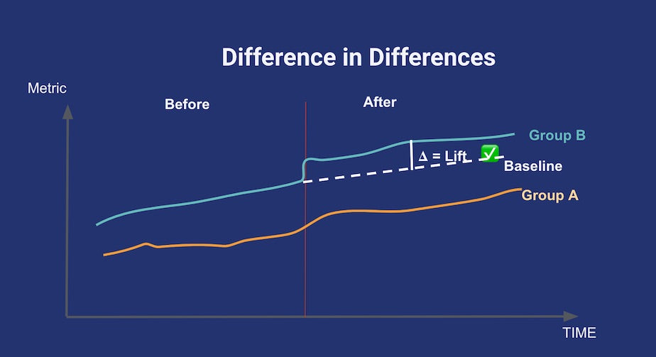
The parallel trends assumption for differences-in-differences. In the absence of treatment, the difference between the ‘treatment’ and ‘control’ group is a constant. Plotting both lines in a temporal graph like this can help check the validity of the assumption. Credits to Youcef Msaid.
The second is also a very popular method in causal inference: difference in difference. For this method to be applicable, you have to find a control group that shows a trend that’s parallel to your treatment group for the metric of interest, prior to any treatment being applied. Then, after treatment happens, you assume the break in the parallel trend is only due to the treatment itself. This is summed up in the above diagram.
Finally, there will be cases when you’ll want to try to detect causal factors from data that only consists of observations of the treatment. A classic example in tech is estimating the effect of a new feature that was released to all the user base at once: no A/B test was done and there’s absolutely no one that could be the control group. In this case, you can try making a counterfactual estimation (rung three).
The idea behind counterfactual estimation is to create a model that allows you to compute a counterfactual control group. In other words, you estimate what would happen had this feature not existed. It isn’t always simple to compute an estimate. However, if you have a model of your users that you’re confident about, then you have enough material to start doing counterfactual causal analyses!
Example of time series counterfactual vs. observed data
A good way to explain counterfactuals is with an example. A few months ago, my team faced a situation where we needed to assess the impact of a security update. The security update was important and it was rolled out to everyone, however it introduced friction for users. We wanted to see if this added friction caused a decrease in usage. Of course, we had no way of finding a control group among our users.
With no control group, we created a time-series model to get a robust counterfactual estimation of usage of the updated feature. We trained the model on data such as usage of other features not impacted by the security update and global trends describing the overall level of activity on Shopify. All of these variables were independent from the security update we were studying. When we compared our model’s prediction to actuals, we found that there was no lift. This was a great null result which showed that the new security feature did not negatively affect usage.
When using counterfactual methods, the quality of your prediction is key. If a confounding factor that’s independent from your newest rollout varies, you don’t want to attribute this change to your feature. For example, if you have a model that predicts daily usage of a certain feature, and a competitor launches a similar feature right after yours, your model won’t be able to account for this new factor. Domain expertise and rigorous testing are the best tools to do counterfactual causal inference. Let’s dive into that a bit more.
While quasi-experiments and counterfactuals are great methods when you can’t perform a full randomization, these methods come at a cost! The tradeoff is that it’s much harder to compute sensible confidence intervals, and you’ll generally have to deal with a lot more uncertainty—false positives are frequent. The key to avoiding falling into traps is robustness checks.
Robustness really isn't that complicated. It just means clearly stating assumptions your methods and data rely on, and gradually relaxing each of them to see if your results still hold. It acts as an efficient coherence check if you realize your findings can dramatically change due to a single variable, especially if that variable is subject to noise, error measurement, etc.
Direct Acyclic Graphs (DAGs) are a great tool for checking robustness. They help you clearly spell out assumptions and hypotheses in the context of causal inference. Popularized by the famous computer scientist, Judea Pearl, DAGs have gained a lot of traction recently in tech and academic circles.
At Shopify, we’re really fond of DAGs. We often use Dagitty, a handy browser-based tool. In a nutshell, when you draw an assumed chain of causal events in Dagitty, it provides you with robustness checks on your data, like certain conditional correlations that should vanish. I recommend you explore the tool
Let’s quickly recap the most important points regarding causal inference:
I love causal inference applications for business and I think there is a huge untapped potential in the industry. Just like generalizing A/B tests lead to building a very successful “Experimentation Culture” since the end of the 1990s, I hope the 2020s and beyond will be an era of the “Causal Culture” as a whole! I hope sharing how we do it at Shopify will help. If any of this sounds interesting to you, we’re looking for talented data scientists to join our team.
Application databases are generally designed to only track current state. For example, a typical user’s data model will store the current settings for each user. This is known as a Type 1 dimension. Each time they make a change, their corresponding record will be updated in place:
|
id |
feature_x_enabled |
created_at |
updated_at |
|
1 |
true |
2019-01-01 12:14:23 |
2019-01-01 12:14:23 |
|
2 |
false |
2019-01-01 15:21:45 |
2019-01-02 05:20:00 |
This makes a lot of sense for applications. They need to be able to rapidly retrieve settings for a given user in order to determine how the application behaves. An indexed table at the user grain accomplishes this well.
But, as analysts, we not only care about the current state (how many users are using feature “X” as of today), but also the historical state. How many users were using feature “X” 90 days ago? What is the 30 day retention rate of the feature? How often are users turning it off and on? To accomplish these use cases we need a data model that tracks historical state:
|
id |
feature_x_enabled |
valid_from |
valid_to |
is_current |
|
1 |
true |
2019-01-01 12:14:23 |
2019-01-01 12:14:23 |
true |
|
2 |
true |
2019-01-01 15:21:45 |
2019-01-02 05:20:00 |
false |
|
2 |
false |
2019-01-02 05:20:00 |
|
true |
This is known as a Type 2 dimensional model. I’ll show how you can create these data models using modern ETL tooling like PySpark and dbt (data build tool).
I currently work as a data scientist in the International product line at Shopify. Our product line is focused on adapting and scaling our product around the world. One of the first major efforts we undertook was translating Shopify’s admin in order to make our software available to use in multiple languages.
 Shopify admin translated
At Shopify, data scientists work across the full stack—from data extraction and instrumentation, to data modelling, dashboards, analytics, and machine learning powered products. As a product data scientist, I’m responsible for understanding how our translated versions of the product are performing. How many users are adopting them? How is adoption changing over time? Are they retaining the new language, or switching back to English? If we default a new user from Japan into Japanese, are they more likely to become a successful merchant than if they were first exposed to the product in English and given the option to switch? In order to answer these questions, we first had to figure out how our data could be sourced or instrumented, and then eventually modelled.
The functionality that decides which language to render Shopify in is based on the language setting our engineers added to the users data model.
|
id |
language |
… |
created_at |
updated_at |
|
1 |
en |
|
2019-01-01 12:14:23 |
2019-06-01 07:15:03 |
|
2 |
ja |
|
2019-02-02 11:00:35 |
2019-02-02 11:00:35 |
|
… |
… |
… |
… |
… |
User 1 will experience the Shopify admin in English, User 2 in Japanese, etc... Like most data models powering Shopify’s software, the users model is a Type 1 dimension. Each time a user changes their language, or any other setting, the record gets updated in place. As I alluded to above, this data model doesn’t allow us to answer many of our questions as they involve knowing what language a given user is using at a particular point in time. Instead, we needed a data model that tracked user’s languages over time. There are several ways to approach this problem.
In an ideal world, the core application database model will be designed to track state. Rather than having a record be updated in place, the new settings are instead appended as a new record. Due to the fact that the data is tracked directly in the source of truth, you can fully trust its accuracy. If you’re working closely with engineers prior to the launch of a product or new feature, you can advocate for this data model design. However, you will often run into two challenges with this approach:
In the case of rendering languages for the Shopify admin, the language field was added to the pre-existing users model, and updating this model design was out of the question.

System that extracts newly created or updated records from the application databases on a fixed schedule
At most technology companies, snapshots of application database tables are extracted into the data warehouse or data lake. At Shopify, we have a system that extracts newly created or updated records from the application databases on a fixed schedule.
Using these snapshots, one can leverage them as an input source for building a Type 2 dimension. However, given the fixed schedule nature of the data extraction system, it is possible that you will miss updates happening between one extract and the next.
If you are using dbt for your data modelling, you can leverage their nice built-in solution for building Type 2’s from snapshots!

Newly created or updated record is stored in this log in Kafka
Another alternative is to add a new event log. Each newly created or updated record is stored in this log. At Shopify, we rely heavily on Kafka as a pipeline for transferring real-time data between our applications and data land, which makes it an ideal candidate for implementing such a log.
If you work closely with engineers, or are comfortable working in your application codebase, you can get new logging in place that will stream any new or updated record to Kafka. Shopify is built on the Ruby on Rails web framework. Rails has something called “Active Record Callbacks”, which allows you to trigger logic before or after an alternation of an object’s (read “database records”) state. For our use case, we can leverage the after_commit callback to log a record to Kafka after it has been successfully created or updated in the application database.
While this option isn’t perfect, and comes with a host of other caveats I will discuss later, we ended up choosing it as it was the quickest and easiest solution to implement that provided the required granularity.
Below, I’ll walk through some recipes for building Type 2 dimensions from the event logging option discussed above. We’ll stick with our example of modelling user’s languages over time and work with the case where we’ve added event logging to our database model from day 1 (i.e. when the table was first created). Here’s an example of what our user_update event log would look like:
|
id |
language |
created_at |
updated_at |
|
1 |
en |
2019-01-01 12:14:23 |
2019-01-01 12:14:23 |
|
2 |
en |
2019-02-02 11:00:35 |
2019-02-02 11:00:35 |
|
2 |
fr |
2019-02-02 11:00:35 |
2019-02-02 12:15:06 |
|
2 |
fr |
2019-02-02 11:00:35 |
2019-02-02 13:01:17 |
|
2 |
en |
2019-02-02 11:00:35 |
2019-02-02 14:10:01 |
This log describes the full history of the users data model.
2019-01-01 12:14:23 with English as the default language.2019-02-02 11:00:35 with English as the default language.2019-02-02 12:15:06.2019-02-02 13:01:17.2019-02-02 14:10:01.Our goal is to transform this event log into a Type 2 dimension that looks like this:
|
id |
language |
valid_from |
valid_to |
is_current |
|
1 |
en |
2019-01-01 12:14:23 |
|
true |
|
2 |
en |
2019-02-02 11:00:35 |
2019-02-02 12:15:06 |
false |
|
2 |
fr |
2019-02-02 12:15:06 |
2019-02-02 14:10:01 |
false |
|
2 |
en |
2019-02-02 14:10:01 |
|
true |
We can see that the current state for all users can easily be retrieved with a SQL query that filters for WHERE is_current. These records also have a null value for the valid_to column, since they are still in use. However, it is common practice to fill these nulls with something like the timestamp at which the job last ran, since the actual values may have changed since then.
Due to Spark’s ability to scale to massive datasets, we use it at Shopify for building our data models that get loaded to our data warehouse. To avoid the mess that comes with installing Spark on your machine, you can leverage a pre-built docker image with PySpark and Jupyter notebook pre-installed. If you want to play around with these examples yourself, you can pull down this docker image with docker pull jupyter/pyspark-notebook:c76996e26e48 and then run docker run -p 8888:8888 jupyter/pyspark-notebook:c76996e26e48 to spin up a notebook where you can run PySpark locally.
We’ll start with some boiler plate code to create a Spark dataframe containing our sample of user update events:
With that out of the way, the first step is to filter our input log to only include records where the columns of interest were updated. With our event instrumentation, we log an event whenever any record in the users model is updated. For our use case, we only care about instances where the user’s language was updated (or created for the first time). It’s also possible that you will get duplicate records in your event logs, since Kafka clients typically support “at-least-once” delivery. The code below will also filter out these cases:
We now have something that looks like this:
|
id |
language |
updated_at |
|
1 |
en |
2019-01-01 12:14:23 |
|
2 |
en |
2019-02-02 11:00:35 |
|
2 |
fr |
2019-02-02 12:15:06 |
|
2 |
en |
2019-02-02 14:10:01 |
The last step is fairly simple; we produce one record per period for which a given language was enabled:
|
id |
language |
valid_from |
valid_to |
is_current |
|
1 |
en |
2019-01-01 12:14:23 |
2020-05-23 00:56:49 |
true |
|
2 |
en |
2019-02-02 11:00:35 |
2019-02-02 12:15:06 |
false |
|
2 |
fr |
2019-02-02 12:15:06 |
2019-02-02 14:10:01 |
false |
|
2 |
en |
2019-02-02 14:10:01 |
2020-05-23 00:56:49 |
true |
dbt is an open source tool that lets you build new data models in pure SQL. It’s a tool we are currently exploring using at Shopify to supplement modelling in PySpark, which I am really excited about. When writing PySpark jobs, you’re typically taking SQL in your head, and then figuring out how you can translate it to the PySpark API. Why not just build them in pure SQL? dbt lets you do exactly that:
With this SQL, we have replicated the exact same steps done in the PySpark example and will produce the same output shown above.
I’ve leveraged the approaches outlined above with multiple data models now. Here are a few of the things I’ve learned along the way.
1. It took us a few tries before we landed on the approach outlined above.
In some initial implementations, we were logging the record changes before they had been successfully committed to the database, which resulted in some mismatches in the downstream Type 2 models. Since then, we’ve been sure to always leverage the after_commit callback based approach.
2. There are some pitfalls with logging changes from within the code:
after_commit call. These are rare, but can happen. A good safeguard against this is to leverage tooling like the CODEOWNERS file, which notifies you when a particular part of the codebase is being changed.User model when making changes to records in the database.3. It is possible to lose some events in the Kafka process.
For example, if one of the Shopify servers running the Ruby code were to fail before the event was successfully emitted to Kafka, you would lose that update event. Same thing if Kafka itself were to go down. Again, rare, but nonetheless something you should be willing to live with. There are a few ways you can mitigate the impact of these events:
4. If deletes occur in a particular data model, you need to implement a way to handle this.
Otherwise, the deleted events will be indistinguishable from normal create or update records with the logging setup I showed above. Here are some ways around this:
create, update, or delete), and then handle accordingly in your Type 2 model code.Implementing Type 2 dimensional models for Shopify’s admin languages was truly an iterative process and took investment from both data and engineering to successfully implement. With that said, we have found the analytical value of the resulting Type 2 models well worth the upfront effort.
Looking ahead, there’s an ongoing project at Shopify by one of our data engineering teams to store the MySQL binary logs (binlogs) in data land. Binlogs are a much better source for a log of data modifications, as they are directly tied to the source of truth (the MySQL database), and are much less susceptible to data loss than the Kafka based approach. With binlog extractions in place, you don’t need to add separate Kafka event logging to every new model as changes will be automatically tracked for all tables. You don’t need to worry about code changes or other processes making updates to the data model since the binlogs will always reflect the changes made to each table. I am optimistic that with binlogs as a new, more promising source for logging data modifications, along with the recipes outlined above, we can produce Type 2s out of the box for all new models. Everybody gets a Type 2!
Once we have our data modelled as a Type 2 dimension, there are a number of questions we can start easily answering:
Humans generate a lot of data. Every two days we create as much data as we did from the beginning of time until 2003! The International Data Corporation estimates the global datasphere totaled 33 zettabytes (one trillion gigabytes) in 2018. The estimate for 2025 is 175 ZBs, an increase of 430%. This growth is challenging organizations across all industries to rethink their data pipelines.
The nature of data usage is problem driven, meaning data assets (tables, reports, dashboards, etc.) are aggregated from underlying data assets to help decision making about a particular business problem, feed a machine learning algorithm, or serve as an input to another data asset. This process is repeated multiple times, sometimes for the same problems, and results in a large number of data assets serving a wide variety of purposes. Data discovery and management is the practice of cataloguing these data assets and all of the applicable metadata that saves time for data professionals, increasing data recycling, and providing data consumers with more accessibility to an organization’s data assets.
To make sense of all of these data assets at Shopify, we built a data discovery and management tool named Artifact. It aims to increase productivity, provide greater accessibility to data, and allow for a higher level of data governance.
Data discovery and management is applicable at every point of the data process:
| Acquire |
|
| Transform |
|
| Model |
|
| Apply |
|
High level data process
The data discovery issues at Shopify can be categorized into three main challenges: curation, governance, and accessibility.
“Is there an existing data asset I can utilize to solve my problem?”
Before Artifact, finding the answer to this question at Shopify often involved asking team members in person, reaching out on Slack, digging through GitHub code, sifting through various job logs, etc. This game of information tag resulted in multiple sources of truth, lack of full context, duplication of effort, and a lot of frustration. When we talked to our Data team, 80% felt the pre-Artifact discovery process hindered their ability to deliver results. This sentiment dropped to 41% after Artifact was released.
The current discovery process hinders my ability to deliver results survey answers
“Who is going to be impacted by the changes I am making to this data asset?”
Data governance is a broad subject that encompasses many concepts, but our challenges at Shopify are related to lack of granular ownership information and change management. The two are related, but generally refer to the process of managing data assets through their life cycle. The Data team at Shopify spent a considerable amount of time understanding the downstream impact of their changes, with 16% of the team feeling they understood how their changes impacted other teams:

I am able to easily understand how my changes impact other teams and downstream consumers survey answers
Each data team at Shopify practices their own change management process, which makes data asset revisions and changes hard to track and understand across different teams. This leads to loss of context for teams looking to utilize new and unfamiliar data assets in their workflows. Artifact has helped each data team understand who their downstream consumers are, with 46% of teams now feeling they understand the impact their changes have on them.
“How many merchants did we have in Canada as of January 2020?”
Our challenge here is surfacing relevant, well documented data points our stakeholders can use to make decisions. Reporting data assets are a great way to derive insights, but those insights often get lost in Slack channels, private conversations, and archived powerpoint presentations. Lack of metadata surrounding these report/dashboard insights directly impacts decision making, causes duplication of effort for the Data team, and increases the stakeholders’ reliance on data as a service model that in turn inhibits our ability to scale our Data team.
We spent a considerable amount of time talking to each data team and their stakeholders. On top of the higher level challenges described above, there were two deeper themes that came up in each discussion:
Working off of these themes, we wanted to build a couple of different entry points to data discovery, enable our end users to quickly iterate through their discovery workflows, and provide all available metadata in an easily consumable and accessible manner.
Artifact is a search and browse tool built on top of a data model that centralizes metadata across various data processes. Artifact allows all teams to discover data assets, their documentation, lineage, usage, ownership, and other metadata that helps users build the necessary data context. This tool helps teams leverage data more effectively in their roles.

Artifact Landing Page
Artifact’s landing page offers a choice to either browse data assets from various teams, sources, and types, or perform a plain English search. The initial screen is preloaded with all data assets ordered by usage, providing users who aren’t sure what to search for a chance to build context before iterating with search. We include the usage and ownership information to give the users additional context: highly leveraged data assets garner more attention, while ownership provides an avenue for further discovery.

Artifact Search Results
Artifact leverages Elasticsearch to index and store a variety of objects: data asset titles, documentation, schema, descriptions, etc. The search results provide enough information for users to decide whether to explore further, without sacrificing the readability of the page. We accomplished this by providing the users with data asset names, descriptions, ownership, and total usage.

Artifact Data Asset Details
Clicking on the data asset leads to the details page that contains a mix of user and system generated metadata organized across horizontal tabs, and a sticky vertical nav bar on the right hand side of the page.
The lineage information is invaluable to our users as it:
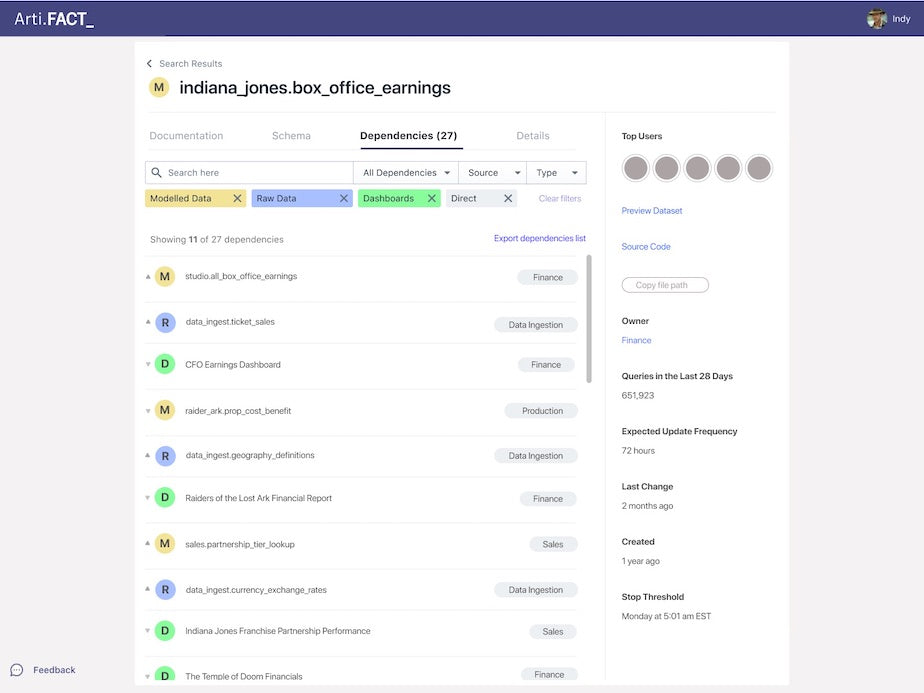
Artifact Data Asset Lineage
This lineage feature is powered by a graph database, and allows the users to search and filter the dependencies by source, direction (upstream vs. downstream), and lineage distance (direct vs. indirect).
Before starting the build, we decided on these guiding principles:
Artifact High Level Architecture
With these in mind, we started with a generic data model, and a simple metadata ingestion pipeline that pulls the information from various data stores and processes across Shopify. The metadata extractor also builds the dependency graph for our lineage feature. Once processed, the information is stored in Elasticsearch indexes, and GraphQL APIs expose the data via an Apollo client to the Artifact UI.
The recent growth in data, and applications utilizing data, has given rise to data management and cataloguing tooling. We researched a couple of enterprise and open source solutions, but found the following challenges were common across all tools:
With these factors in mind, the buy option would’ve required heavy customization, technical debt, and large efforts for future integrations. So, we went with the build option as it was:
The architecture diagram above shows the metadata sources our pipeline ingests. During the technical design phase of the build, we reached out to the teams responsible for maintaining the various data tools across the organization. The ideal solution was for each tool to expose a metadata API for us to consume. All of the teams understood the value in what we were building, but writing APIs was new incremental work to their already packed roadmaps. Since pulling the metadata was an acceptable workaround and speed to market was a key factor, we chose to write jobs that pull the metadata from their processes; with the understanding that a future optimization will include metadata APIs for each data service.
Our data processes create a multitude of data assets: datasets, views, tables, streams, aliases, reports, models, jobs, notebooks, algorithms, experiments, dashboards, CSVs, etc. During the initial exploration and technical design, we realized we wouldn’t be able to support all of them with our initial release. To cut down the data assets, we evaluated each against the following criteria:
Based on our analysis, we decided to integrate the top queryable data assets first, along with their downstream reports and dashboards. The end users would get the highest level of impact with the least amount of build time. The rest of the data assets were prioritized accordingly, and added to our roadmap.
Since its launch in early 2020, Artifact has been extremely well received by data and non-data teams across Shopify. In addition to the positive feedback and the improved sentiment, we are seeing over 30% of the Data team using the tool on a weekly basis, with a monthly retention rate of over 50%. This has exceeded our expectations of 20% of the Data team using the tool weekly, with a 33% monthly retention rate.
Our short term roadmap is focused on rounding out the high impact data assets that didn’t make the cut in our initial release, and integrating with new data platform tooling. In the mid to long term, we are looking to tackle data asset stewardship, change management, introduce notification services, and provide APIs to serve metadata to other teams. The future vision for Artifact is one where all Shopify teams can get the data context they need to make great decisions.
Artifact aims to be a well organized toolbox for our teams at Shopify, increasing productivity, reducing the business owners’ dependence on the Data team, and making data more accessible.
Are you passionate about data discovery and eager to learn more, we’re always hiring! Reach out to us or apply on our careers page.
At Shopify, our mission is to make commerce better for everyone. With over one million businesses in more than 175 countries, Shopify is a mini-economy with merchants, partners, buyers, carriers, and payment providers all interacting. Careful and thoughtful planning helps us build products that positively impact the entire system.
Commerce is a rapidly changing environment. Shopify’s Data Science & Engineering team supports our internal teams, merchants, and partners with high quality, daily insights so they can “Make great decisions quickly.” Here are the foundational approaches to data warehousing and analysis that empower us to deliver the best results for our ecosystem.
One of the first things we do when we onboard (at least when I joined) is get a copy of The Data Warehouse Toolkit by Ralph Kimball. If you work in Data at Shopify, it’s required reading! Sadly it’s not about fancy deep neural nets or technologies and infrastructure. Instead, it focuses on data schemas and best practices for dimensional modelling. It answers questions like, “How should you design your tables so they can be easily joined together?” or “Which table makes the most sense to house a given column?” In essence, it explains how to take raw data and put it in a format that is queryable by anyone.
I’m not saying that this is the only good way to structure your data. For what it's worth, it could be the 10th best strategy. That doesn’t matter. What counts is that we agreed, as a Data Team, to use this modelling philosophy to build Shopify's data warehouse. Because of this agreed upon rule, I can very easily surf through data models produced by another team. I understand when to switch between dimension and fact tables. I know that I can safely join on dimensions because they handle unresolved rows in a standard way—with no sneaky nulls silently destroying rows after joining.
The modelled data approach has a number of key benefits for working faster and more collaboratively. These are crucial as we continue to provide insights to our stakeholders and merchants in a rapidly changing environment.
Key Benefits
We have a single data modelling platform. It’s built on top of Spark in a single GitHub repo that everyone at Shopify can access, and everyone uses it. With everyone using the same tools as me, I can gather context quickly and independently: I know how to browse Ian's code, I can find where Ben has put the latest model, etc. I simply need to pick a table name and I can see 100% of the code that built that model.
What is more, all of our modelled data sits on a Presto Cluster that’s available to the whole company, and not just data scientists (except PII information). That’s right! Anyone at the company can query our data. We also have internal tools to discover these data sets. That openness and consistency makes things scalable.
Key Benefits
As a company focused on software, the skills we’ve developed as a Data Team were influenced by our developer friends. All of our data pipeline jobs are unit tested. We test every situation that we can think of: errors, edge cases, and so on. This may slow down development a bit, but it also prevents many pitfalls. It’s easy to lose track of a JOIN that occasionally doubles the number of rows under a specific scenario. Unit testing catches this kind of thing more often than you would expect.
We also ensure that the data pipeline does not let jobs fail in silence. While it may be painful to receive a Slack message at 4 pm on Friday about a five-year-old dataset that just failed, the system ensures you can trust the data you play with to be consistently fresh and accurate.
Key Benefits
Like our data pipeline, we have one main visualization engine. All finalized reports are centralized on an internal website. Before blindly jumping into the code like a university student three hours before a huge deadline, we can go see what others have already published. In most cases, a significant portion of the metrics you’re looking for are already accessible to everyone. In other cases, an existing dashboard is pretty close to what we’re looking for. Since the base code for every dashboard is centralized, this is a great starting point.
Key Benefits
All data points that form the basis for major decisions, or that need to be published externally are what we call vetted data points. They’re stored together with the context we need to understand them. This includes the original question, its answer, and the code that generated the results. One of the fundamentals in producing vetted data points is that the result shouldn’t change over time. For example, if I ask how many merchants were on the platform in Q1 2019, the answer should be the same today and in 4 years from now. Sounds trivial, but it’s harder than it looks! By having it all in a single GitHub repo, it's discoverable, reproducible, and easy to update each year
Key Benefits
All of our work is peer reviewed, usually by at least two other data scientists. Even my boss and my boss's boss go through this. This is another practice we gleaned by working closely with developers. Dashboards, vetted data points, dimensional models, unit tests, data extraction, etc… it’s all reviewed. Knowing several people looked at a query invokes a high level of trust in the data across the company. When we do work that touches more than one team, we make sure to involve reviewers from both teams. When we touch raw data, we add developers as reviewers. These tactics really improve the overall quality of data outputs by ensuring pipeline code and analytics meet a high standard that is upheld across the team.
Key Benefits
Now for my favourite part: all analyses require a deep understanding of the product. At Shopify, we strive to fall in love with the problem, not the tools. Excellence doesn’t come from just looking at the data, but from understanding what it means for our merchants.
One way we do this is to divide the Data Team into smaller sub-teams, each of which is associated with a product (or product area). A clear benefit is that sub-teams become experts about a specific product and its data. We know it inside and out! We truly understand what enable means in the column status of some table.
Product knowledge allows us to slice and dice quickly at the right angles. This has allowed us to focus on metrics that are vital for our merchants. Deep product understanding also allows us to guide stakeholders to good questions, identify confounding factors to account for in analyses, and design experiments that will really influence the direction of Shopify’s products.
Of course, there is a downside, which I call the specialist gap: sub-teams have less visibility into other products and data sources. I’ll explain how we address that soon.
Key Benefits
What is the point of insights if you don’t share them? Our philosophy is that discovering an insight is only half the work. The other half is communicating the result to the right people in a way they can understand.
We try to avoid throwing a solitary graph or a statistic at anyone. Instead, we write down the findings along with our opinions and recommendations. Many people are uncomfortable with this, but it’s crucial if you want a result to be interpreted correctly and spur the right actions. We can't expect non-experts to focus on a survival analysis. This may be the data scientist’s tool to understand the data, but don’t mistake it for the result.
On my team, every time anyone wants to communicate something, the message is peer reviewed, preferably by someone without much background knowledge of the problem. If they cannot understand your message, it’s probably not ready yet. Intuitively, it might seem best to review the work with someone who understands the importance of the message. However, assumptions about the message become clear when you engage someone with limited visibility. We often forget how much context we have on a problem when we’ve just finished working on it, so what we think is obvious might not be so obvious for others.
Key Benefits
Since Shopify went Digital by Default, I have worked with many people I’ve never met, and they’ve all been incredible! Because we share the same assumptions about the data and underlying frameworks, we understand each other. This enables us to work collaboratively with no restrictions in order to tackle important challenges faced by our merchants. Take COVID-19 for example. We created a fully cross-functional task force with one champion per data sub-team to close the specialist gap I mentioned previously. We meet to share findings on a daily basis and collaborate on deep dives that may require or affect multiple products. Within hours of establishing this task force, the team was running at full speed. Everyone has been successfully working together towards one goal, making things better for our merchants, without being constrained to their specific product area.
Key Benefits
If you share some game-changing insights with a big decision maker at your company, do they listen? At Shopify, leaders might not action every single recommendation from Data because there are other considerations to weigh, but they definitely listen. They’re keen to consider anything that could help our merchants.
Shopify announced several features at Reunite to help merchants like gift card features for all merchants and the launch of local deliveries. The Data Team provided many insights that influenced these decisions.
At the end of the day, it is the data scientists job to make sure insights are understood by the key people. That being said, having leaders that listen helps a lot. Our company’s attitude towards data transforms our work from interesting to impactful.
Key Benefits
Shopify isn’t perfect. However, our emphasis on foundations and building for the long term is paying off. No one on the Data Team needs to start from scratch. We leverage years of data work to uncover valuable insights. Some we get from existing dashboards and vetted data points. In other cases, modelled data allows us to calculate new metrics with fewer than 50 lines of SQL. Shopify’s culture of data sharing, collaboration, and informed decision making ensures these insights turn into action. I am proud that our investment in foundations is positively impacting the Data Team and our merchants.
Data is key to making great decisions at scale, so it’s no surprise that all new hires in RnD (Research & Development) at Shopify are invited to take a 90-minute hands-on workshop to learn about Shopify’s data practices, architecture, and some SQL. Since RnD is a multi-disciplinary organization, participants come from a variety of technical backgrounds ( engineering, data science, UX, project management) and sometimes non-technical disciplines that work closely with engineering teams. We split the workshop into two groups: a beginner-friendly group that assumes no prior knowledge of SQL or other data tools, and an intermediate group for those with familiarity.
Beginners have little-to-no experience with SQL, although they may have experience with other programming languages. Still, many participants aren’t programmers or data analysts. They’ve never encountered databases, tables, data models, and have never seen a SQL query. The goal is to empower them to responsibly use the data available to them to discover insights and make better decisions in their work.
That’s a lofty goal to achieve in 90 minutes, but creating an engaging, interactive workshop can help us get there. Here are some of the approaches we use to help participants walk away equipped and excited to start using data to power their work.
Before learning to query and analyze data, you should first know some basics about where the data comes from and how to use it responsibly. Data Scientists at Shopify are responsible for acquiring and preprocessing data, and generating data models that can be leveraged by anyone looking to query the data. This means participants of the workshop, who aren’t data scientists, won’t be expected to know how to collect and clean big data, but should understand how the data available to them was collected. We take the first 30 minutes to walk participants through the basics of the data warehouse architecture:

Data Warehouse Architecture
We also caution participants to use data ethically and responsibly. We warn them not to query production systems directly, rely on modelled data when possible, and respect data privacy. We also give them tools that will help them find and understand datasets (even if that “tool” is to ask a data scientist for help). By the time they are ready to start querying, they should have an appreciation for how datasets have been prepared and what they can do with them.
At Shopify, anyone in RnD has access to tools to help them query and analyze data extracted from the ecosystem of apps and services that power Shopify. Our workshop doesn’t play around with dummy data—participants go right into using real data from our production systems, and learn the tools they’ll be using throughout their career at Shopify.
If you have multiple tools available, choose one that has a simple querying interface, easy chart-building capabilities, and is connected (or can easily be connected) to your data source. We use Mode Analytics, which has a clean console UI, drag-and-drop chart and report builders, clean error feedback, and a pane for searching and previewing data sources from our data lake.
In addition to choosing the right tool, the dataset can make or break the workshop. Choosing a complex dataset with cryptic column names that is poorly documented, or one that requires extensive domain knowledge will draw the attention of the workshop away from learning to query. Instead, participants will be full of questions about what their data means. For these reasons, we often use our support tickets dataset. Most people understand the basic concepts of customer support: a customer who has an issue submits a ticket for support and an agent handles the question and closes the ticket once it’s been solved. That ticket’s information exists in a table where we have access to facts like when the ticket was created, when it was solved, who it was handled by, what customer it was linked to, and more. As a rule of thumb, if you can explain the domain and the structure of the data in 3 sentences or less, it’s a good candidate to use in a beginner exercise.
To figure out what your workshop should touch, it’s often helpful to think about the types of questions you want your participants to be able to answer. At the very least, you should introduce the SELECT, FROM, WHERE, ORDER BY, and LIMIT clauses. These are foundational for almost any type of question participants will want to answer. Additional techniques can depend on your organization’s goals.
Some of the most common questions we often answer with SQL include basic counts, trends over time, and segmenting metrics by certain user attributes. For example, a question we might get in Support is “How many tickets have we processed monthly for merchants with a Shopify Plus plan?”, or “What was the average handling time of tickets in January 2020?”
For our workshop, we teach participants foundations of SQL that include the keywords SELECT, DISTINCT, FROM, WHERE, JOIN, GROUP BY, and ORDER BY, along with functions like COUNT, AVG, and SUM. We believe this provides a solid foundation to answer almost any type of question someone outside of Data Science could be able to self-solve.
Do you remember the most common question from your high school math classes? If it was anything like my classroom, it was probably, “When will we actually need to know this in the real world?” Linking the techniques to real questions helps all audiences grasp the “why” behind what we’re doing. It also helps participants identify real use cases of the queries they build and how they can apply queries to their own product areas, which motivates them to keep learning!
Once you have an idea what keywords and functions you want to include in your workshop, you’ll need to figure out how you want to teach them to your participants. Using the dataset you chose for the workshop, construct some interesting questions and identify the workshop objectives required for each question.

Identifying Objectives and Questions
It also helps to have one big goal question for participants to aim to answer. Ideally, answering the question should result in a valuable, actionable insight. For example, using the domain of support tickets, our goal question can be “How have wait times for customers with a premium plan changed over time?” Answers to this question can help identify trends and bottlenecks in our support service, so participants can walk away knowing their insights can solve real problems.
A beginner-friendly exercise should start with the simplest question and work its way toward answering the goal question.
An important part of any analysis is the initial exploration. When we encounter new data sources, we should always spend time understanding the structure and quality of the data before trying to build insights off it. For example, we should know what the useful columns for our analysis will be, the ranges for any numerical or date columns, the unique values for any text columns, and the filtering we’ll need to apply later, such as filtering out test tickets created by the development team.
The first query we run with participants is always a simple “SELECT * FROM {table}”. Not only does this introduce participants to their first keywords, but it gives us a chance to see what the data in the table looks like. We then learn how to select specific columns and apply functions like MIN, MAX, or DISTINCT to explore ranges.
Earlier, we talked about identifying real questions we want to have participants answer with SQL. It turns out that it only really requires one or two additional keywords or functions to answer increasingly-difficult questions from a simple query.
We discussed how participants start with a simple “SELECT * FROM {tickets_table}” query to explore the data. This forms the foundational query used for the rest of the exercise. Next, we might start adding keywords or functions in this sequence:
Question → Objective
Each question above can be built from the prior query and the addition of up to two new concepts, and already participants can start deriving some interesting insights from the data!
Unfortunately, there’s only so far we can go in a single 90-minute workshop and we won’t be able to answer every question participants may have. However, there are many free resources out there for those who want to keep learning. Before we part, here’s a list of my favourite learning resources from beginner to advanced levels.
I haven’t run into anyone in RnD at Shopify who hasn’t used SQL in some capacity. Those who invest time into learning it are often able to use the available data tools to 10x their work. When employees are empowered to self-serve their data, they have the ability to quickly gather information that helps them make better decisions.
There are many benefits to learning SQL, regardless of discipline. SQL is a tool that can help us troubleshoot issues, aggregate data, or identify trends and anomalies. As a developer, you might use SQL to interact with your app’s databases. A UX designer can use SQL to get some basic information on the types of users using their feature and how they interact with the product. SQL helps technical writers explore pageview and interaction data of their documents to inform how they should spend their time updating documents that may be stale or filling resource gaps. The opportunities are endless when we empower everyone.
Learn SQL from the ground up with these free resources! Don’t be discouraged by the number of resources shared below - pick and choose which resources best fit your learning style and goals. See the comments section to understand the key concepts you should learn. If you choose to skip a resource, make sure you understand any concepts listed before moving on.
Database management systems allow data to be stored and accessed in a computer system. At Shopify, many applications store their data inRelational Database Management Systems (RDMS). It can be useful to understand the basics behind RDMS since much of the raw data we encounter will come from these databases, which can be “spoken to” with SQL. Learning about RDMS also exposes you to concepts like tables, keys, and relational operations that are helpful in learning SQL.
|
Source |
Comments |
|
This free course introduces databases for developers. Complete the 1st lesson to learn about data and tables. Complete the rest of the lessons if they interest you, or continue on with the rest of the resources |
|
|
This free MOOC from Stanford University is a great resource for tailoring your learning path to your specific goals. Unfortunately as of March 2020, the Lagunita online learning platform was retired and they are working on porting the course over to edx.org. Stay tuned for these resources to come back online! When they become available, check out the following videos: Introduction, Relational Model, Querying Relational Databases Some terms you should be familiar with at this point: data model, schema, DDL (Data Definition Language), DML (Data Manipulation Language), Columns/attributes, Rows, Keys (primary and foreign keys), Constraints, and Null values |
|
|
While the Stanford MOOC is being migrated, this course may be the next best thing. It covers many of the concepts discussed above |
|
|
This is another comprehensive course that covers relational models and querying. This is part of a specialization focusing on business intelligence warehousing, so there’s also some exposure to data modelling and normalization (advanced concepts!) |
Before learning the SQL syntax, it’s useful to familiarize yourself with some of the concepts listed in the prior section. You should understand the concept of a table (which has columns/attributes and rows), data types, and keys (primary and foreign keys).
|
Source |
Comments |
|
This series of interaction lessons will take you through the basics of SQL. Lessons 1-6 cover basic SQL exercises, and lessons 7-12 cover intermediate-level concepts. The remaining exercises are primarily for developers and focus on creating and manipulating tables. You should become familiar with SQL keywords like: SELECT, FROM, WHERE, LIMIT, ORDER BY, GROUP BY, and JOIN Intermediate-level concepts you should begin to understand include: aggregations, types of joins, unions |
|
|
This is a great read that breaks down all the keywords you’ve encountered so far in the most beginner-friendly way possible. If you’re still confused about what a keyword means, how to use it properly, or how to get the syntax right for the question you’re trying to answer (what order do these keywords go in?), this is a great resource to help you build your intuition. |
|
|
W3 has a comprehensive tutorial for learning SQL. I don’t recommend you start with w3, since it doesn’t organize the concepts in a beginner-friendly way as the other resources have done. But, even as an advanced SQL user, I still find their guides helpful as a reference. It’s also a good reference for understanding all the different JOIN types. |
|
|
For the audio-visual learners, this video lesson covers the basics of database management and SQL |
|
Source |
Comments |
|
|
Despite its name, this resource covers some topics I’d consider beyond the basic level. Learn about subqueries and aggregations.This site also has good notes on joins if you’re still trying to wrap your head around them. |
|
Complete the exercises here for some more hands-on practice |
|
|
Learn about the WITH keyword (also known as Common Table Expressions (CTE)) for writing more readable queries |
|
|
At Shopify, we use Mode to analyze data and create shareable reports. Mode has its own SQL tutorial that also shares some tips specific to working in the Mode environment. I find their section on the UNION operator more comprehensive than other sources. If you’re interested in advanced topics, you can also explore their advanced tutorials.> Complete some of their exercises in the Intermediate and Advanced sections. Notably, at this point you should start to become comfortable with aggregate functions - functions like COUNT, SUM, MIN, MAX, AVG, GROUP BY and HAVING keywords, CASE statements, joins, and date formats |
Here’s a full list of interactive exercises available:
And finally, bookmark this SQL cheat sheet for future reference
The journey to learning SQL can sometimes feel endless - there are many keywords, functions, or techniques that can help you craft readable, performant queries. Here are some advanced concepts that might be useful to add to your toolbelt.
Note: database systems and querying engines may have different functions built-in. At Shopify, we use Presto to query data across several datastores - consult the Presto docs on available functions
|
Source |
Comments |
|
Window functions are powerful functions that allow you to perform a calculation across a set of rows in a “window” of your data. The Mode SQL tutorial also shares some examples and practice problems for working with window functions |
|
|
Common Table Expressions, aka CTEs, allow you to create a query that can be reused throughout the context of a larger query. They are useful for enhancing the readability and performance of your query. |
|
|
|
The EXPLAIN keyword in Presto’s SQL engine allows you to see a visual representation of the operations performed by the engine in order to return the data required by your query, which can be used to troubleshoot performance issues. Other SQL engines may have alternative methods for creating an execution plan |
|
Grouping sets can be used in the GROUP BY clause to define multiple groupings in the same query |
|
|
Coalesce is used to evaluate a number of arguments and return the first non-NULL argument seen. For example, it can be used to set default values for a column holding NULL values. |
|
|
Explore functions for working with string values |
|
|
|
Explore functions for working with date and time values |
|
These “best practices” share tips for enhancing the performance of your queries |
|
|
Chris Saxon shares tips and tricks for advancing your SQL knowledge and tuning performance |
By: Jeet Mehta and Kathy Ge
With over 1M business owners now on Shopify, there are billions of products being created and sold across the platform. Just like those business owners, the products that they sell are extremely diverse! Even when selling similar products, they tend to describe products very differently. One may describe their sock product as a “woolen long sock,” whereas another may have a similar sock product described as a “blue striped long sock.”
How can we identify similar products, and why is that even useful?
Business owners come to our platform for its multiple sales/marketing channels, app and partner ecosystem, brick and mortar support, and so much more. By understanding the types of products they sell, we provide personalized insights to help them capitalize on valuable business opportunities. For example, when business owners try to sell on other channels like Facebook Marketplace, we can leverage our product categorization engine to pre-fill category related information and save them time.
In this blog post, we’re going to step through how we implemented a model to categorize all our products at Shopify, and in doing so, enabled cross-platform teams to deliver personalized insights to business owners. The system is used by 20+ teams across Shopify to power features like marketing recommendations for business owners (imagine: “t-shirts are trending, you should run an ad for your apparel products”), identification of brick-and-mortar stores for Shopify POS, market segmentation, and much more! We’ll also walk through problems, challenges, and technical tradeoffs made along the way.
To start off, how do we even come up with a set of categories that represents all the products in the commerce space? Business owners are constantly coming up with new, creative ideas for products to sell! Luckily, Google has defined their own hierarchical Google Product Taxonomy (GPT) which we leveraged in our problem.
The particular task of classifying over a large-scale hierarchical taxonomy presented two unique challenges:

Sample visualization of the GPT
With all machine learning problems, the first step is featurization, the process of transforming the available data into a machine-understandable format.
Before we begin, it’s worth answering the question: What attributes (or features) distinguish one product from another? Another way to think about this is if you, the human, were given the task of classifying products into a predefined set of categories: what would you want to look at?
Some attributes that likely come to mind are
These are the same attributes that a machine learning model would need access to in order to perform classification successfully. With most problems of this nature though, it’s best to follow Occam’s Razor when determining viable solutions.
Among competing hypotheses, the one with the fewest assumptions should be selected.
In simpler language, Occam’s razor essentially states that the simplest solution or explanation is preferable to ones that are more complex. Based on the computational complexities that come with processing and featurizing images, we decided to err on the simpler side and stick with text-based data. Thus, our classification task included features like
There are a variety of ways to vectorize text features like the above, including TF-IDF, Word2Vec, GloVe, etc. Optimizing for simplicity, we chose a simple term-frequency hashing featurizer using PySpark that works as follows:

HashingTF toy example
Given the vast size of our data (and the resulting size of the vocabulary), advanced featurization methods like Word2Vec didn’t scale since they involved storing an in-memory vocabulary. In contrast, the HashingTF provided fixed-length numeric features which scaled to any vocabulary size. So although we’re potentially missing out on better semantic representations, the upside of being able to leverage all our training data significantly outweighed the downsides.
Before performing the numeric featurization via HashingTF, we also performed a series of standard text pre-processing steps, such as:
string into an array of individual words or “tokens”.With our data featurized, we can now move towards modelling. Ensuring that we maintain a simple, interpretable, solution while tackling the earlier mentioned challenges of scale and structure was difficult.
Fortunately, during the process of solution discovery, we came across a method known as Kesler’s Construction [PDF]. This is a mathematical maneuver that enables the conversion of n one-vs-all classifiers into a single binary classifier. As shown in the figure below, this is achieved by exploding the training data with respect to the labels, and manipulating feature vectors with target labels to turn a multi-class training dataset into a binary training dataset.

Kesler’s Construction formulation
Applying this formulation to our problem implied pre-pending the target class to each token (word) in a given feature vector. This is repeated for each class in the output space, per feature vector. The pseudo-code below illustrates the process, and also showcases how the algorithm leads to a larger, binary-classification training dataset.
modified_training_data
feature_vector in the original_training_data:
feature_vector, called modified_feature_vector
feature_vector is an example of the class, append (modified_feature_vector, 1) to modified_training_data
modified_feature_vector, 0) to modified_training_data
modified_training_data
Note: In the algorithm above, a vector can be an example of a class if its ground truth category belongs to a class that’s a descendant of the category being compared to. For example, a feature vector that has the label Clothing would be an example of the Apparel & Accessories class, and as a result would be assigned a binary label of 1. Meanwhile, a feature vector that has the label Cell Phones would not be an example of the Apparel & Accessories class, and as a result would be assigned a binary label of 0.
Combining the above process with a simple Logistic Regression classifier allowed us to:
Great, we now have a trained model, how do we then make predictions to all products on Shopify? Here’s an example to illustrate. Say we have a sample product, a pair of socks, below:

Sample product entry for a pair of socks
We aggregate all of its text (title, description, tags, etc.) and clean it up using the Kesler’s Construction formulation resulting in the string:
“Check out these socks”
We take this sock product and compare it to all categories in the available taxonomy we trained on. To avoid computations on categories that will likely be low in relevance, we leverage the taxonomy structure and use a greedy approach in traversing the taxonomy.

Sample traversal of taxonomy at inference time
For each product, we prepend a target class to each token of the feature vector, and do so for every category in the taxonomy. We score the product against each root level category by multiplying this prepended feature vector against the trained model coefficients. We start at the root level and keep track of the category with the highest score. We then score the product against the children of the category with the highest score. We continue in this fashion until we’ve reached a leaf node. We output the full path from root to leaf node as a prediction for our sock product.
The model is built. How do we know if it’s any good? Luckily, the machine learning community has an established set of standards around evaluation metrics for models, and there are good practices around which metrics make the most sense for a given type of task.
However, the uniqueness of hierarchical classification adds a twist to these best practices. For example, commonly used evaluation metrics for classification problems include accuracy, precision, recall, and F1 Score. These metrics work great for flat binary or multi-class problems, but there are several edge cases that show up when there’s a hierarchy of classes involved.
Let’s take a look at an illustrating example. Suppose for a given product, our model predicts the following categorization: Apparel & Accessories > Clothing > Shirts & Tops. There’s a few cases that can occur, based on what the product actually is:

1. Product is a Shirt: In this case, we’re correct! Everything is perfect.
Product is a dress - Model example
2. Product is a Dress: Clearly, our model is wrong here. But how wrong is it? It still correctly recognized that the item is a piece of apparel and is clothing

3. Product is a Watch: Again, the model is wrong here. It’s more wrong than the above answer, since it believes the product to be an accessory rather than apparel.

Product is a phone - Model example
4. Product is a Phone: In this instance, the model is the most incorrect, since the categorization is completely outside the realm of Apparel & Accessories.
The flat metrics discussed above would punish each of the above predictions equally, when it’s clear that this isn’t the case. To rectify this, we leveraged work done by Costa et al. on hierarchical evaluation measures [PDF] which use the structure of the taxonomy (output space) to punish incorrect predictions accordingly. This includes:
As shown below, the calculation of the metrics largely remains the same as their original flat form. The difference is that these metrics are regulated by the distance to the nearest common ancestor. In the examples provided, Dresses and Shirts & Tops are only a single level away from having a common ancestor (Clothing). In contrast, Phones and Shirts & Tops are in completely different sub-trees, and are four levels away from having a common ancestor

Example hierarchical metrics for “Dresses” vs. “Shirts & Tops”
This distance is used as a proxy to indicate the magnitude of incorrectness of our predictions, and allows us to present, and better assess the performance of our models. The lesson here is to always question conventional evaluation metrics, and ensure that they indeed fit your use-case, and measure what matters.
Like all probabilistic models, our model is bound to be incorrect on occasions. While the goal of model development is to reduce these misclassifications, it’s important to note that 100% accuracy will never be the case (and it shouldn’t be the gold standard that teams drive towards).
Instead, given that the data product is delivering downstream impact to the business, it's best to determine feedback mechanisms for misclassification instances. This is exactly what we implemented through a unique setup of schematized Kafka events and an in-house annotation platform.

Feedback system design
This flexible human-in-the-loop setup ensures a plug-in system that any downstream consumer can leverage, leading to reliable, accurate data additions to the model. It also extends beyond misclassifications to entire new streams of data, such that new business owner-facing products/features that allow them to provide category information can directly feed this information back into our models.
Having established a baseline product categorization model, we’ve identified a number of possible improvements that can significantly improve the model’s performance, and therefore its downstream impact on the business.
Much like other e-commerce platforms, Shopify has large sets of merchants selling certain types of products. As a result, our training dataset is skewed towards those product categories.
At the same time, we don’t want that to preclude merchants in other industries from receiving strong, personalized insights. While we’ve taken some efforts to improve the data balance of each product category in our training data, there’s a lot of room for improvement. This includes experimenting with different re-balancing techniques, such as minority class oversampling (e.g. SMOTE [PDF]), majority class undersampling, or weighted re-balancing by class size.
As Shopify expands to international markets, it’s increasingly important to make sure we’re providing equal value to all business owners, regardless of their background. While our model currently only supports English language text (that being the primary source available in our training data), there’s a big opportunity here to capture products described and sold in other languages. One of the simplest ways we can tackle this is by leveraging multi-lingual pre-trained models such as Google’s Multilingual Sentence Embeddings.
Product images would be a great way to leverage a rich data source to provide a universal language in which products of all countries and types can be represented and categorized. This is something we’re looking to incorporate into our model in the future, however with images come increased engineering resources required. While very expensive to train images from scratch, one strategy we’ve experimented with is using pre-trained image embeddings like Inception v3 [PDF] and developing a CNN for this classification problem.
Our simple model design allowed us interpretability and reduced computational resource usage, enabling us to solve this problem at Shopify’s scale. Building out a shared language for products unlocked tons of opportunities for us to build out better experiences for business owners and buyers. This includes things like being able to identify trending products or identifying product industries prone to fraud, or even improving storefront search experiences.
If you’re passionate about building models at scale, and you’re eager to learn more - we’re always hiring! Reach out to us or apply on our careers page.
For many Shopify business owners, whether they’ve just started their entrepreneur journey or already have an established business, marketing is one of the essential tactics to build audience and drive sales to their stores. At Shopify, we offer various tools to help them do marketing. One of them is Kit, a virtual employee that can create easy Instagram and Facebook ads, perform email marketing automation and offer many other skills through powerful app integrations. I’ll talk about the engineering decision my team made to transform Kit from a rule based system to an artificially-intelligent assistant that looks at a business owner’s products, visitors, and customers to make informed recommendations for the next best marketing move.
As a virtual assistant, Kit interacts with business owners through messages over various interfaces including Shopify Ping and SMS. Designing the user experience for messaging is challenging especially when creating marketing campaigns that can involve multiple steps, such as picking products, choosing audience and selecting budget. Kit not only builds a user experience to reduce the friction for business owners in creating ads, but also goes a step further to help them create more effective and performant ads through marketing recommendation.
Marketing can be daunting, especially when the number of different configurations in the Facebook Ads Manager can easily overwhelm its users.
 Facebook Ads Manager screenshot
There is a long list of settings that need configuring including objective, budget, schedule, audience, ad format and creative. For a lot of business owners who are new to marketing, understanding all these concepts is already time consuming, let alone making the correct decision at every decision point in order to create an effective marketing campaign.
Kit simplifies the flow by only asking for the necessary information and configuring the rest behind the scenes. The following is a typical flow on how a business owner interacts with Kit to start a Facebook ad.


Screenshot of the conversation flow on how a business owner interacts with Kit to start a Facebook ad
Kit simplifies the workflow into two steps: 1) pick products as ad creative and 2) choose a budget. We use heuristic rules based on our domain knowledge and give business owners limited options to guide them through the workflow. For products, we identify several popular categories that they want to market. For budget, we offer a specific range based on the spending behavior of the business owners we want to help. For the rest of configurations, Kit defaults to best practices removing the need to make decisions based on expertise.
The first version of Kit was a standalone application that communicated with Shopify to extract information such as orders and products to make product suggestions and interacted with different messaging channels to deliver recommendations conversationally.

System interaction diagram for heuristic rules based recommendation. There are two major systems that Kit interacts with: Shopify for product suggestions; messaging channels for communication with business owners
One of the major limitations in the existing heuristic rules-based implementations is that the range of budget is hardcoded into the application where every business owner has the same option to choose from. The static list of budget range may not fit their needs, where the more established ones with store traffic and sales may want to spend more. In addition, for many of the business owners who don’t have enough marketing experience, it’s a tough decision to choose the right amount in order to generate the optimal return.
Kit strives to automate marketing by reducing steps when creating campaigns. We found that budgeting is one of the most impactful criteria in contributing to successful campaigns. By eliminating the decision from the configuration flow, we reduced the friction for business owners to get started. In addition, we eliminated the first step of picking products by generating a proactive recommendation for a specific category such as new products. Together, Kit can generate a recommendation similar to the following:

Screenshot of a one-step marketing recommendation
To generate this recommendation, there are two major decisions Kit has to make:
Kit decided that for business owner Cheryl, she should spend about $40 for the best chance to make sales given the new products marketing opportunity. From a data science perspective, it’s broken down into two types of machine learning problems:
The heuristic rules-based system allowed Kit to collect enough data to make solving the machine learning problem possible. Kit can generate actionable marketing recommendation that gives the business owners the best chance of making sales based on their budget range and the state of their stores using the data we learnt.
The second version of Kit had its first major engineering revision by implementing the proactive marketing recommendation in the app through the machine learning architecture in Google Cloud Platform:
Flow diagram on generating proactive machine learning driven recommendation in Kit
There are two distinct flows in this architecture:
Training flow: Training is responsible for building the regression and classification models that are used in the prediction flow.
At Shopify, we have a data platform engineering team to maintain the data services required to implement both the training and prediction flows. This allows the product team to focus on building the domain specific machine learning pipelines, prove product values, and iterate quickly.
Looking back at our example featuring business owner Cheryl, Kit decided that she can spend $40 for the best chance of making sales. In marketing, making sales is often not the first step in a business owner’s journey, especially when they don’t have any existing traffic to their store. Acquiring new visitors to the store in order to build lookalike audiences that are more relevant to the business owner is a crucial step to expand the audience size in order to create more successful marketing campaigns afterward. For this type of business owner, Kit evaluates the budget based on a different goal and suggests a more appropriate amount to acquire enough new visitors in order to build the lookalike audience. This is how the recommendation looks:
[
Screenshot of a recommendation to build lookalike audience
To generate this recommendation, there are three major decisions Kit has to make:
Decision two and three are solved using the same machine learning architecture as described previously. However, there’s a new complexity in this recommendation that step one needs to determine the required number of new visitors in order to build lookalike audiences. Since the traffic to a store can change in real time, the prediction flow needs to process the request at the time when the recommendation is delivered to the business owner.
One major limitation for the Spark-based prediction flow is that recommendations are optimized in batch manner rather than on demand, i.e., the prediction flow is triggered from Spark on schedule basis rather than from Kit at the time when the recommendation is delivered to business owners. With the Spark batch setting, it’s possible that the budget recommendation is already stale by the time it’s delivered to the business owner. To solve that problem, we built a real time prediction service to replace the Spark prediction flow.

Flow diagram on generating real time recommendation in Kit
One major distinction compared to the previous Spark-based prediction flow is that Kit is proactively calling into the real time prediction service to generate the recommendation.
Kit started as a heuristic rules-based application that uses common best practices to simplify and automate marketing for Shopify’s business owners. We progressively improved the user experience by building machine learning driven recommendations to further reduce user friction and to optimize budgets giving business owners a higher chance of creating a more successful campaign. By first using a well established Spark-based prediction process (that’s well supported within Shopify) we showed the value of machine learning in driving user engagement and marketing results. This also allows us to focus on productionalizing an end-to-end machine learning pipeline with both training and prediction flows that serve tens of thousands of business owners.
We learned that having a proper monitoring component in place is crucial to ensure the integrity of the overall machine learning system. We moved to an advanced real time prediction architecture to solve use cases that required time-sensitive recommendations. Although the real time prediction service introduced two additional containers (web and TensorFlow Serving) to maintain, we delegated the most heavy-lifting model prediction component to TensorFlow Serving, which is a well supported service by Google and integrates with Shopify’s existing cloud infrastructure easily. This ease of use allowed us to focus on defining and implementing the core business logic to generate marketing recommendation in the web container.
Moving to machine learning driven implementation has been proven valuable. One third of the marketing campaigns in Kit are powered by machine learning driven recommendations. Kit will continue to improve its marketing automation skills by optimizing for different marketing tactics and objectives in order to support their diverse needs.
Disclaimer: Kit was a free virtual employee that helped Shopify merchants with marketing. As of September 1st, 2021, Shopify no longer actively maintains Kit.
There is a general consensus that code reviews are an important aspect of highly effective teams. This research paper is one of many exploring this subject. Most organizations undergo code reviews of some form.
However, it’s all too common to see code reviews that barely scratch the surface, or that offer feedback that is unclear or hard to act upon. This robs the team the opportunity to speed up learning, share knowledge and context, and raise the quality bar on the resulting code.
At Shopify, we want to move fast while building for the long term. In our experience, having strong code review practices has a huge impact on the growth of our engineers and in the quality of the products we build.
Imagine you join a new team and you’re given a coding task to work on. Since you’re new on the team, you really want to show what you’re made of. You want to perform. So, this is what you do:
You may have lived through some of the situations above, and hopefully you’ve seen some of the red flags in that process.
Let’s talk about how we can make it much better.
At Shopify, we value the speed of shipping, learning, and building for the long term. These values - which sometimes conflict - lead us to experiment with many techniques and team dynamics. In this article, I have distilled a series of very practical techniques we use at Shopify to ship valuable code that can stand the test of time.
A Note about terminology: We refer to Pull Requests (PR) as one unit of work that's put forth for review before merging into the base branch. Github and Bitbucket users will be familiar with this term.
As simple as this sounds, this is easily the most impactful technique you can follow to level up your code review workflow. There are 2 fundamental reasons why this works:
Breaking up your work in smaller chunks increases your chances of getting faster and deeper reviews.
Now, it’s impossible to set one universal standard that applies to all programming languages and all types of work. Internally, for our data engineering work, the guideline is around 200-300 lines of code affected. If we go above this threshold, we almost always break up the work into smaller blocks.
Of course, we need to be careful about breaking up PRs into chunks that are too small, since this means reviewers may need to inspect several PRs to understand the overall picture.
Have you heard the metaphor of building a car vs. drawing a car? It goes something like this:
Clearly, the problem here is that the goal is poorly defined and the team jumped directly into the solution before gathering enough feedback.If after step 1 we created a drawing of the car and showed it to our users, they would have asked the same questions and we would have discovered their expectations and saved ourselves 6 months of work. Software is no different—we can make the same mistake and work for a long time on a feature or module that isn't what our users need.
At Shopify, it’s common practice to use Work In Progress (WIP) PRs to elicit early feedback whose goal is validating direction (choice of algorithm, design, API, etc). Early changes mean less wasted effort on details, polish, documentation, etc.
As an author, this means you need to be open to changing the direction of your work. At Shopify, we try to embrace the principle of strong opinions, loosely held. We want people to make decisions confidently, but also be open to learning new and better alternatives, given sufficient evidence. In practice, we use Github’s Draft PRs—they clearly signal the work is still in flow and Github prevents you from merging a Draft PR. Other tools may have similar functionality, but at the very least you can create normal PRs with a clear WIP label to indicate the work is early stage. This will help your reviewers focus on offering the right type of feedback.
In addition to line count, another dimension to consider is how many concerns your unit of work is trying to address. A concern may be a feature, a bugfix, a dependency upgrade, an API change, etc. Are you introducing a new feature while refactoring at the same time? Fixing two bugs in one shot? Introducing a library upgrade and a new service?
Breaking down PRs into individual concerns has the following effects:
If you end up with a PR that includes more than one concern, you can break it down into individual chunks. Doing so will accelerate the iteration cycle on each individual review, giving a faster review overall. Often part of the work can land quickly, avoiding code rot and merge conflicts.

In the example above, we’ve taken a PR that covered three different concerns and broke it up. You can see how each reviewer has strictly less context to go over. Best of all, as soon as any of the reviews is complete, the author can begin addressing feedback while continuing to wait for the rest of the work. In the most extreme cases, instead of completing a first draft, waiting several days (and shifting focus), and then eventually returning to address feedback, the author can work almost continuously on their family of PRs as they receive the different reviews asynchronously.
Focus on the code, not the person practice refers to communication styles and relationships between people. Fundamentally, it’s about trying to focus on making the product better, and avoiding the author perceiving a review as personal criticism.
Here are some tips you can follow:
Below are a few examples of not-so-great review comments, and a suggestion on how we can reword to emphasize the tips above.
| Less of These | More of These |
| Move this to Markdown | How about moving this documentation into our Markdown README file? That way we can more easily share with other users. |
| Read the Google Python style guidelines | We should avoid single-character variables. How about board_size or size instead? |
| This feels too slow. Make it faster. Lightning fast. | This algorithm is very easy to read but I’m concerned about performance. Let’s test this with a large dataset to gauge its efficiency. |
| Bool or int? | Why did you choose a list of bool values instead of integers? |
Ultimately, a code review is a learning and teaching opportunity and should be celebrated as such.
It’s often challenging to decide who should review your work. Here are some questions can use as guidance:
Whatever rules your team might have, remember that it is your responsibility as an author to seek and receive a high-quality code review from a person or people with the right context.
Last but definitely not least, the description on your PR is crucial. Depending on who you picked for review, different people will have different context. The onus is on the author to help reviewers by providing key information or links to more context so they can produce meaningful feedback.
Some questions you can include in your PR templates:
Good code is not only bug-free; it is also useful! As an author, ensure that your PR description ties your code back to your team’s objectives, ideally with link to a feature or bug description in your backlog. As a reviewer, start with the PR description; if it’s incomplete, send it back before attempting to judge the suitability of the code against undefined objectives. And remember, sometimes the best outcome of a code review is to realize that the code isn’t needed at all!
By adopting some of the techniques above, you can have a strong impact on the speed and quality of your software building process. But beyond that, there’s the potential for a cultural effect:
Any one person in a team should be able to take a holiday and disconnect from work for a number of days without risking the business or stressing about checking email to make sure the world didn’t end.
If you lead teams, start experimenting with these techniques and find what works for your team.
If you’re an individual contributor, discuss with your lead on why you think code reviews techniques are important, how they help effectiveness and how they help your team.
Bring this up on your next 1:1 or your next team synch.
To close, I’ll share some words from my lead, which summarizes the importance of Code Reviews:
“We could prioritize landing mediocre but working code in the short term, and we will write the same debt-ridden code forever, or we can prioritize making you a stronger contributor, and all of your future contributions will be better (and your career brighter).
An enlightened author should be delighted to have this attention.”
We're always on the lookout for talent and we’d love to hear from you. Please take a look at our open positions on the Data Science & Engineering career page.
Authors: Dóra Jámbor and Chen Karako
There is a good chance you have come across a “recommended for you” statement somewhere in our data-driven world. This may be while shopping on Amazon, hunting for new tracks on Spotify, looking to decide what restaurant to go to on Yelp, or browsing through your Facebook feed — ranking and recommender systems are an extremely important feature of our day-to-day interactions.
This is no different at Shopify, a cloud-based, multi-channel commerce platform that powers over 600,000 businesses of all sizes in approximately 175 countries. Our customers are merchants that use our platform to design, set up, and manage their stores across multiple sales channels, including web, mobile, social media, marketplaces, brick-and-mortar locations, and pop-up shops.
Shopify builds many different features in order to empower merchants throughout their entrepreneurial lifecycle. But with the diversity of merchant needs and the variety of features that Shopify provides, it can quickly become difficult for people to filter out what’s relevant to them. We use recommender systems to suggest personalized insights, actions, tools and resources to our merchants that can help their businesses succeed. Every choice a merchant makes has consequences for their business and having the right recommendation at the right time can make a big difference.
In this post, we’ll describe how we design and implement our recommender system platform.
Collaborative Filtering (CF) is a common technique to generate user recommendations for a set of items. For Shopify, users are merchants, and items are business insights, apps, themes, blog posts, and other resources and content that merchants can interact with. CF allows us to leverage past user-item interactions to predict the relevance of each item to a given user. This is based on the assumption that users with similar past behavior will show similar preferences for items in the future.
The first step of designing our recommender system is choosing the right representation for user preferences. One way to represent preferences is with user-item interactions, derived from implicit signals like the user’s past purchases, installations, clicks, views, and so on. For example, in the Shopify App Store, we could use 1 to indicate an app installation and 0 to represent an unobserved interaction with the given app.

User-item interaction
These user-item interactions can be collected across all items, producing a user preference vector.

User preference vector
This user preference vector allows us to see the past behavior of a given user across a set of items. Our goal is now to predict the relevance of items that the user hasn’t yet interacted with, denoted by the red 0s. A simple way of achieving our goal is to treat this as a binary classification problem. That is, based on a user’s past item interactions, we want to estimate the probability that the user will find an item relevant.

User Preference (left) and Predicted Relevance (right)
We do this binary classification by learning the relationship between the item itself and all other items. We first create a training matrix of all user-item interactions by stacking users’ preference vectors. Each row in this matrix serves as an individual training example. Our goal is to reconstruct our training matrix in a way that predicts relevance for unobserved interactions.
There are a variety of machine learning methods that can achieve this task including linear models such as Sparse Linear Methods (SLIM), linear method variations (e.g., LRec), autoencoders, and matrix factorization. Despite the differences in how these models recover item relevance, they can all be used to reconstruct the original training matrix.
At Shopify, we often use linear models because of the benefits they offer in real-world applications. For the remainder of this post, we’ll focus on these techniques.
Linear methods like LRec and its variations solve this optimization problem by directly learning an item-item similarity matrix. Each column in this item-item similarity matrix corresponds to an individual item’s model coefficients.
We put these pieces together in the figure below. On the left, we have all user-item interactions, our training matrix. In the middle, we have the learned item-item similarity matrix where each column corresponds to a single item. Finally, on the right, we have the predicted relevance scores. The animation illustrates our earlier discussion of the prediction process.

User-item Interactions (left), Item-item Similarity (middle), and Predicted Relevance (right)
To generate the final user recommendations, we take the items that the user has not yet interacted with and sort their predicted scores (in red). The top scored items are then the most relevant items for the user and can be shown as recommendations as seen below.

Personalized app recommendations on the Shopify App Store
Linear methods and this simple binary framework are commonly used in industry as they offer a number of desired features to serve personalized content to users. The binary aspect of the input signals and classification allows us to maintain simplicity in scaling a recommender system to new domains, while also offering flexibility with our model choice.
As shown in the figure above, we train one model per item on all user-item interactions. While the training matrix is shared across all models, the models can be trained independently from one another. This allows us to run our model training in a task-parallel manner, while also reducing the time complexity of the training. Additionally, as the number of users and items grows, this parallel treatment favors the scalability of our models.
When building recommender systems, it’s important that we can interpret a model and explain the recommendations. This is useful when developing, evaluating, and iterating on a model, but is also helpful when surfacing recommendations to users.
The item-item similarity matrix produced by the linear recommender provides a handy tool for interpretability. Each entry in this matrix corresponds to a model coefficient that reflects the learned relationship of two items. We can use this item-item similarity to derive which coefficients are responsible for a produced set of user recommendations.
Coefficients are especially helpful for recommenders that include other user features, in addition to the user-item interactions. For example, we can include merchant industry as a user feature in the model. In this case, the coefficient for a given item-user feature allows us to share with the user how their industry shaped the recommendations they see. Showing personalized explanations with recommendations is a great way of establishing trust with users.
For example, merchants’ home feeds, shown below, contain personalized insights along with explanations for why those insights are relevant to them.

Shopify Home Feed: Showing Merchants how Their Business is Doing, Along With Personalized Insights
Beyond explanations, user features are also useful for enriching the model with additional user-specific signals such as shop industry, location, product types, target audience and so on. These can also help us tackle cold-start problems for new users or items, where we don’t yet have much item interaction data. For example, using a user feature enriched model, a new merchant who has not yet interacted with any apps could now also benefit from personalized content in the App Store.
A recommender system must yield high-quality results to be useful. Quality can be defined in various ways depending on the problem at hand. There are several recommender metrics to reflect different notions of quality like precision, diversity, novelty, and serendipity. Precision can be used to measure the relevance of recommended items. However, if we solely optimize for precision, we might appeal to the majority of our users by simply recommending the most popular items to everyone, but would fail to capture subtleties of individual user preferences.
For example, the Shopify Services Marketplace, shown below, allows merchants to hire third-party experts to help with various aspects of their business.

Shopify Services Marketplace, Where Merchants can Hire Third-party Experts
To maximize the chance of fruitful collaboration, we want to match merchants with experts who can help with their unique problems. On the other hand, we also want to ensure that our recommendations are diverse and fair to avoid scenarios in which a handful of experts get an overwhelming amount of merchant requests, preventing other experts from getting exposure. This is one example where precision alone isn’t enough to evaluate the quality of our recommender system. Instead, quality metrics need to be carefully selected in order to reflect the key business metric that we hope to optimize.
While recommendations across various areas of Shopify optimize different quality metrics, they’re ultimately all built with the goal of helping our merchants get the most out of our platform. Therefore, when developing a recommender system, we have to identify the metric, or proxy for that metric that allows us to determine whether the system is aligned with this goal.
Having a simple and flexible base model reduces the effort needed for Shopify Data Science team members to extend into new domains of Shopify. Instead, we can spend more time deepening our understanding of the merchant problems we are solving, refining key model elements, and experimenting with ways to extend the capabilities of the base model.
Moreover, having a framework of binary input signals and classification allows us to easily experiment with different models that enrich our recommendations beyond the capabilities of the linear model we presented above.
We applied this approach to provide recommendations to our merchants in a variety of contexts across Shopify. When we initially launched our recommendations through A/B tests, we observed the following results:

Shopify Theme Store: Where Merchants can Select Themes for Their Online Store
This post was originally published on Medium.
This post was edited on Feb 6, 2019
We’re always working on challenging new problems on the Shopify Data team. If you’re passionate about leveraging data to help entrepreneurs, check out our open positions in Data Science and Engineering.
At Shopify, our business depends upon understanding the businesses of the more than 500,000 merchants who rely on our platform. Customers are at the heart of any business, and deciphering their behavior helps entrepreneurs to effectively allocate their time and money. To help our merchants, we set upon tackling the nontrivial problem of helping our merchants determine customer retention.
When a customer stops buying from a business, we call that churn. In a contractual business (like software as a service), it’s easy to see when a customer leaves because they dissolve their contract. By comparison, in a non-contractual business (like a clothing store), it’s more difficult as the customer simply stops purchasing without any direct notification. This business won’t know, so we can’t describe it as deterministic. Entrepreneurs running non-contractual businesses can better define churn using probability.
Correctly describing customer churn is important: picking the wrong churn model means your analysis will be either full of arbitrary assumptions or misguided. Far too often businesses define churn as no purchases after N days; typically N is a multiple of 7 or 30 days. Because of this time-limit, it arbitrarily buckets customers into two states: active or inactive. Two customers in the active state may look incredibly different and have different propensities to buy, so it’s unnatural to treat them the same. For example, a customer who buys groceries in bulk should be treated differently than a customer who buys groceries every day. This binary model has clear limitations.
Our Data team recognized the limitation of defining churn incorrectly, and that we had to do better. Using probability, we have a new way to think about customer churn. Imagine a few hypothetical customers visit a store, visualized in the below figure. Customer A is reliable. They are a long-time customer and buy from your store every week. It’s been three days since you last saw them in your store but chances are they’ll be back. Customer B’s history is short-lived. When they first found your store, they made purchases almost daily, but now you haven’t seen them in months, so there’s a low chance of them still being considered active. Customer C has a slower history. They buy something from your store a couple times a year, and you last saw them 10 months ago. What can you say about Customer C’s probability of being active? It’s likely somewhere in the middle.


Further detail on implementing the BG/NBD model is given below, but what’s interesting is that after writing down the likelihood of the model, the sufficient statistics turn out to be:
Because the above statistics (age, frequency, recency) contain all the relevant information needed, we only need to know these three quantities per customer as input to the model. These three statistics are easily computed from the raw purchase data. Using these new statistics, we can redescribe our customers above:
Being able to statistically determine the behaviors of Customers A, B and C means an entrepreneur can better run targeted ad campaigns, introduce discount codes, and project customer lifetime value.
The individual-customer data can be plugged into a likelihood function and fed to a standard optimization routine to find the Gamma distribution and Beta distribution parameters \((r, \alpha)\), and \((a, b)\), respectively. You can use the likelihood function derived in the BG/NBD paper for this:

We use optimization routines in Python, but the paper describes how to do this in a spreadsheet if you prefer.
Once these distribution parameters are known \((\alpha, r, a, b)\), we can look at metrics like the probability of a customer being active given their purchase history. Organizing this as a distribution is useful as a proxy for the health of a customer base. Another view is to look at the heatmap of the customer base. As we vary the recency of a customer, we expect the probability of being active to increase. And as we vary the frequency, we expect the probability to increase given a high recency too. Below we plot the probability of being active given varying frequency and recency:

The figure reassures us that the model behaves as we expect. Similarly, we can look at the expected number of future purchases in a single unit of time:

At Shopify, we’re using a modified BG/NBD model implemented in lifetimes, an open-source package maintained by the author and the Shopify Data team. The resulting analysis is sent to our reporting infrastructure to display in customer reports. We have over 500K merchants that we can train the BG/NBD model on, all in under an hour. We do this by using Apache Spark’s DataFrames to pick up the raw data, group rows by the shop, and apply a Python user-defined function (UDF) to each partition. The UDF contains the lifetimes estimation algorithm. For performance reasons, we subsample to 50k customers per shop because the estimation beyond this yielded diminishing returns. After fitting the data to the BG/NBD model’s parameters, we apply the model to each customer in that shop, and yield the results again. In all, we infer churn probabilities and expected values for the over 500 million historical merchant customers.
One reason for choosing the BG/NBD model is its easy interpretability. Because we are displaying the end results to shop owners, we didn’t want the model to be a black-box that they’d have a difficult time explaining why a customer was at-risk or loyal. Recall the variables the BG/NBD model requires are age, frequency and recency. Each of these variables is easily understood by even non-technical individuals. The BG/NBD model is codifying the interactions between these three variables and providing quantitative measures based on them. On the other hand, the BG/NBD does suffer from over simplicity. It doesn’t handle seasonal trends well. For example, the frequency term collapses all purchases into a single value, ignoring any seasonality in the purchase behaviour. Another limitation is using this model, you cannot add additional customer variables to the model (ex: country, products purchased) easily.
Once we fitted a model for a store, we rank customers from highest to lowest probability of being active. The highest customers are the reliable customers. The lowest customers are unlikely to come back. The customers around 50% probability are at risk of churning, so targeted campaigns could be made to entice them back, possibly reviving the relationship and potentially gaining a life-long customer. By providing these statistics, our merchants are in a position to drive smarter marketing campaigns, order fulfillment prioritization, and customer support.


