
How Shopify Built An In-Context Analytics Experience
Federica Luraschi & Racheal Herlihy
Whether determining which orders to fulfill first or assessing how their customer acquisition efforts are performing, our merchants rely on data to make informed decisions about their business. In 2013, we made easy-access to data a reality for Shopify merchants with the Analytics section. The Analytics section lives within the Shopify admin (where merchants can login to manage their business) and it gives them access to data that helps them understand how their business is performing.
While the Analytics section is a great way to get data into merchants’s hands, we realized there was an opportunity to bring insights right within their workflows. That’s why we’ve launched a brand new merchant analytics experience that surfaces data in-context within the most visited page in the Shopify admin—the Orders page.
Below, we’ll discuss the motivation behind bringing analytics in-context and the data work that went into launching this new product. We’ll walk you through the exploratory analysis, data modeling, instrumentation, and success metrics work we conducted to bring analytics into our merchants’s workflow.
Moving Towards In-Context Analytics
Currently, almost all the data surfaced to merchants lives in the Analytics section in the Shopify admin. The Analytics section contains:- Overview Dashboard: A dashboard that captures a merchant’s business health over time, including dozens of metrics ranging from total sales to online store conversion rates.
- Reports: Enables merchants to explore their data more deeply and view a wider, more customizable range of metrics.
- Live View: Gives merchants a real-time view of their store activity by showcasing live metrics and a globe to highlight visitor activity around the world.

From user research, as well as quantitative analysis, we found merchants were often navigating back and forth between the Analytics section and different pages within the Shopify admin in order to make data-informed decisions. To enable merchants to make informed decisions faster, we decided to bring data to where it is most impactful to them—right within their workflow.
Our goal was to insert analytics into the most used page in the Shopify admin, where merchants view and fulfill their orders—aka the Orders page. Specifically, we wanted to surface real-time and historical metrics that give merchants insight into the health of their orders and fulfillment workflows.
Step 1: Choosing (and Validating) Our Metrics
First, we collaborated with product managers to look at merchant workflows on the Orders Page (for example how merchants fulfill their orders) and, just as important, the associated goals the merchant would have for that workflow (e.g. they want to reduce the time required for fulfillment). We compared these to the available data to identify:
- The top-level metrics (for example median fulfillment time)
- The dimensions for the metrics (for example location)
- Complementary visualizations or data points to the top-level metrics that we would surface in reports (for example the distribution of the fulfillment time)
For every metric we identified, we worked through specific use cases to understand how a merchant would use the metric as part of their workflow. We wanted to ensure that seeing a metric would push merchants to a follow-up action or give them a certain signal. For example, if a merchant observes that their median fulfillment time for the month is higher than the previous month, they could explore this further by looking at the data over time to understand if this is a trend. This process validated that the metrics being surfaced would actually improve merchant workflows by providing them actionable data.
Step 2: Understanding the Shape of the Data
Shopify has millions of merchants all at different stages of their entrepreneurial journey. In order to build the best analytics experience it was important for our team to have an understanding of what the data would look like for different merchant segments. Some of the ways we segmented our merchants were by:- Order volumes (for example low, medium or high volume stores)
- The stage of their entrepreneurial journey (for example stores that just started making sales to stores that have been running their business for years)
- Different fulfillment and delivery processes (for example merchants that deliver orders themselves to merchants that use shipping carriers)
- Geographic region
- Industry
After segmenting our merchants, we looked at the “shape of the data” for all the metrics we wanted to surface. More specifically, it was important for us to answer the following questions for each metric:
- How many merchants would find this metric useful?
- What merchant segments would find it most useful?
- How variable is this metric over time for different merchants?
- What time period is this metric most valuable for?
These explorations helped us understand the data that was available for us to surface and also validate or invalidate our proposed metrics. Below are some examples of how what we noticed in the shape of data affected our product:
| What we saw | Action we took |
| We don’t have the data necessary to compute a metric, or a metric is always 0 for a merchant segment | Only show the metric to the stores where the metric is applicable |
| A metric stays constant over time | The metric isn’t a sensitive enough health indicator to show in the Orders page |
| A metric is most useful for longer time periods | The metric will only be available in reports where a merchant could look at those longer time periods |
These examples highlight that looking at the real data for different merchant segments was crucial for us to build an analytics experience that was useful, relevant, and fit the needs of all merchants.

As you can imagine, these data explorations meant we were producing a lot of analyses. By the end of our project, we had collected hundreds of data points. To communicate these analyses clearly to our collaborators we produced a slide deck that contained one data point per slide, along with its implications and product recommendations. This enabled us to share our analyses in a consistent, digestible format, keeping everyone on our team informed.
Step 3: Prototyping the Experience with Real Data
Once we had explored the shape of the data, aligned on the metrics we wanted to surface to our merchants, and validated them, we worked with the UX team to ensure that they could prototype with data for the different merchant segments we outlined above.

|

|
When we started exploring data for real stores, we found ourselves often re-thinking our visualizations or introducing complementary metrics to the ones we already identified. For example, we initially considered a report that displayed the median fulfillment, delivery, and in-transit times by location. When looking at the data and prototyping the report, we noticed that there was a spread in the event durations. We identified that a histogram visualization of the distribution of the event durations would be the most informative to merchants. As data scientists, we could prototype the graphs with real data and explore new visualizations that we provided to our product, engineering, and UX collaborators, influencing the final visualizations.
Step 4: Finalizing Our Findings and Metrics
Every metric in the experience (on the Orders page and reports) was powered by a different query, meaning that there were a lot of queries to keep track of. We wanted to make sure that all clients (Web, Android, and iOS) were using the same query with the same data source, fields, and aggregations. To make sure there was one source of truth for the queries powering the experience, the final step of this exploratory phase was to produce a data specification sheet.
This data specification sheet contained the following information for each metric in-context and in reports:
- The merchant goal
- The qualification logic (we only surface a metric to a merchant if relevant to them)
- The query (this was useful to our developer team when we started building)
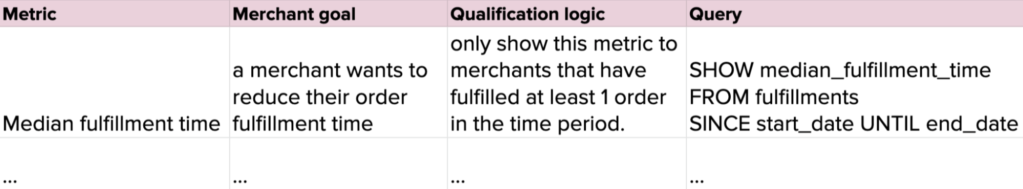
Giving our whole team access to the queries powering the experience meant that anyone could look at data for stores when prototyping and building.
Step 5: Building and Productionizing Our Models
Once we had identified the metrics we wanted to surface in-context, we worked on the dataset design for all the new metrics that weren’t already modelled. This process involved a few different steps:
- Identifying the business processes that our model would need to support (fulfilling an order, marking an order in-transit, marking an order as delivered)
- Selecting the grain of our data (we chose the atomic grain of one row per fulfillment, in-transit or delivery event, to ensure our model would be compatible with any future product or dimension we wanted to add)
- The dimensions we would need to include
Beyond the dataset design, one of our requirements was that we wanted to surface real-time metrics, meaning we needed to build a streaming pipeline. However, for a few different reasons, we decided to start by building a batch pipeline.
First, modelling our data in batch meant we could produce a model in our usual development environment, iron out the details of the model, and iterate on any data cleaning. The model we created was available for internal analysis before sending it to our production analytics service, enabling us to easily run sanity checks. Engineers on our team were also able to use the batch model’s data as a placeholder when building.
Second, given our familiarity with building models in the batch environment, we were able to produce the batch model quickly. This gave us the ability to iterate on it behind the scenes and gave the engineers on our team the ability to start querying the model, and using the data as a placeholder when building the experience.
Third, the batch model allowed us to backfill the historic data for this model, and eventually use the streaming pipeline to power the most recent data that wasn’t included in our model. Using a lambda architecture approach where historical data came from the batch data model, while the streaming model powered the most recent data not yet captured in batch, helped limit any undue pressure on our streaming infrastructure.
Step 6: Measuring Success
At Shopify, our primary success metrics always come back to: what is the merchant problem we’re solving? We use a framework that helps us define what we intend to answer and consider any potential factors that could influence our findings. The framework goes over the following questions:
- What is the problem?
- What is our hypothesis or expected outcome for resolving the problem?
- What signals can we use to determine if we are successful?
- What factors could contribute to seeing this signal go up or down, and which are good or bad?
- What is our baseline or goal?
- What additional context or segments should we focus on?
Here’s an example for this project using the above framework:
- Problem: as a merchant, I don’t want to have to dig for the data I need to inform decisions. I want data to be available right within my workflow.
- Hypothesis: providing in-context analytics within a merchant’s workflow will enable them to make informed decisions, and not require them to move between pages to find relevant data.
- Signals: merchants are using this data while completing operational tasks on the Orders page, and we see a decrease in their transitioning between the Orders page and Analytics section.
- Considerations: the signal and adoption may be lower than expected due to this being a new pattern. This may not necessarily be because the data wasn’t valuable to the merchant, but simply because merchants aren’t discovering it.
- Baseline: merchants transitioning between the Orders Page and Analytics section prior to release compared to post-release.
- Context: explore usage by segments like merchant business size - e.g. the larger a business the more likely they are to hire staff to fulfill orders, which may mean they aren’t interested in analyzing the data.
This is just one example and with each point in the framework there is a long list of things to consider. It’s also important to note that for this project there are other audiences who have questions of their own. For instance, our data engineers have goals around the performance of this new data model. Due to the fact that this project has multiple goals and audiences, combining all of these success metrics into one dashboard would be chaotic. That’s why we decided to create a dashboard for each goal and audience, documenting the key questions each dashboard would answer. If you’re interested in how we approach making dashboards at Shopify, check out our blog!
As for understanding how this feature impacts users, we’re still working on that last step to ensure there are no unintended negative impacts.
The Results
From the ideation and validation of the metrics, to prototyping and building the data models, to measuring success, data science was truly involved end-to-end for this project. With our new in-context analytics experience, merchants can see the health of their orders and fulfillment workflows right within their Orders page. More specifically, merchants are surfaced in-context data about their:
- Total orders (overall and over time)
- Number of ordered items
- Number of returned items
- Fulfilled orders (overall and over time)
- Delivered orders
- Median fulfillment time
These metrics capture data for the day, the last seven days, and last thirty days. For every time period, merchants can see a green (positive change) or red (negative change) colored indicator informing them of the metric’s health compared to a previous comparison period.

We also gave merchants the functionality to click on a metric to view reports that give them a more in-depth view of the data:
- The Orders Over Time Report: Displays the total number of orders that were received over the selected time period. It includes total orders, average units (products) per transaction, average order value, and returned items.
- Product Orders and Returns Report: Helps merchants understand which products are their best sellers and which get returned the most often.
- Fulfillment, Shipping, and Delivery Times Report: Shows how quickly orders move through the entire fulfillment process, from order receipt to delivery to the customer.
- Fulfillments Over Time Report: Showcases the total number of orders that were either fulfilled, shipped, or delivered over the selected time period.

What We Learned
There were a lot of key takeaways from this project that we plan to implement in future analytics projects, including:
-
Collaborating with different disciplines and creating central documents as a source of truth. Working with and communicating effectively with various teams was an essential part of enabling data-informed decision making. Creating documents like the data highlights slidedeck and data specification sheet ensured our full team was kept up-to-date.
-
Exploring and prototyping our experience with real, segmented data. We can’t stress this enough - our merchants come in all shapes and sizes, so it was critical for us to look at various segments and prototype with real data to ensure we were creating the best experience for all our merchants.
-
Prototyping models in the batch environment before making them streaming. This was effective in derisking the modelling efforts and unblocking engineers.
So, what’s next? We plan to continue putting data into the hands of our merchants, when and where they need it most. We aim to make data accessible to merchants in more surfaces that involve their day-to-day workflows beyond their Orders page.
If you’re interested in building analytic experiences that help entrepreneurs around the world make more data-informed decisions, we’re looking for talented data scientists and data engineers to join our team.
Federica Luraschi: Federica is a data scientist on the Insights team. In her last 3+ years at Shopify, she has worked on building and surfacing insights and analytics experiences to merchants. If you’d like to connect with Federica, reach out here.
Racheal Herlihy: Racheal has been a Data Scientist with Shopify for nearly 3 years. She works on the Insights team whose focus is on empowering merchants to make business informed decisions. Previously, Racheal helped co-found a social enterprise helping protect New Zealand’s native birds through sensor connected pest traps. If you’d like to get in touch with Racheal, you can reach out on LinkedIn.