
Building a Data Table Component in React
I’m a front-end developer at Shopify, the leading commerce platform for over 600,000 merchants across the globe. I started in web development when the industry used tables for layout (nearly 20 years ago) and have learned my way through different web frameworks and platforms as web technology evolved. I now work on Polaris, Shopify’s design system that contains design guidelines, content guidelines, and a React component library that Shopify developers use to build the main platform and third-party app developers use to create apps on the App store.
When I started learning React its main advantage (especially for the component library of a design system) was obvious because everything in React is a component and intended to be reused. React props make it possible to choose which component attributes and behaviors to expose and which to hard-code. So, the design system can both standardize design while making customization easier.
But when it came to manipulating the DOM in React, I admit I initially felt frustrated because my background was heavy in jQuery. It’s easy to target an element in jQuery using a selector, pull a value from that element using a baked-in method, and then use another method to apply that value. My initial opinion was that React over-engineered DOM manipulation until I understood the bigger picture.
As developers, we tend to read more code than we write and I’ve inherited my fair share of legacy code. I’ve wasted many hours searching through jQuery files for that elusive piece of code that’s creating that darn animation I need to change. jQuery event listeners are often in different files than the files containing the markup of the elements they’re targeting, making it all too easy to hide the source of animations or style changes.
However, a React component controls its behavior, so you can predict exactly what it’s meant to do. There are no surprises because there is no indirection. It’s also easier to tear down event listeners in React, resulting in better performance.
The first component I worked on with the Polaris team was the data table component, and it helped me realize what makes React such a powerful library. React’s component approach made it easy to create a stateful data table component and a stateless functional cell subcomponent. Its built-in lifecycle methods also provided more control over when to re-render the data table's cell heights.
Here are the basic steps we took to build the Polaris data table component in React.
The Challenge
Building a good data table is a common design challenge most of us have had to solve at least once. By nature, a table has an inflexible grid shape with a nearly infinite potential to grow both vertically and horizontally, but it still needs to be flexible to work well on all screen sizes and orientations. The data table needs to fulfill a few requirements at once: it must be responsive, readable, contextual, and accessible.
Must Be Responsive
For a data table to fit all screen sizes and orientations, it needs to accommodate the potential for several columns of data that surpass the horizontal edges of the screen. Typically, responsive designs either stack or collapse elements at narrow widths, but these solutions break the grid structure of a data table, so it requires a different design solution.

Responsive Design Stacking
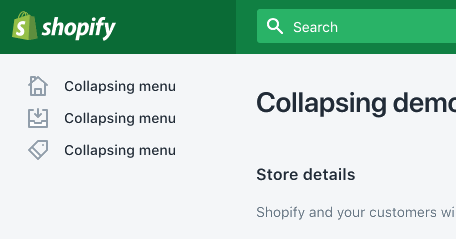
Responsive Design Collapsing
Must Be Readable
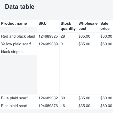
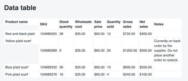
A typical use case for a data table is presenting product data to a merchant who wants to see which of their products earned the most income. The purpose of the data table is to organize the information in a way that makes it easy for the merchant, in Shopify’s case, to compare and analyze— so proper alignment is important. A flexible data table solution can account for long strings of data without creating misalignment or compromising readability.
Must Be Contextual
A good experience for the user is a well-designed data table that provides context around the information, preventing the user from getting confused by seemingly random cell values. This means keeping headings visible at all times so that whichever data a user is seeing, it still has meaning.
Must Be Accessible
Finally, to accommodate users with screen readers a data table needs to have proper semantic markup and attributes.
Building a Data Table
Here’s how to create a stripped down version of the data table we built for Polaris using React (note: This post requires polaris-react. Polaris uses TypeScript, and for this example, I’ve used JavaScript). I’ve left out some features like a totals row, a footer, and sortable columns for the sake of simplicity.
Start With a Basic React Data Table
First, create a basic data table component that receives as props an array of headings and an array of rows. Map over these two arrays to extract cell content then break <Cell /> up into its subcomponent and pass content to it.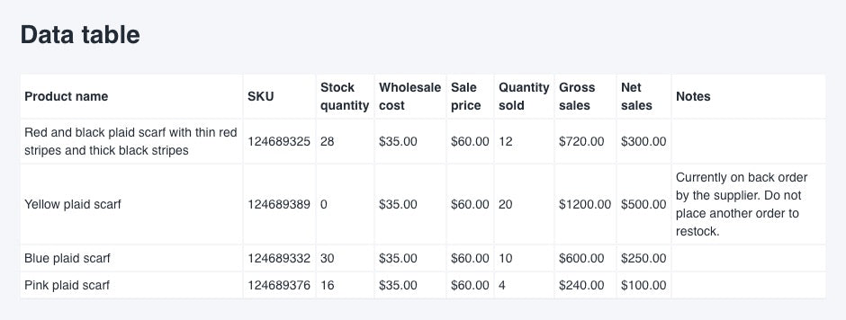
Basic Data Table Component
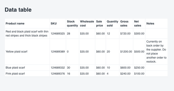
You can see the first problem in the image. With this many columns, the width of the table exceeds the screen width and scrolls the entire document horizontally, which isn’t ideal.
Basic Data Table Component Scrolling
One way to handle a wide table is to collapse the columns and make them expandable, but this solution only works with a limited number of columns. Beyond a certain number, the collapsed width of each column still exceeds the total screen width, especially in portrait orientation. The columns are also awkward to expand and collapse, which is a poor experience for users. To solve this, restrict the width of the table.
Making it Responsive: Add Max-width
Wrap the entire table in a div element with max-width: 100vw and give the table itself width: 100%.
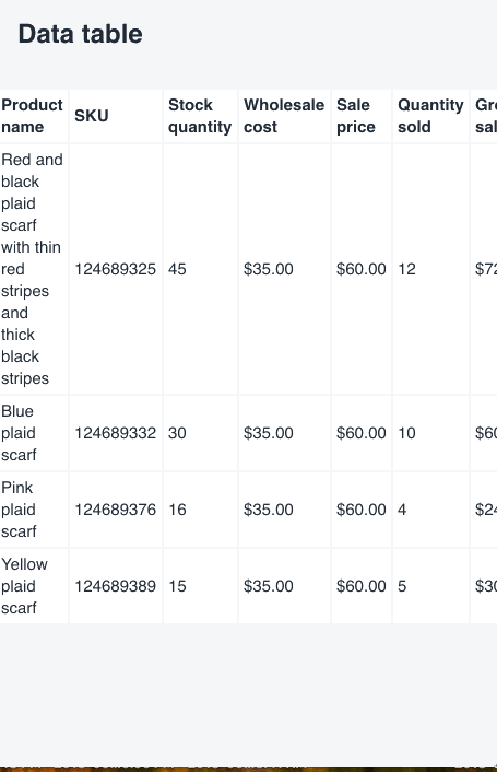
Unfortunately, this doesn’t work properly at very narrow screen widths when the cell content contains long words. The longest word forces the cell width to expand and pushes the table width beyond the screen’s right edge.
Basic Data Table Component - Max Width
Sure, you can solve this with word-break: break-all, but that violates the design requirements to keep the data readable.

Basic Data Table Component - word-break: break-all
So, the next thing to do is force only the table to scroll instead of the entire document.
Making it Responsive and Readable: Create a Scroll Container
Wrap the table in a div element with overflow-x: auto to cause a scrolling behavior for the overflow content.
Scroll all the way right to the last column, and you see the next problem. The data is difficult to understand without the context of the first column, which are the product names in this example.

Basic Data Table Component - Missing First Column Context
With several rows of data to compare, it’s difficult to remember which row corresponds to which product and repeatedly scrolling left and right is a terrible experience for the user. We chose to keep the first column visible at all times by fixing it in place and preventing it from scrolling along with the other columns as a solution.
Adding Context: Create a Fixed First Column
Give each cell in the first column an explicit width, then position them with position: absolute and left: 0. Then add margin-left: 145px to the remaining columns’ cells (the value must be equal to the width of the first column cells).Add className=”Cell-fixed” to the first cell of each row. The component maps through each row (and not each column) so, for simplicity, we pass a boolean prop called fixed to the cell component. It’s set to true if the current item is first in the array being mapped over. The cell component then adds the class name Cell-fixed to the cell it renders if fixed is true.
Basic Data Table Component - Fixed Column
Using an absolute position on each cell gives us a fixed first column, but creates another problem.
Basic Data Table Component- Fixed Column Issue
Typically, the DOM renders each cell height to match the height of the tallest cell in the same row, but this behavior breaks when the cells are positioned absolutely, so cell heights need to be adjusted manually.
Fixing a Bug: Adjust Cell Heights
Create a state variable called cellHeights.Set a ref on the table element that calls a function called setTable.
Then write a function called getTallestCellHeights() that targets the table ref and creates an array of all of its <tr> elements, using getElementsByTagName.
Absolute positioning converts the fixed column to a block and breaks the natural behavior of the table, so the cell heights no longer adjust according to the height of the other cells in their row. To fix this, pull the clientHeight value from both the fixed cell and the remaining cells for each row in the array. Write a function that uses Math.max to find the highest number (the tallest height) of each cell in each row and return an array of those values.
Create a function called handleCellHeightResize() that calls getTallestCellHeights() to set the state of heights from the returned array.
The table needs to render first for the DOM to have clientHeight values to fetch, so place the call to handleCellHeightResize() in the componentDidMount() lifecycle method and re-render the component.
When mapping over the headings and rows arrays use the same index to target the correct value in the heights array to retrieve a height value for each <Cell /> and pass it as height prop. Because the heights array contains all heights and there are two separate calls to <Cell /> (one for headings and one for the table body) you need to increment the row index by 1 in renderRow() to skip the value for the headings cells.
We’re close now, and there’s one final bug to solve. The handleCellHeightResize() is called after the component is mounted and is never called again unless the page is refreshed. This means the height values for each cell remain the same even if the window is resized.

Set up an event listener and call the function any time the window is resized, so the cell heights readjust. In this example, I’ve used the event listener component already in Polaris.
Making it Accessible
Two important attributes make a data table accessible. Add a caption that a screen reader will read and a scope tag for each cell. For more details, the a11y project has an article about how to create accessible data tables.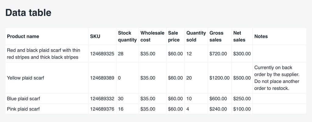
A Responsive, Accessible Data Table Component
And there you have it, a responsive, accessible data table component in React that can be used to compare and analyze a data set. Check out the full version of the Polaris React data table component in the Polaris component library that includes a full set of features like truncation, a totals row, sortable columns, and navigation.
We're always on the lookout for talent and we’d love to hear from you. Visit our Engineering career page to find out about our open positions.